(Archive) Advertising District / Monsters of the Underworld
-
 05-October 09
-

 Casimir
Offline
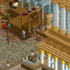
I think the tower should be a little bit thinner. what is it right now? 3x3?
maybe try a 2x2? -
Airtime Offline
Yer^ I just think the tower looks almost bigger than the whole structure. Try, as Casimir said, 2x2? maybe. And the balcony on the tower looks to square. Hope that helps to explain my comments
-

 Louis!
Offline
The structures are great. Fantastic even. But the colours of the yellow building is too bright for me.
Also the scale is still off. Put a staff member or a peep next to those buildings and they would be aboslutely dwarfed. Thats the only real issue for me with these screens.
Great work, keep it up
-

 Casimir
Offline
i think the scale isn't that off.
6 x 1/4 blocks is okay as an arch's height.
what I don't really like is the roof of the left building, but that might just be because it's not my cup of tea. others might like it, because it is in fact architecturally interesting! -

 gir
Offline
I agree with Louis, the scale looks ridiculous. Those fences look like they're taller than the peeps. I do like the buildings themselves though, but the trees and paths out front are not too aesthetically pleasing.
 -

 Alpengeistfan1
Offline
I like the the buildings overall, but the two things that I don't like are the yellow roof on the left building and the purple awning on the right. Purple seems like a random color.
 -

 Wolfman
Offline
Yeah. The structures look alright. But the curved blocks on the edge of the roof are waaaay too fat. It's a cool design, but it makes it look too top heavy. Maybe try some thinner Art Deco blocks. Maybe that might work.
I don't know if you can get the same curves and work it out the same way. But it might be worth a try. I like that small room hanging off the green building, And that grape colored awning is too much. I'd try gold or a copper color. Like deep orange maybe?Edited by Wolfman, 22 October 2009 - 01:17 PM.
-

 Welshcraft
Offline
I like the structure of those buildings but one thing I want to critisize. The yellow building looks too big for me but I like the style
 -
tdub96 Offline
Looks nice great color scheme and the station goes perfect with the track colors of the coaster. The Supports are fantastic. Have you named it yet
 Tags
Tags
- No Tags
