(Archive) Advertising District / Large RCT2 Project- LOTS of Screens!
-
 01-September 09
-

 LiveForTheLaunch
Offline
Okay so here is a big project on a BIG map that I have been working on since April of 2008! I've posted it on other sites but they don't give very much feedback or constructive criticism so I decided to try here.
So, this isn't JUST a park, in fact only about 1/4 of the entire map is a park/waterpark. There are also shopping centres, hotels, and there will be some residential areas and office buildings when the entire thing is complete. I also don't hack, or custom support.. Custom supporting has never been my strong point so it detracts from my park even more than just leaving the normal supports there. I use 8-cars ONLY for zero clearancing once in a blue moon because it glitches my game (my drop tower is permanently screwed up because of it).
Okay so I'm a bit embarassed to post on here with all the great parks but here we go!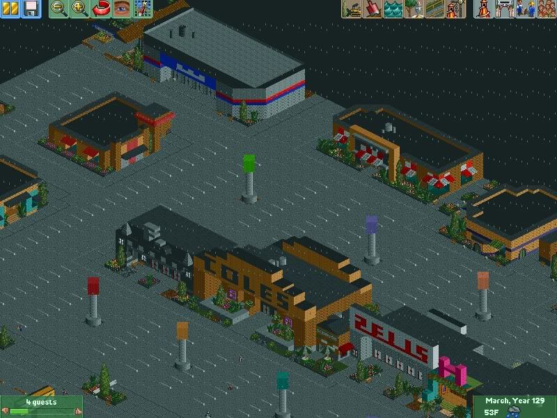
Shopping area featuring things such as Zellers, Hollister, Coles, and Abercrombie & Fitch. There's a hotel adjacent to all of these but I forgot to get a screenshot. You may be able to see it as well as the Waffle House in the overviews.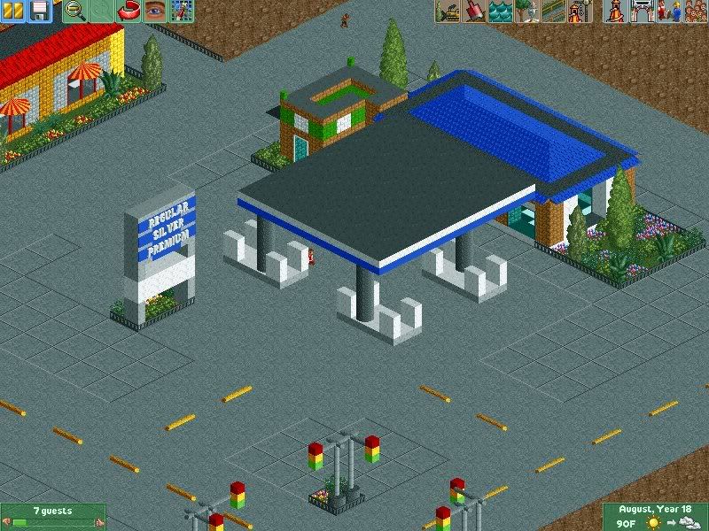
A gas station and a little Subway.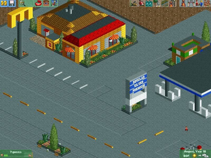
A McDonalds as a tribute to my workplace, haha.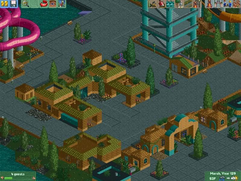
Waterpark entrance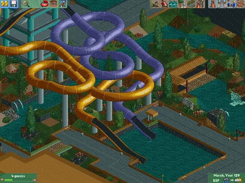
Some slides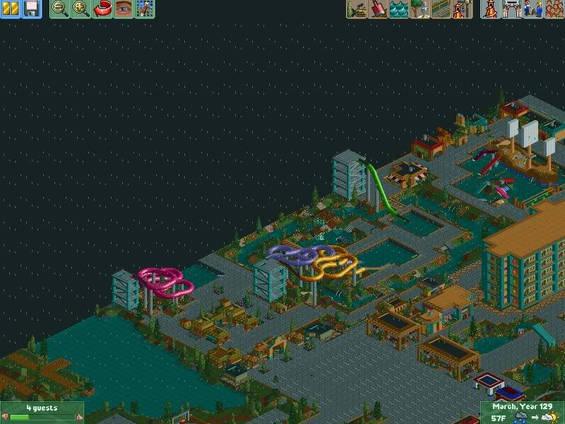
Waterpark overview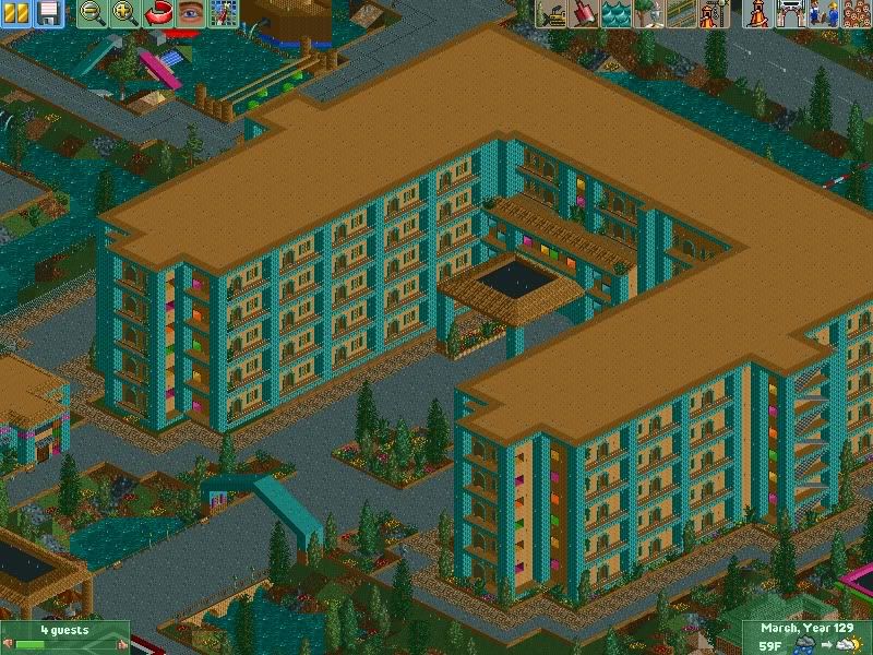
I guess you can kinda call this the centrepiece for now because it's the biggest thing so far. It's obviously a hotel!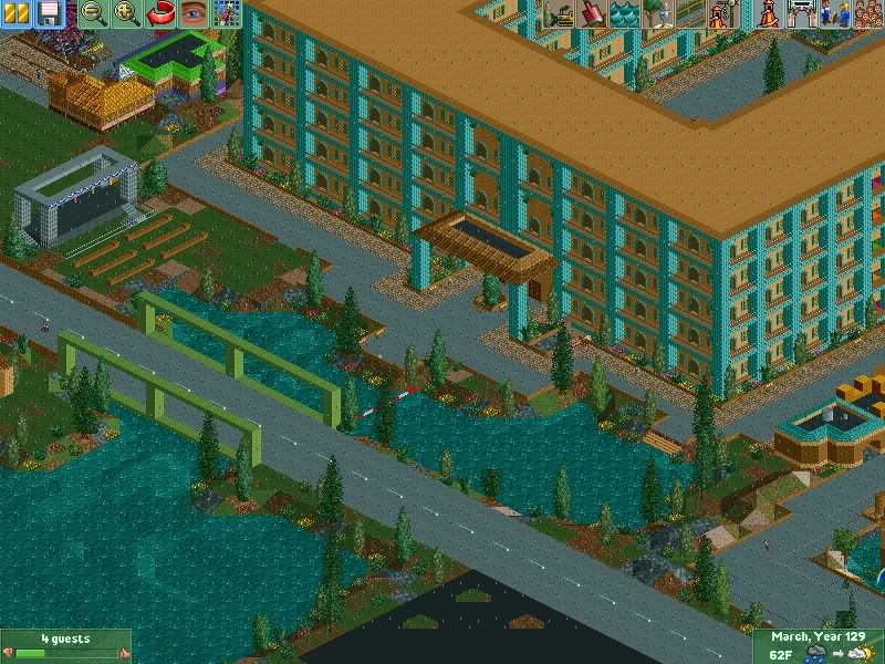
Back of the hotel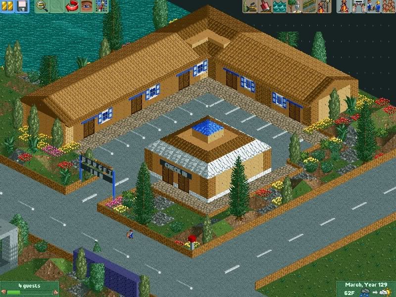
A budget inn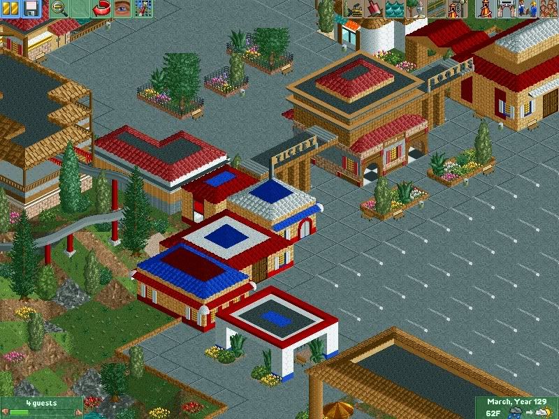
The entrance of the actual park!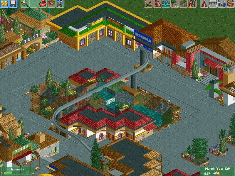
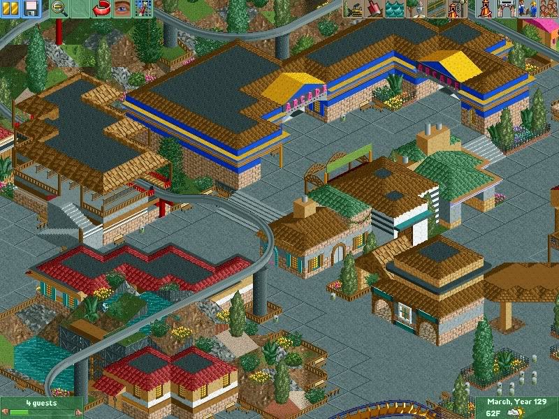
An unfinished monorail and some random screenies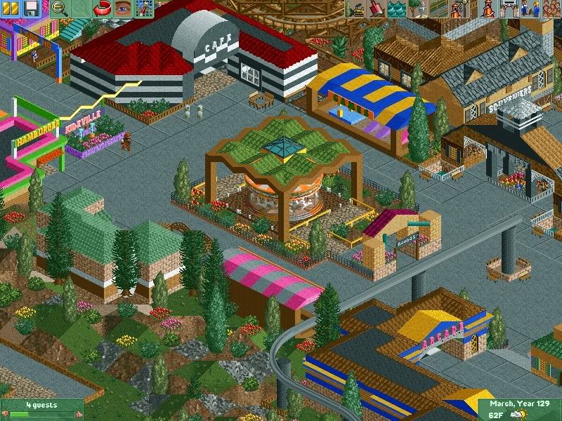
A path leading up to Kidzville which WAS finished but I was unhappy so I deleted! But you can also see the Nascar cafe and stuff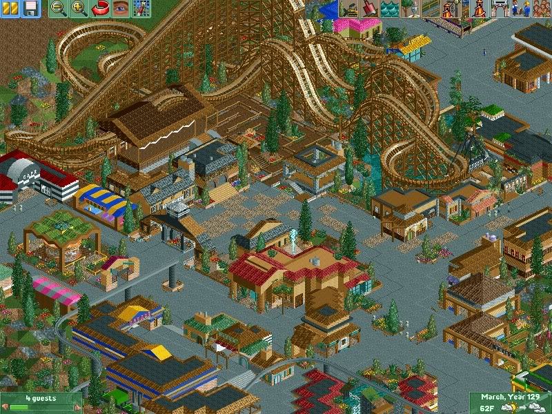
Best area in my park so far, with a coaster in the centre which I forget the name of (Geronimo I think ?)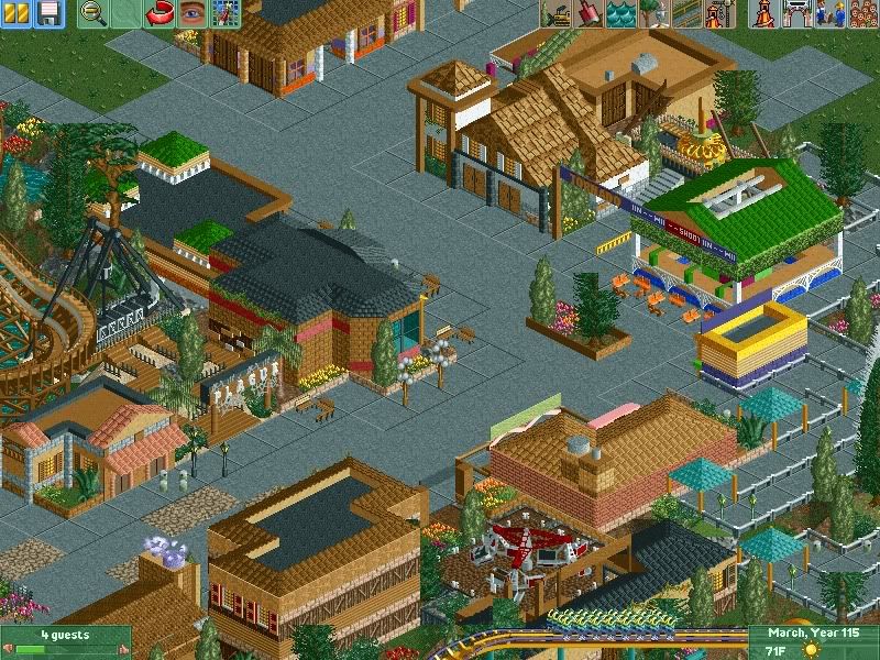
Area near the other B&M Floorless, Adrenaline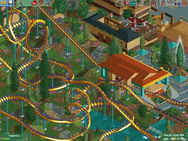
Adrenaline has one of my favourite layouts I have ever made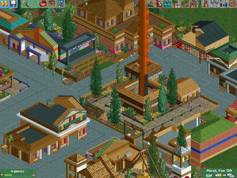
Glitchy drop tower called "Mind Shaft" (play on words a bit), and the surroudning area.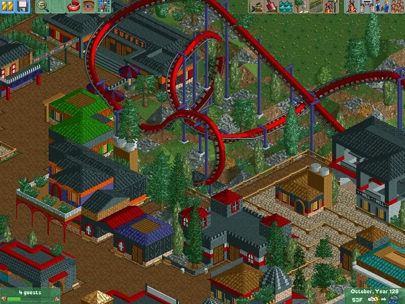
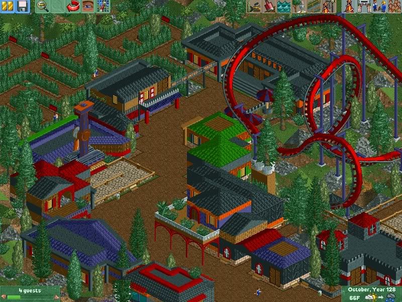
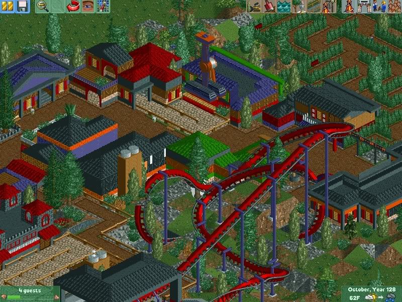
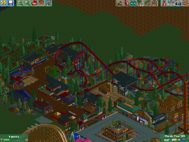
The new Haunted Forest area just to break up the monotony of everything else. It includes a flyer called Hell, an inverted called The Dungeon, and a Haunted Maze.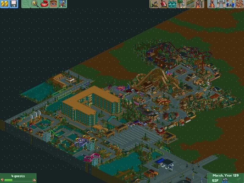
Overview of mostly everything besides some of the shopping centre and the other hotel which got cut off.
ENJOY!
PS- ANYONE KNOW HOW TO GET RID OF GHOSTING? It's happening a lot. -

 robbie92
Offline
I was just thinking about this today. I'm glad you brought this over here. I love your archy here. It's simple, but quaint.
 -

 zburns999
Offline
Not bad man. It's a bit blocky, in that most stuff is made out of quarter tile blocks or something similar, but it's got some nice charm to it. I like the first screen especially, as well as the woody. May want to fix that pirate ship, though. It's looking a little dangerous in its present location haha.
 -

 LiveForTheLaunch
Offline
Yes, my archy could definitely use some work though.. It IS kind of blocky, but I try not to keep it to 4x4 buildings.. I try and at least vary up the size of the buildings though I do think I could probably go a litle bigger. I'll try in the future for sure.. I still got a LOT of map left !I was just thinking about this today. I'm glad you brought this over here. I love your archy here. It's simple, but quaint.
Not bad man. It's a bit blocky, in that most stuff is made out of quarter tile blocks or something similar, but it's got some nice charm to it. I like the first screen especially, as well as the woody. May want to fix that pirate ship, though. It's looking a little dangerous in its present location haha.
Yeah as I said before, I'm gonna try and be a bit different with my architecture.. though most of the pieces I have ARE blocky tiles. But yes I'm gonna try and make somwe different-ish things.
P.S.- WOman
And about the Pirate Ship.. Man, I didn't think so many people would notice it lookin it a bit.. crashy into the woodie . It actually doesn't quite touch it but my stupid computer makes it look like it's basically sitting half on top of it.
-

 Comet
Offline
I remember this from over at Coaster Force, it was one of the better parks there.
It still is pretty good, there's not much in particular I can point out but I think just being here naturally gets you a little bit better, haha
And for the white glitches...
-paint the land under glitch a color not yet used in the park, for example red/yellow/purple checkers
-go to misc in 8cars
-map object manipulation
-then check remove, large scenery, and the ground color you used
-then apply and it should be gone
The glitch nromally happens when you drag a large scenery piece over another large scenery piece in zero clearance mode.
Hopefully that helps -

 LiveForTheLaunch
Offline
YES thanks Comet!! You don't even know how many buildings on this map had to be built in order to cover up ghosted objects, haha.
 -

inVersed Offline
Hey this is really pretty good. I love the town outside the park. The only thing I am not a big fan of is the over used quarter tile pieces. It make a lot of things look "chunky" and I think a smaller piece would look better. -

 reflex
Offline
I really like this. But the roads in the first few screens seem a bit wide. Unless they are two laned, but then the dotted line would be solid, no? Keep up the good work
oh and What version of 8cars are you using? Because some of the trees and things seem cut off.Edited by reflex, 01 September 2009 - 07:10 PM.
-

 tracidEdge
Offline
it all looks pretty lifeless and sterile. i don't know. i'm sure taking screens when it's raining doesn't help at all though.
 -

 LiveForTheLaunch
Offline
Inversed- Thanks! The town is really the main thing in this, I just kinda wanted to challenge myself with it and see if I could pull it off, and I think I've been doing okay. My buildings are pretty chunky as you say, but as I said, I am going to start concentrating more on the architecture in my park. If you had seen some of my former parks you'd think my chunky buildings were FABULOUS
Reflex- I had the roads kinda narrow before, but then they just seemed too narrow, so I widened them up. I could always add sidewalks or soemthing. I'm using like, a normal version of 8cars, I dunno which one.. But I thinkit's just because my computer sucksss.
Tracid- I understand, it doesn't have TOO much personality. And I did have the thing set to being frozen as sunny.. But obviously it shuts off when you shut the game off.
I'm a bit all over on this oen though.. I've been jumping from working on Kidzville to working on building a few more buildings near the shopping centre, to just kinda adding in a few random things here and there on the map.. I get a bit bored after working too long on one thing and I start to rush, which I think is a problem with my Haunted Woods section. I did it in like, two days whereas my whole park has taken me months so far. -

 In:Cities
Offline
looks pretty solid so far.
but it seems to me that your colors dont flow together well at all.
its like, there's no cohesiveness that makes everything seem consistant.
maybe try adding more of a set color scheme for different areas.
for instance, that bright green roof in the haunted area really looks bad, and detracts from the whole atmosphere in that section.
otherwise, its looking pretty nice:] -

FullMetal Offline
Wow! At first I thought that this was another blocky park, but there's really a lot of detail in there!
Is this a 256x256 park? That's what it looks like from the arial.
Either way, nice work! 129 years? You certainly have a lot of patience. -

 Louis!
Offline
Hey Taylor!!!
Good to see you finally venture over here The park is looking nice as always, I still cant get over how far you've come with the game!
Great stuff! -

 LiveForTheLaunch
Offline
I don't like when people use the same colours over and over in their parks so I am trying not to. In the Haunted Forest I thought the green colour reminded me of Frankenstin but you're right, it doesn't go well and I am going to change it.but it seems to me that your colors dont flow together well at all.
its like, there's no cohesiveness that makes everything seem consistant.
maybe try adding more of a set color scheme for different areas.Wow! At first I thought that this was another blocky park, but there's really a lot of detail in there!
Is this a 256x256 park? That's what it looks like from the arial.
Either way, nice work! 129 years? You certainly have a lot of patience.
It's a bit blocky yeah but like I said I've bene tryin to stay away from the 4x4 and just plain square/rectangle buildings.. And I'm gonna try using more smaller pieces instead of quarter blocks.
Yes it is 129 years and yes it is a 256 x 256 park haha you have no idea how long it takes me to build things.Good to see you finally venture over here The park is looking nice as always, I still cant get over how far you've come with the game!
Yes compared to some former parks you can see why I am proud of this one, haha. -

 Cena
Offline
Wow, that looks really great, I like it. Although it is a bit blocky and simplistic it still very fun to watch
 I like all the colors in it
  . And it is obviously that you had a great amount of fun building this.
-

 LiveForTheLaunch
Offline
Thank you
 .
.
I have a question though.. What kind of shapes should I start using or what should I start doing to the buildings to make them less blocky? I've been trying but everything looks very square. Maybe I'll just look around and get some hints off other parks. -
 Luketh
Offline
try using diaginal pieces for corners, or make the buildings a different shape. For buildings with two stories, try makig the second floor a bit smaller in area than the first.
Park looks pretty cool, 129 game years? WOW! -

 LiveForTheLaunch
Offline
Hah okay I'll be sure to take your advice
And yes 129 game years.. I didn't think that was THAT much though, haha.. A lot of it comes down to the fact that I can build for hours and then demolish everything because I didn't like it. I'm considernig doing that with some of my Haunted Forest right now.. The more I look at it the more i dislike it. -

FullMetal Offline
Well, the way I figured it up is that each game year takes about 1 hour. (This takes into consideration things like snack breaks, bathroom breaks, etc., where you would pause the game.) So 129 years comes down to about 120 hours. That's a lot of time that you'll never get back.Hah okay I'll be sure to take your advice

And yes 129 game years.. I didn't think that was THAT much though, haha..
 Tags
Tags
- No Tags
