(Archive) Advertising District / Marvel Xtreme City
-
 09-August 09
-
 hulkpower25
Offline
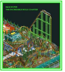
Here is a new update
Archagel
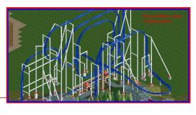
B&M FLYER
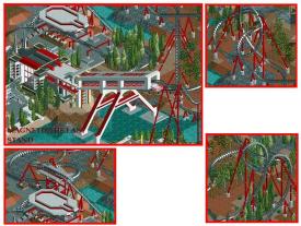
AND SOME BUILDINGS
tell me what you guys think about the flyer. -

 Alpengeistfan1
Offline
I really like that tunnel coming out of the ground, but you should add some more trees to the other half of the coaster. The ground looks pretty bare.
 -

 In:Cities
Offline
looks great dude!
one issue for me though, is that your skyscrapers are see through.
maybe somehow put some kind of a filler inside them so they look a little more realistic?
either way, this is looking really nice. -
 Ripsaw
Offline
Everything looks really cool!
But tbh i really wana see more of the DrDoom towers i assume thats what they are? -

 Lowenaldo
Offline
would not go on the hulk with that sharp turn right after the first drop. everything else looks good though
 -

 Katapultable
Offline
That support on the Hulk coaster is not ver realistic. I mean the support holding up the first hill. Your work has an oldschool feel to it. Very likeable.
 -

 ChillerHockey33
Offline
I keep feeling like your architecture around Archangel is ripping off the Design Archangel
 -

 hulkpower25
Offline
everything i have done in the park is unique only done by me, i have not copy cat anybody, if you have not notice everythinh in the park is the style, i am very if it look like the archagel design.
 Tags
Tags
- No Tags
