(Archive) Advertising District / Hungtington Thrills Theme Park!
-
 07-August 09
-

 Goliath123
Online
Thanks everyone!
Wick:This is the only area where you can escape the mine, theirs an on ride audio i want to include when i'm done with the in and exteriors. -

 Hepta
Offline
Wow what a fabulous well executed screen. I truly am impressed. And I also adore the mine shaft by the way. I love the feel of that large building.
 -

 BelgianGuy
Offline
It all looks very good and has some real mine feeling to it but I suggest changing the colour of the supports because it looks too black IMO, other than that fanf**kingtastic
 -

 Goliath123
Online
Taking a break from the mine ride, still open for name suggestions we take a look at weasley's wizard wheezes:
Enjoy! -

 SSSammy
Offline
i know its meant to be different, but its different in a bad way.
they had converted an old shop, not built an 80s warehouse.
its meant to be really thin and tall aswell, and i think with one window either side of the door, now i know in a thempark sometimes its not possible, but i think you can do better than this. -

 Goliath123
Online
Huh? Whats wrong with it? It's not supposed to be a recreation. Why do you always rate my work so badly
-

 SSSammy
Offline
dude, i dont.
i dont know why youd thik that.
im not picking on you buddy.
even without the recreation it looks abit odd anyway. i think it would definately be a step in the right direction to make it even abit more like the book.
or even the film. -

 J K
Offline
If it was just a generic building I'd love it but as its themed to such an iconic book/film, you have to do this justice.
That sounds negative but I'm really liking this project. -
 ahank
Offline
I personally like the building.
Only thing I don't like is that, by judging the surrounding buildings, it sticks out badly.
Of course, I haven't read the book or seen the film, so I could just be missing something. -

 Alpengeistfan1
Offline
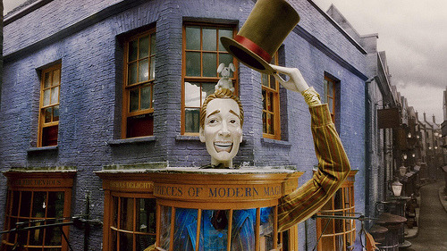
I don't think the building looks too bad, but I think there's too much purple. Fred and George did paint it purple, but they just did the walls. They left the roofs to their original colors.
-
 Splitvision
Offline
It should be more whimsical, have more colours and more stuff going on. And I agree with sammy that it should be taller and thinner. Right now it doesn't look very wizard-jokeshop-ish. Plus it needs to be on a corner, like in the pic alpengeistfan posted.
Splitvision
Offline
It should be more whimsical, have more colours and more stuff going on. And I agree with sammy that it should be taller and thinner. Right now it doesn't look very wizard-jokeshop-ish. Plus it needs to be on a corner, like in the pic alpengeistfan posted.Edited by Splitvision, 19 September 2009 - 08:05 AM.
-

 Goliath123
Online
Yes the park finally has a name and i'm happy with it!
Anyway here's the dilemma i don't know which wall type to use on the backstage area of the mine ride a wooden wall or a steel wall! Heres a pic to help you out:
All suggestions welcome
-

 Splitvision
Offline
Yes.
EDIT: I'd personally spell it Huntington and not Hungtington...Edited by Splitvision, 21 September 2009 - 08:55 AM.
-

 BelgianGuy
Offline
Isn't huntington like a very serious desease that kills you?
doesn't sound as joyous as you would think -
 Katapultable
Offline
Isn't huntington like a very serious desease that kills you?
doesn't sound as joyous as you would think
A muscle desease, I believe. -

 Goliath123
Online
Well i love the US and surfing so it stays!
Goliath123
Online
Well i love the US and surfing so it stays!Edited by Goliath123, 22 September 2009 - 12:11 AM.
 Tags
Tags
- No Tags


