(Archive) Advertising District / nin's Six Flags Magic Mountain
-
 17-July 09
-

 Comet
Offline
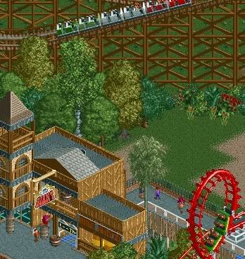
I see no problem with the flower colors, but I don't like the white wooden fence.
I think it should be a brown or something darker.
Great screen nonetheless. -

FullMetal Offline
That is one hot looking sign. Haven't we seen something like this from you before, though? -

 K0NG
Offline
Yeah nin, this is looking sweet. I've been trying to do something non-CSO for the USA Road Rally and couldn't have a harder time getting it to look anything NEAR this good with a years supply of Viagra.
Nice job, bro. -

 Goliath123
Offline
Wow thanks everyone! I'm famous.
Aside from that...
My only suggestion is to take the time to rotate some of the ruins for a more rocky sign if you know what i mean. -

 Xophe
Offline
Amazing screen! I love the palm trees but I think the blue flowers are too dark and don't really go with the colour scheme of the rest of the area. The custom sign is infinitely better than the one the game provided. Good stuff!
 -

 Brent
Offline
Great screen... really makes me wanna go back as it's been over two years now.
 Keep up the excellent work.
-

 nin
Offline
@ Xin
My first try at doing something like this, and I must say the latest version is much better imo.
The flowers were merely a test, as I didn't exactly know how i was going to add planters there. I'm still experimenting will various techniques, so bare with me. -

 nin
Offline
Did you change the name of the coaster fro Goliath to Titan?
That sign was from a different park, SF over Texas. -

inVersed Offline
The Viper loop looks under supported. Besides that, this park is one of the best parks without non custom scenery I have ever seen. -

 Louis!
Offline
The foliage looks a bit bland at the moment. The train colours for Texas Giant are really nice.
With the structure, i'm not too keen on the tower part, it seems a bit messy, but the rest is top notch.
 Tags
Tags
- No Tags

