(Archive) Advertising District / Martens Thrill Kingdome
-
 01-July 09
-

 Ripsaw
Offline
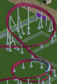
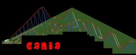
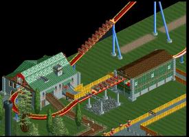
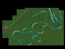
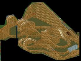
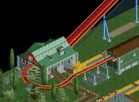
Theres alot of potential here, but i would say you need to work on your layouts, your architecture is really good but some of the layouts look a bit painfull, smooth out the basics of the layout for instance the bottom of Gania's drop the corner is way to small, things like that which will make the ride flow. Good luck =]
 -

 Liampie
Offline
Hi Tezee.
Dein Architektur ist gut ja, aber deine Achterbahnen brauchen eine besseren 'flow'. Besonders die Hyper und die Suspended.
Sorry, I am from the Netherlands and my German is bad. Architecture is quite good, coasters need a better flow.
-

 Stanman
Offline
Well I understood, what you said Liampie
B2T:
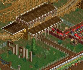
Die Häuser sind ok, nichts ausgefallenes aber trotzdem gut.
Layouts scheinen jedoch nicht deine Stärke zu sein, vielleicht
baust du mal ein paar Coaster nach, um ein Gefühl zu kriegen.
I mostly like the houses you built, nothing to fancy but still good.
Coaster layouts don´t seem to be your excellence. Maybe start with recreating
some real Coasters to get a feeling for it.
Have fun building! -

 posix
Offline
i agree with ripsaw about the "a lot of potential here". from the screens, it looks like you have a certain sense for harmony in rct style. i think that's a huge plus for you. looking forward to what you can come up with in the future.
 -

Tezee Offline
thanks for the comments.
some even if I do not entirely understand.
but this is probably due to my English skills.
So here are a few questions:
1. says her "flow" which makes it more "smooth" should be?
2. what does "Diggin '?
I have your criticism to heart and tries to put as much as possible. I hope it's me as well.
mfg. -
 LDW
Offline
I gotta say that I really like your archy!
 I think you over-do it on fences though...
EDIT: "diggin" is slang for love it!
Edited by LDW, 10 July 2009 - 10:19 AM.
-

 reflex
Offline
1. says her "flow" which makes it more "smooth" should be?
2. what does "Diggin '?
1. Stimmt
2. Er hat deine Architektur gern (diggin' = digging = liking)
Excuse my bad German.
I like the stations, good work.Edited by ice³, 09 July 2009 - 03:40 PM.
-

inVersed Offline
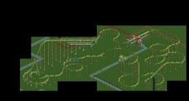
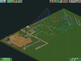
This is very impressive for your first project. Much better than my early stuff. I would recommend that you work on adding more depth to your parks considering right now the land is very flat and could use more variation. Tree, shrubs, and other pieces of landscaping would dramatically help here as well. I might also recommend that you touch up your coaster layouts they do not look very appealing now. -

Tezee Offline
thank you again to all who have written something.
I will try everything once again as good as possible.
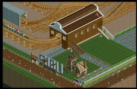
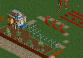
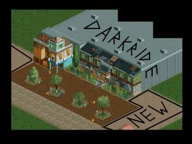
the facade of darkride is now completed.
you see also on a screen.
in the darkride is about 2 Mexican.
a means vorko el paco and is good.
the other tako eso Takko and the evil.
more, there is not really to say.
Tomorrow, I go to Phantasialand and driving black mamba. -

 MF72
Offline
I really like that Tezee. I especially like that building with the blue walls. Great work.
 -

 RCTCA
Offline
That looks perfect to me. I really like the colors you have chosen. Maybe we can see inside?
-

 turbin3
Offline
Looks good, but put some small bushes under the trees and give them different colours.
Yannik -

 Todd Lee
Offline
I like that alot! The signage hides the excellent themeing from the peeps viewpoint though.
 -

 Stanman
Offline
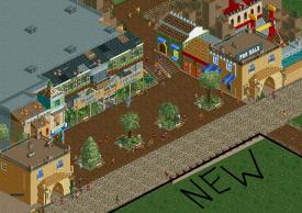
Wow this new screen looks really cool! I like it a lot.
The only thing you should work on is your English
-

Tezee Offline
Yeeeaarr new pics!
I hope you like the.
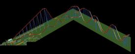
But first I tell something. I´ve deleted ALL coasters. than i´ve build ja new woodie and a new inverted coaster. and a rafting.


sorry my bad enlish
Edited by Tezee, 19 November 2009 - 03:06 PM.
 Tags
Tags
- No Tags
