H2H5 / [H2H5] Round Robin | Round 4 | Match 2
-
 29-May 09
-

 geewhzz
Offline
 Round RobinAnnotations
- The poll will stay open for exactly 120 hours.
- You can only vote by entering BOTH vote codes you find in the custom message of the parks.
- If you are a member of a team that is in this match up, you can not vote and will automatically see the poll outcome.
- You will only receive a vote code if you are logged in with a forum account.
- Only members registered before 3/11/09 will be able to vote.
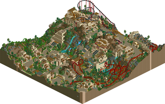
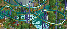
Round 4 | Match 2Alpha Legends"Xlapak"(RCTLL)
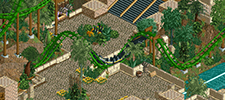
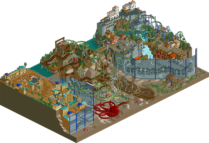
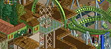
VS Flying Germans"Aquatica"(RCT2)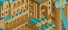
 Match DecisionThe 120 hours voting time for this poll have passed. Here are the official results of the match.
 >
> "Xlapak"1684.21%ParkVotesVote %Creators"Aquatica"315.79%
 -

 Six Frags
Offline
Wow, it got posted already (and as first of round 4!).. Thanks and good job posix/geewhzz!
Pity about the Germans park being unfinished how it looks, but good job getting something in I guess.. I like the bits done in the upper right corner, props to whoever did it!
I really like what our team did for this week, can't stop looking at it, lol
SF -

 posix
Offline
I voted for Xlapak. The part with the minetrain just blew me away. I never thought stacked fences in ll could be SOOO beautiful. Also the use of the Aztec themeing objects is very tasteful and used to create looks with it I haven't seen in that particular way. Great job. On a bigger picture though, I'll have to admit that the overall composition of the park is a little wacky and seems out of order. But maybe that's just the realistic style addict in me.
The Germans park, while having a few highlights here in there, didn't quite excite me as much. I didn't quite know what to think of it as I couldn't understand it very well. -

 RRP
Offline
Both parks have there weak points and i think if i had to vote it'd be a tough desision.Im sick of seeing aztec themes in LL and this one is no exception,posix also makes a good point about the layout being being a bit strange and awkward.Our park had the superior area but also 2 weaker areas
 -

 Coaster Ed
Offline
 I love this match-up! Just from the screen shot, this looks like the best LL park in...well, ever. And there's another unfinished (but potentially brilliant) underwater park too! I guess that idea is just eternally doomed. There's some gorgeous architecture in there though.
-

 J K
Offline
Yay ED!!! I didnt like the RCT park very much. Quite a confused concept imo but Atlantis and Port Royal seem to be that different from each other that they just don't suit being near each other. It seems like you both had your sections and did your own thing. Correct me if I'm wrong as I hope I am.
The good points however were the Port Royal section. While not breaking any rules for innovative work it did its job and the archy was beautiful. I liked the underwater fish but it just seemed an after thought to me to ask people to visualise them swimming through the blank space. You did well to fill it up but I just couldnt get into the park.
Atlantis had some beautiful structures and it had a nice atmosphere (of the architecture on the cliff face) The section in the middle really didnt do anything for me.
Good job on trackitecture however. Someones pretty skilled in the ammount of shapes and variation of track you put on this map.
I'm sorry to seem so harsh but I think this park could of been a lot better or even a winner with either Atlantis or Port Royal expanded. -

 6000000flags
Offline
Great job both, downloading now. For some reason Xlapak(?) reminds me of Nemica from the recent pro tour.
Edited with double review:
Xlapak:
Pros
Great idea for a theme. We've all heard the conspiracy nuts.
A well shoestringed mine train
A great multilooper that's kinda like Viper, Anaconda, and Dragon Mountain combined... but with far more epicsauce.
Well themed
Quite a few nice touches. Love the parrots, I found them all without cheating.
Cons
From all the similarly themed parks out there, the egypt theme tab has been burned into my brain.
Meh pacing on the suspended
I'm not feeling the invert for some reason
An aztec park that somewhat breaks the Aztec mold but doesn't break the "4 Coasters, 1 Water-ride, Generic Flats" pattern I've seen too often.
TLDR: Nemica: Forgotten Land with an aztec theme.
The one water-related name:
Pros:
Good theme idea
Port Royal is somewhat vibrant
All the little fishies in the sea!
No Quarter is a good medium size invert
Nice quarter tiling
Cons:
Atlantis area is dead, no atmosphere, done to death, and has no big ticket rides.
Center is unfinished
No water! Seriously, did all the fish in the world sprout wings?
No reefs or anything for the fishies to swim around
TBH the octopus is meh and Indigo Hills did it better
Odd supports
Atlantis, aside from Port Royal, is a waste of time and I only spent more than 4 minutes on it because I was eating ramen.
TLDR: When finished, it'd make tough competition. Until then, it's veering towards shit.Edited by 6000000flags, 29 May 2009 - 08:31 PM.
-

 AustinPowers
Offline
Another easy round to choose for me.
I voted for Xlapak...whatever that means.
Nothing overly special. The green coaster and the water ride were highlights.
The layout and red coaster were low points. But a solid entry nonetheless.
Aquatica was a mess. 3 distinctly different styles and qualities exhibited. And it was unfinished.
The light brown side was decent though really repetitive and bland especially for such a small area.
The middle was atrocious. The coster was terrible, all of the ride entry and exits everywhere were eyesores, the coster things buzzing around were annoying and not that effective really, and the octopus could have been better. I think it could have looked nicer if it had been all under water, though those ugly diagonal window fence things would have made that difficult. The Port Royal area was really nice. Pretty much everything in this area was well done and effective. The only downside there was the giant fence in front of it blocking the view. -

 Kumba
Offline
Parrot on a fence this the coolest thing H2H has seen since Spaceman on a shop
My vote went to the ALs, really good park. btw whats the thing to watch at the end of Snake in the grass? I did not see anything... 8.1/10
FGs your park was nice, but really seemed like it was trying to be generic. I liked some things, but overall it was just not as good as Xingawhatever. Oh and Port Royal? Atlantis? and to top it off the park is named Aquatica, Ed already made an H2H park with the same name! 6.4/10 -

 Micool
Offline
Xlapak will win and deserves it. I think it's quality, really beautiful. I know the theme is a bit tired but you can't blame someone for using what they have in LL, because resources are limited and making something like this should be commended for being nearly flawless if not ingenious. Personally I have always tried to transcend the basic thematic opportunities that Mr. Sawyer unknowingly granted us, but I understand the popularity of the Mayan/Aztec selection. I thought all the coasters were well done although the underground lift kind of killed the end of Demon of the Fall, although putting the lift hill at the end was smart. I particularly enjoyed the snake, that is fucking awesome. I thought it was a ride at first and could not for the LIFE of me figure out where the station was... I also dug all the egyptian stacking, most excellent, and I loved the staircase made out of woodie track. Very nicely made park.
I can't open Aquatica but from the screenshot, what's there looks pretty cool. That underground creature there is wiiiiiild... Wish it was finished but it does give me a laugh to see that the exact same thing happened that happened to Ed's Aquati- IS THAT FUCKING ED WHAT THE FUCK IS UP DUDE?! Nobody leaves forever! Nobody!
-

 Louis!
Offline
Our park is clearly the weaker here. It's a shame as our park had the potential to go a long way, I think timing just got in the way.
The idea was great but the execution wasnt, Port Royale was the best area with Atlantis coming up second. Seperately each area worked but together they seemed to distant and didnt carry much flow between the areas.
It's a shame that the idea didnt work as well as it should have. -

 SSSammy
Offline
credit where it is due, the AL park was freaking spectacular.
parrots?
made from bikes?
PARROTS YAAY
sadly it also had its flaws, mainly with the rides.
the invert was , kinda boring...
the suspended was also kinda boring...
the corky was better though
overall, a pretty good park AL
im slightly dissapointed our park didnt get finished.
the areas stood well alone, but they lacked continuity.
i hope we can get a decent percentage and maybe win
-

 Buckeye Becky
Offline
My vote is for Xlapak and what does that park name mean? I pretty much loved everything in this park.
Aquatica - why the name that indicates there would be water when there is not water...don't get it. As others have said, the park was obviously created in three sections by three people who had three different styles that did not work well together. Really did not get what all was going on, no flow, no cohesiveness, too many ideas and not enough execution Just unfortunate.
-

 turbin3
Offline
Is there a chance for players without LL to see the votes?
Sorry, if this question was already asked...
-

 posix
Offline
yeah, get llIs there a chance for players without LL to see the votes?
Sorry, if this question was already asked...
-

 SSSammy
Offline
to be fair, everyone was given sufficient warning to purchase Loopy Landscapes before the competition went underway, Turbin3.
 Tags
Tags
- No Tags
