(Archive) Advertising District / Phantasia Worldtour
-
 22-May 09
-

 Cena
Offline
Yannik, I don't like that you are using Pathblocks on the tiles that you have stuctures on. (at the doors on the building and the coaster supports for example), it looks rushed/lazy to do a extra round of zero-clearincing/restoring. For me it takes more time writing this, then for you to change it.
 -

 Fisch
Offline
It looks very very nice!
 Also like Robbie said it's finally some well organized work. Something I don't really like though is the tower at the end of the lift hill. You should atleast put fencing on the side of the top of it or something to make it look like it had more of a purpose.
The rest of the architecture is really nice but in my opinion the bits of foliage have too much of a square shape. Good luck finishing this!
-

 Cena
Offline
Then do everything wit pathblocks? And put invisible paths on top of it. How simple is that? This just looks ugly/out of place.
 -

 Katapultable
Offline
Yannik, you are really improving. But you might wanna add some supports to that red coaster. And I don't like the bright and unnatural colors of your foliage.
 -

 Cocoa
Offline
It's ok. I really am just not a fan of your style, I can't figure out what it is. But you are getting better.
 -

 Katapultable
Offline
That tree is a bit blocky and you guys could add some green around it. The supports underneath the drop of the water rides are cool. The loop of the Arrow looper and the first drop of the B&M need more supports, 'cause it's gonna sway like a bitch the way it is now. And again: DO SOMETHING ABOUT THE COLORS OF YOUR FOLIAGE, by which I mainly mean the ones your using in the tree behind the drop.
 -

 Comet
Offline
I love that last screen, absolutely brilliant!
I still have some suggestions though. The supports for the umbrella are way too thick and you must have a better object to use then what's there, then the splash down is just ugly to me for some reason not sure why, I think the flume should continue into the water and the fountains are unnecessary because the boat does actually make a splash. You also don't need a catwalk on the B&M because the 4D track takes care of that. -

 turbin3
Offline
Update!
After a long time with no building, I started building again today

Here's the current overview, hopefully we can finish the park up this year.
Greets,
Yannik -
 Jaguar
Offline
I have decided to finish (or atleast put something useful into this park) with permission from Turbin3 of course.
Does the foliage here look better than it did?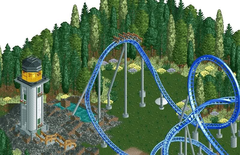
 Tags
Tags
- No Tags


