(Archive) Advertising District / My Solo.
-
 15-May 09
-

 T.N.T.
Offline
I'd have to say, much better than your last screen of that. Much more theme incorporated into it.
 -

 Casimir
Offline
The only letdown for me is the really, really muddy dark brown of this particular wooden block. But that's not your fault, I guess
It always annoyed me that you can't really see any texture anymore =/ -

 Bacchus
Offline
2 new screens:
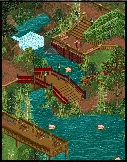
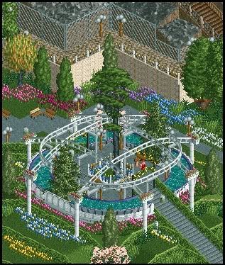
This area of the park is based on the Butchart gardens which I visited a week ago.
It won't have any rides besides some small restaurants. -

 chapelz
Offline
both screens are just missing something to put them over the top for me. also, in the second screen i don't like the clash of the gardens with the metal fence and rocks in the background.
 -

 Katapultable
Offline
Screen 2, Zippo's Gardens, anyone?
Screen 1 is nice, but screen 2 is a bit overdone. It's got a lot of flowers just crammed in there. -

 T.N.T.
Offline
What the...
Wow. Those screens are lovely. They feel very quaint and tranquil...
Now let's see some restaraunts!
-

 Steve
Offline
also, in the second screen i don't like the clash of the gardens with the metal fence and rocks in the background.
Good call, Chris. I agree on that one there.
The rest of the screenshots, however, look lovely.
And Mozilla, are you really that surprised people are ripping the Gardens from Zippo's? Hell, even I'm going to do it. -

 Xophe
Offline
Beautiful screens! The first one has so much atmosphere. And the second is good too but I agree with chapelz about the rocks and metal fence at the top - it looks to industrial. Maybe if you had some vines growing over the fence it would look more natural.
 -

 Bacchus
Offline
Thanks alot for the replies guys!
The vines are a really good idea, I'll place some there. -

 J K
Offline
I love the overall compostition in both screens. Theres just something different about them that I really like. Can't wait to see more.
 -

 turbin3
Offline
To be honest, I dont like the 2nd screen that much, sorry.
First of all the giant tree in the middle is ugly imo.
Moreover the "rainbow"-coloured flowers could a little bit more uniform.
On the top of the screen the roman walls dont fit that good and the same
with the two fences.
I dont like the fact, that one tree-art has two different colours on one screen.
First screen has a lovely atmosphere though.
Sorry for not liking it.
-

 Bacchus
Offline
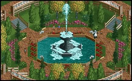
Just bringing over the Fiesta screens:
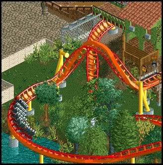
And here's a custom flat I made, which is the result of the guide I'm making on how to create those things.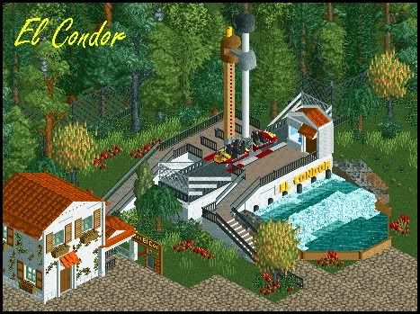
Edited by Bacchus, 07 September 2009 - 08:35 AM.
 Tags
Tags
- No Tags


