(Archive) Advertising District / My Solo.
-
 15-May 09
-

 Cocoa
Offline
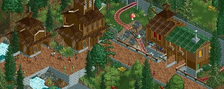
You're very good working with color combinations to make amazing buildings and atmosphere.
 -

 Bacchus
Offline
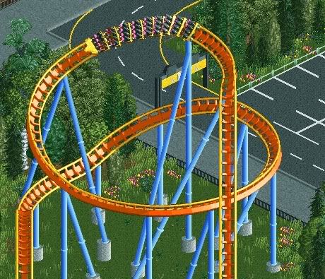
Every park needs a coaster like this one, right?
And did I already told you that I completely redid screen 2 in this topic? It's like 10 times better now .
.
-

 5dave
Offline
Damn I love this park, Bacchus!
It's so fresh and clean!
Don't forget benches and lamps, though!
The colors you used are awesome, as well as your placement of foliage.
IMO you have a bright RCT future!
"MFG" -

 nin
Offline
"Like this one?"
As in, it already exists? If so, then I can already see the similarities, even if its just a helix..
Looks fantastic, btw. -
 Maverix
Offline
^I think he's just referring to B&M hypers in general.
That screen is amazing Bacchus. -

 Steve
Offline
Great colors on that coaster. I'd lose the flowers in the foliage, though -- never been a huge fan of that. Still nicely done.
 -

 geewhzz
Offline
^I think flowers like that are okay, except not in a forced color. I would make them look more like wild flowers, possibly with 2 different shades of green, or all one shade, maybe some white mixed in.
Screen looks good. Good tree placement, too. But please, lose to alternate flange support color. -

 turbin3
Offline
Bacchus, at the moment you are my favourite player
Your stuff is always excellent. This screen is brilliant.
Go on like that.
Yannik -
 jusmith
Offline
Yeah, so, I think that is beautiful in all respects. I like how it is so natural, but still organized to a certain extent
 Tags
Tags
- No Tags


