(Archive) Advertising District / My Solo.
-
 15-May 09
-

 Bacchus
Offline
So, after 2 designs that really helped me to get better, I thought it'd be time to try a full scale solo. I've got some pretty good ideas for it, and i'm happy with how it turned out so far. The map size is 150×150 I believe.
Time for some screens to kick this off: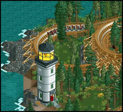
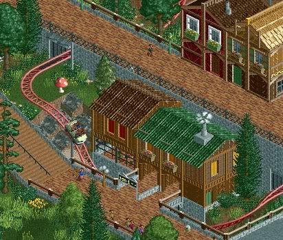

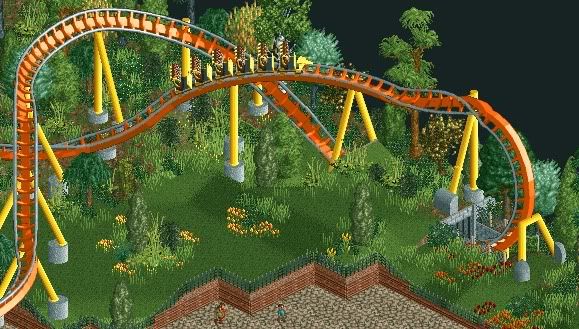
-

 Maverix
Offline
Your foliage and architecture is just amazing. I hope this gets finished.
By the way, what ever happened to that one park of yours with the water coaster and flyer? -

 Brent
Offline
the pathing in the second screen is way too straight.
It's not like he can do much else with the ride there and how it's elevated in the first place. I don't mind it at all... so there's a (not even that) long straight path, big deal?
Anyways, all the screens look great, especially the last one. Also dig the restaurant, but according to Kramer from Seinfeld, it's structurally unsound with a corner entrance, lol. -

 Gwazi
Offline
yeah it is pretty long. its pretty easy to change though. just add a few tiles of path on the bottom and maybe right past the ride on top and you've completely changed its look.
 -

 Louis!
Offline
1st screen is lovely.
2nd & 3rd i'm really not feeling.
4th screen is just beautiful. -

 posix
Offline
I think the screens are nice but not outstanding. I strongly disagree with the ride placement in screen2. It looks like the coaster track just doesn't belong there.
 -

 J K
Offline
I think the the first second and third screens are all amazing. Nice structures with top notch themeing. Can't wait to see more.
 -

 Xophe
Offline
That first screen is just a-maz-ing! So good! The others are all good too - particularly the fourth. I love the coaster in that one.
 -
 Timothy Cross
Offline
i like the mushroom in screen 2.
That sounded smart-assish. seriously though, good stuff... -

 zodiac
Offline
i'm sure you've heard this many times, but you're my favorite non-parkmaker right now. keep working, the screens are fantastic.
 -

 Jazz
Offline
It's pretty good, nothing I haven't seen in some capacity before though, somewhat generic. Could use some originality.
 Tags
Tags
- No Tags


![][ntamin22%s's Photo](https://www.nedesigns.com/uploads/profile/photo-thumb-221.png?_r=1520300638)
