(Archive) Advertising District / Project TOMB
-
 16-February 09
-
 jusmith
Offline
This is my favourite screen so far, great interaction! I like how all the ideas are really wild but they still come together to make some sense. This is the kind of fantasy I like.
 -
 Levis
Offline
@ nin -> thanks, I always try to make the coaster part of the theming cause I feel that is way more fun
 .
.
@ J K -> well hopefully I will finally be able to realese it this year .
.
@ Goliath -> thanks
@ giga -> well actually a blue screen ins't that nice . The idea behind this is a little wink to Internet City by X250, There was the NE tower. Now this is also a tower which used to show NE but now has a blue screen of death
  .
.
@ Dotrobot -> thanks
@ pierrot -> thanks
@ jusmith -> trying to get everything work together is what makes this park take its time. also I must say it doesn't look that good from every angle I always try to take the angle from which it looks best.
-

 Roomie
Offline
looks crap...
Actually looks pretty good Perfectly mental and a nice use of blue screens
-

 leonidas
Offline
I love your style, Levis.
The shapes you create seem to be totally free of all boundries.
You ignore all clichés and compose forms magneticly.
But don't let it become a mess though..
Sometimes it get's on the border of chaos.
But again, extremely nice work! -

 Levis
Offline
thanks
 .
.
Sometimes I try to make a little bit of a chaos. thats to make sure the parts which are not a chaos stand out more. -

 Cena
Offline
thanks
 .
.
Sometimes I try to make a little bit of a chaos. thats to make sure the parts which are not a chaos stand out more.
This is bullshit and you know it, it just depends on how many woman you have seen that day and how much % your brain is affected by that. This effect causes you to build very chaotic.
Leo, can you please finish this thing now? It was supposed to be finished 2 years ago, for RCTAvenged, remember? -

 Levis
Offline
well my primary MC server is down atm so I booted up rct2 again and build a little bit.
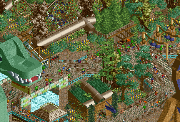
Here are two screens to keep you warm cause I hope I will finally get my self motivated to finnish at least 1 park: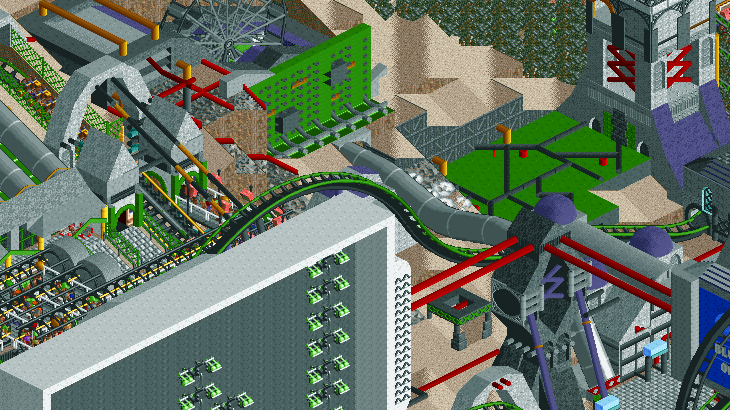
-

 Luigi
Offline
First screen looks very good, can't wait to view that ingame.
The second screen is very good too, I only don't like how the flat ride is fully covered with vinegars. -

 Midnight Aurora
Offline
My guess is that it's code on the computer monitor like in The Matrix.
Wonderful as always, Levis. -

 Roomie
Offline
Certainly the most original coaster station I've seen in a while
so what does TOMB stand for?
 Tags
Tags
- No Tags


