(Archive) Advertising District / Project TOMB
-
 16-February 09
-

 Katapultable
Offline
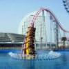
The trees don't look that good, as others have said. The crocodile is cool and the crossbeams on the B&M will knock people's heads off. The supports on top of the loop are a bit overdone too.
 -
 LDW
Offline
I love the croc and the builing with the go karts but the loops look very unsupporsted on the other side. I would strengthen the supports and remove the crossbeams. Withe the big green buiding in the background, I would do something to spruce it up, it looks very dull. Just my opinion thiough.
-

 CoasterForce
Offline
I stared at this for a while before I figured it out and got a sense of everything. The crocodile is great as are the color choices, but I'm not sure about the building draping over the cliff--seems a bit blocky compared to everything else. Well done
 -

 Kumba
Offline
Ed makes Erwindale... then we both make Erwindale Village... my name is Darren... this how you got to Darwindale?
Screens looks neat, your style is nuckingfuts... -

 Katapultable
Offline
Last fantasy builder? Trust me you ain't seen nothin' yet.
Trust you? What fantasy have you showed us? -

 Midnight Aurora
Offline
My comment stands until I actually see something.Last fantasy builder? Trust me you ain't seen nothin' yet.
-

 Turtle
Offline
Ed makes Erwindale... then we both make Erwindale Village... my name is Darren... this how you got to Darwindale?

Screens looks neat, your style is nuckingfuts...
Darwin you idiot. -

 Jazz
Offline
eh i'm not really feeling it, the crocodile is executed well, but otherwise i think aestheticism is lacking here. i applaud you for tackling such a unique and original style, you have really developed a recognizable building method now that is unlike everything else out right now. but the screen lacks unity and seems like a clash of colors and ideas to me, maybe with some more refinement the chaotic effect would seem less blatant
Jazz
Offline
eh i'm not really feeling it, the crocodile is executed well, but otherwise i think aestheticism is lacking here. i applaud you for tackling such a unique and original style, you have really developed a recognizable building method now that is unlike everything else out right now. but the screen lacks unity and seems like a clash of colors and ideas to me, maybe with some more refinement the chaotic effect would seem less blatantEdited by Jazz, 03 July 2009 - 09:24 PM.
-

 Xophe
Offline
I really like that most recent screen. The style is very refreshing. The giant animals are superb and the huge trees are a great idea but I would add some more greenery at the tops. Looking forward to seeing more of this!
 -
 Levis
Offline
@ turbin -> you can't see the trees that good here. when you see more of them together it looks better
@ louis -> I missed it to. glad to be working on it again
@ MCD -> thanks
@ Level -> some names are just to good not to use .
.
@ mozilla -> I think those tops of the supports are necessary. the crossbeams are indeed to low. from another angle they looked higher.
@ LDW -> what you see in the background ins't a building . the loops are supported enough.
@ gee -> thanks
@ olddtfan -> thanks
@ JDP -> just building what I want, and seems that fits my style .
.
@ goliath -> thanks
@ Coasterforce -> like I said earlier that thing draping of the cliff isn't a building.
@ kumba -> just based on Darwin .
.
@ MA -> I sure hope not
@ Jazz -> well I think a forrest should be chaotic and the evolution is chaotic also. so that seems to work for me.
@ Xophe -> haven't got any good bushes which could fit the top. from this view you cant see it but on other view you see some branches in the tops. -

 Levis
Offline
with the park nearing 70% completion I tought it nice to reveal some more of the park.
so here are 3 teaser screens showing some things of the areas you've seen before.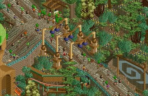
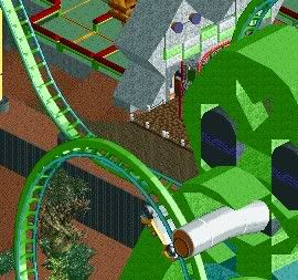
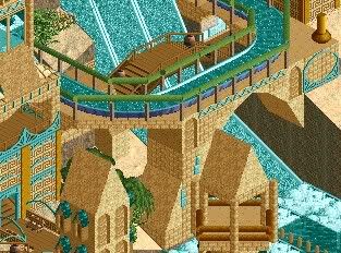
hope you enjoy it. the next update will show the last area (2038) but that will take some time.
 Tags
Tags
- No Tags

