(Archive) Advertising District / Project TOMB
-
 16-February 09
-
 Levis
Offline
Hey,
its been a while since I last posted here. I haven't been inactive in that time. I tried to enter the clockworks final but I'm not gonna make the deadline so now I'm pleased to presend Project TOMB to you.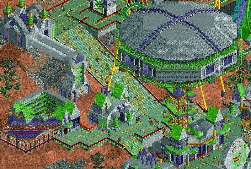
This park is based on internet myths, it will feature 5 area's:
1) Aliens
2) 2012
3) Evolution
4) 2038/Mega Computer Crash
5) Overclocking
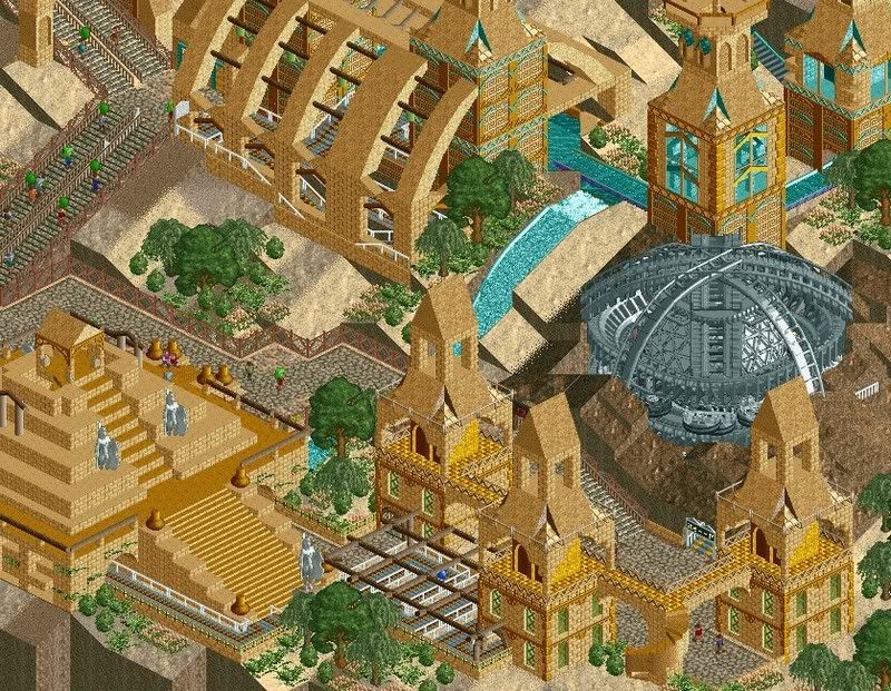
I hope you like the screen, and I apprieciate some comments. For example I'm not quite sure about the treeing in the aliens area and I might want to add another color in the 2012 area. Do you guys have any sugestions or other tips. -

 posix
Offline
that looks very different and interesting. your talent is definitely architecture. sometimes the landscaping looks a little loose and not determined enough. i'm also not sure about the grey 3d cinema and wooden track over it. it's the only spot where you don't use custom scenery to create what you have in mind. i feel it makes the trackitecture stick out a lot. but you might have used it elsewhere in the park, too, so the in the overall viewing experience you won't have this kind of "problem".
 -

 SSSammy
Offline
i adore the second Screen, i actualy like that tracitecture. is it a revolving rapids station?
 -

 Kumba
Offline
I love it! The first screen reminds me of the future theme in X250's PT2, but with peeps which I like. The only issue I have with it is the observation tower which is way to top heavy and would fall over in a second in reality. Try adding a ticker base or supports that jet out to the edges. The second screen is awesome, I love the statues hacked in and the gray thing looks cool with the rapids, but yeah you could give it a bit more color.
Also from which areas of the park are these sections?
Keep it up, but finish Fantasy first
-

 RCTNW
Offline
I'm always amazed at how people can up with this stuff. Looks fantastic Leo. The second SS is my fav of the two. That said, I think the first one needs to be experienced in game to see the true effect.
Well Done! Glad to see work from you again
James -

 JDP
Offline
You may be the only person on this site that can truly say you have your "own" style.
-JDP -
 Camcorder22
Offline
evolution myth?
Screens are really impressive, nothing I can criticize about the architecture, even use of one color looks fine here. The landscape surrounding it might be a bit bare in spots however. -

 Ride6
Offline
I think he's referring to apocalyptic myths. The myth that we're going to stop evolving, which could lead to the demise of our species is at least based loosely on (some facts)...
I love the screens btw.
Ride6 -

 Mike Robbins
Offline
I havent seen anything that funky since Kai or cBass.... I like it. It's different than the typical themes you see in most parks.
 -
 Tom_Dj
Offline
Didn't know you were still here.
Screens look good. Not sure if i like the foilage in the 2nd screen though. -

 Levis
Offline
@ po6 -> I use trackture on other parts also, but you dont see it that much in these screens, for example I used rotodrops to make rocket enigines in the aliens part etc.
@ SSSammy -> no, its suppost to be a comet, the rapids are revolting there to make it look like the thing is slightly on fire and freezing at the same time.
@ Kumba -> that observation tower is suppost to be a UFO with a beam which lifts peeps so I think I wont make the pole thicker, besides that I think it will hold cause the upper part looks wider that it actually is and with the right matierials it should be possible to make. THe first screen is from Aliens and the seccond screen from 2012
@ Ride6 -> I'm referring to disscussion between religious people and non-religious people about the excistance of the evolution theory. The Area will feature some creatures and a coaster dedicated to Darwin (its a special year for him also).
@ Tom_DJ -> I've been gone for a while but back now. Actually I was more concerning about the foilage in the first screen. The foilage in seccond screen is suppost to simbolise the greenhouse effect. With most of the earth as a dessert but some parts still good enough to grow some trees (images this used to be a rainforrest). -

 ACEfanatic02
Offline
Well, looks like you've learned better color schemes than puke-green and brown...
I like it. And I think the second screen has plenty of color. More would just clash.
-ACE -

 Levis
Offline
A new update
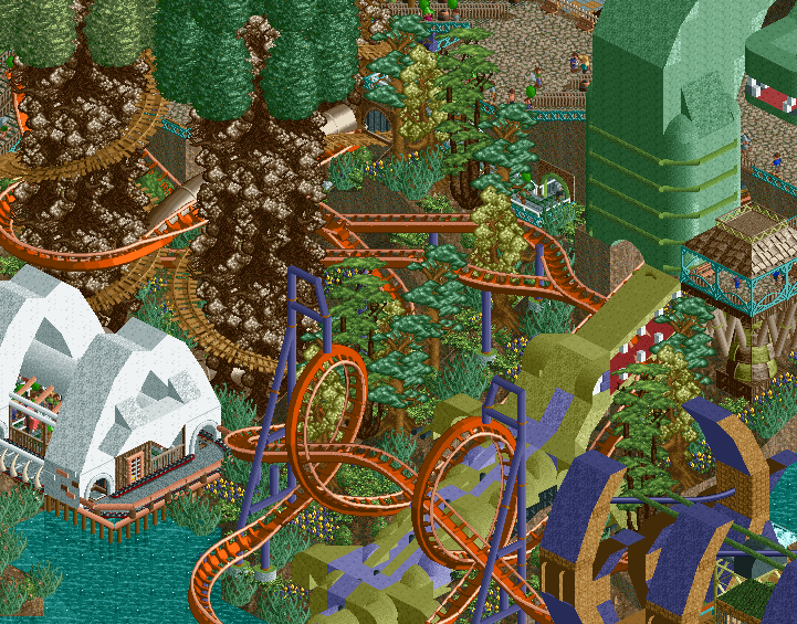
This is a screen of the evolution area.
The coaster you see is called "DarwinDale Forrest" -

 turbin3
Offline
Really nice screen!
The crocodile looks awesome, well done.
But I dislike these giant trees. They don't look that good.
Yannik -

 MCD
Offline
The crocodile is amazing but I don't like the giant trees. (Altough they are very creative)
 Tags
Tags
- No Tags


