(Archive) Advertising District / Pleasure Island
-
 08-February 09
-

 Rub!X
Offline

I decided to make a park today after looking through alot of parks, i got a sudden urge to try accomplish something that i would be proud of. This is my first park that i aim to complete that i will use scenery buildings and so on.. (Never really been into the game much, i discovered this community after discovering rctspace a couple of weeks ago)
The map is a 85x85, And i'm going to call it ''Pleasure Island Family Theme park''.
Here's a little teaser at the entry plaza, it's not done, and the surroundings havn't been complete. this is what i have done so far. Any constructive tips would be greatly apriciated.
Hope you like what i've done so far! =]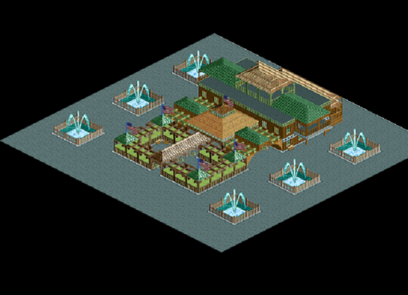
//RubixEdited by Rub!X, 10 February 2009 - 12:02 PM.
-

 SSSammy
Offline
^yeah,
it would be great if you gave the path like a shape.
some form.
i imagine a very evrgreen type forest going with those colours.
with braken and heather and things lining the paths.
with a brown dirt floor with tall pine trees on it.
i could really imagine walking through that. -

 Rub!X
Offline
Well, How is this compared to the previous image?
Better?
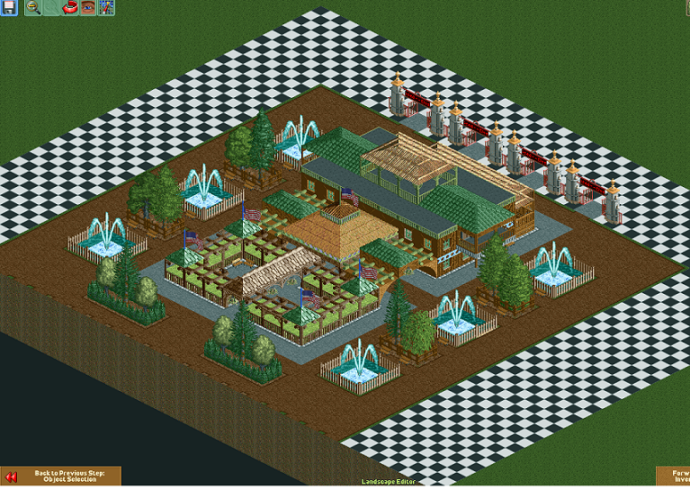
Thanks for the comments!!
//Rubix -

 RCTNW
Offline
Not bad although you are going to have problems when you leave the SE as the pathing to the gates will be considered to complex.
Hang in there
James -

 BreakAway
Offline
It's not that bad.
However it's a bit too symmetrical, if you get what I'm saying.
Best of luck though. -

 Rub!X
Offline
Hi, RCTNW, i had the problem, but in the end figured it out!.
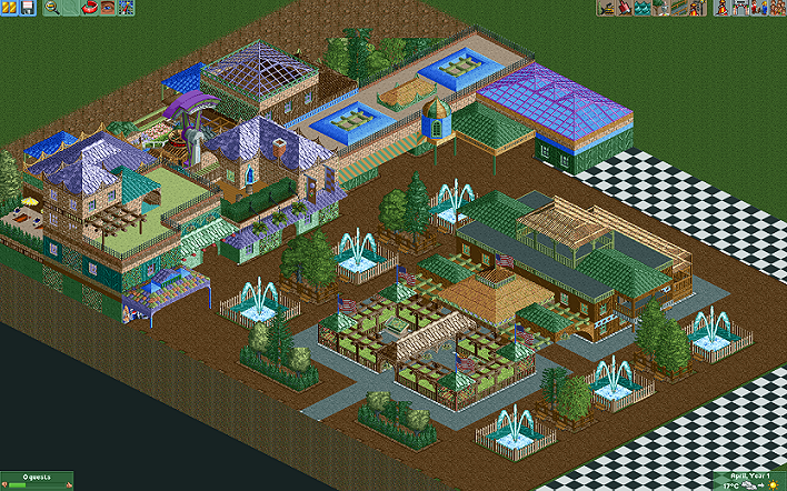
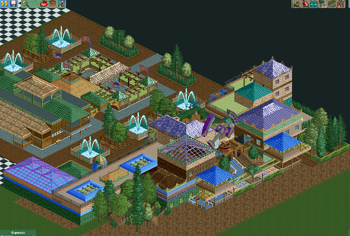
I have an update for you guys, i'm really happy with how it's going, i've been playing around with colours a little bit, and i'm enjoying building this. I still have to put a few pieces together in the pictures i'm showing you, but i thought i'd leave a little update before i go to bed
-

 Daisy
Offline
I like your style of building but I just think maybe there's a bit too much going on. The last set of screens seem very packed at the minute.
Maybe try spacing things out a bit more and making the paths wider. -

 Rub!X
Offline
^
Actually, this isn't quite packed at all in the game, it's got plenty of room and space, and the paths are pretty wide, i'll try show better screens when i've done some more , i kinda agree, when i looked at the screens i found it also looking very ''packed'' and expected comments about that, but the pictures are bluffing
//Rubix -

 BreakAway
Offline
It looks nice. It's different.
However, it seems like there's a lot going on - as if some ideas weren't thoroughly planned...like it's everywhere. Ya catch my drift?
And there's a lot of contrast between that middle building (from the first screens you had) and the new buildings here. And yet, it strangely works.
P.S. - Looks like you didn't restore zero clearances either.
Edited by BreakAway, 09 February 2009 - 04:25 AM.
-

 Rub!X
Offline
^
Thanks for the comment
I realized i forgot about the zero clearance hehe, thanks for pointing it out.
Here are some screenshots of the latest of this park. i've made a few changes, hope you guys like it!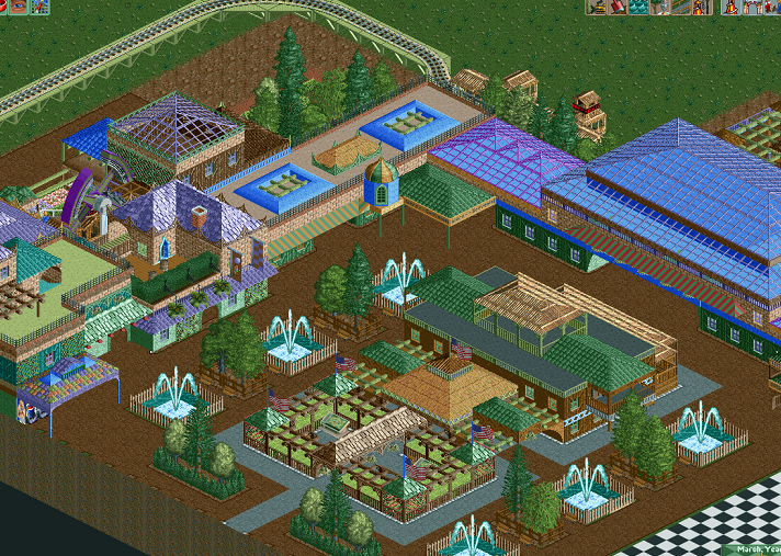
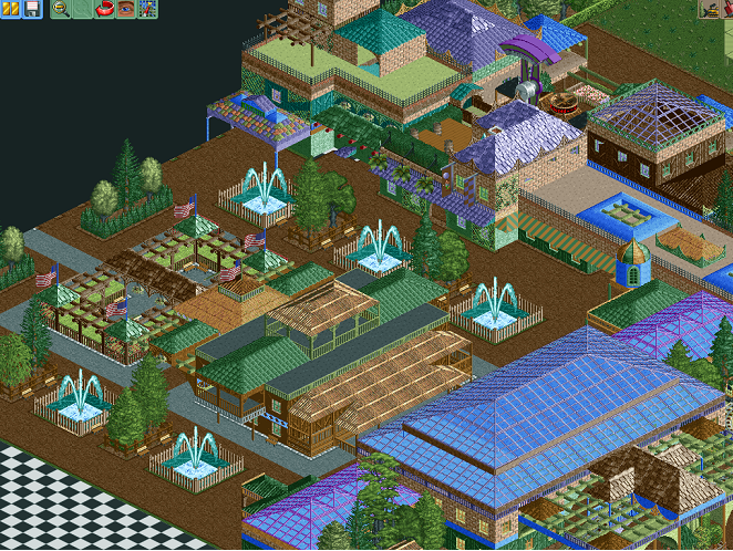
All comments welcome, the more, the better it will be for me to build, so fire away any constructive critizism that you think isn't working for the park.
//RubixEdited by Rub!X, 09 February 2009 - 08:13 AM.
-

 posix
Offline
very interesting to see how this evolved. the style is unique and so are the colours. it works somehow though. good job.
 -

 RCTNW
Offline
It looks like you are going for a realistic approach however I think the big glass roof is a miss with me. I could understand using it to see what is below like a skylight, however all there is below it, is a flat roof. From a peeps perspective, it's a bit of false advertising as they see the huge glass roof yet when they go inside, they don't see the advantage of it. I would try and stick to other forms of roofs and use the glass when you really can take advantage of the see through effect.
Hope it helps.
James -

 Rub!X
Offline
Thanks all for the comments
RCTNW
I could take advantage of it since there are stalls and other goodies inside the building, i started of building it from the blocks so i never actually got to see for myself wich would look better, i will take a look and experiment with other roof styles and also the ''see through'' effect of the glass. And you might think i'm going for a realistic ''look'' or ''park'' but frankly i wasn't going for that at all, my aim with this park was to be able to use alot of colours, building non ''blocky'' architecture, and thus learning from that, for my future projects.
Now a little update on my progress. I've finished the entrance area, created a ''mini'' kid section, and made a very high rated rollercoaster and a few thrill rides. I will from now on show ''teaser'' updates instead of full images, after reading through posts were people actually complain about showing everything you build hehe.
And MF72
Yes i'm building rather fast now, since i'm unemployed and only work partly for microsoft, i've got alot of spare time on my hands at the moment, wich is not a good thing, but good for my park =]
I will show a small update tomorrow!
//RubixEdited by Rub!X, 09 February 2009 - 05:36 PM.
-

 Six Frags
Offline
You've achieved goal one, but missed goal 2 imo.. Maybe study some parks on the spotlight page for some non-blocky building styles, because it's quite hard to explain how to get non-blocky (or; flowing) architecture in your park.. Like daisy said, it looks too packed and there's too much going on..And you might think i'm going for a realistic ''look'' or ''park'' but frankly i wasn't going for that at all, my aim with this park was to be able to use alot of colours, building non ''blocky'' architecture, and thus learning from that, for my future projects.
Good luck with it though, I'm interested to see how this develops,
SF -
 TheLegendaryMatthew
Offline
It dose look a bit crowded, I hope the whole park isn't going to be like this :-P. I do like the swinging ship, reminds me of how KI set up Invertigo and there season gates. I also would also change the train colors to something other than puke green.
Keep up the good work.
-Matthew.K -

 Rub!X
Offline
Thanks for the comments.
SF
Good to know i've achieved one goal, and what got me into making this park was looking at all the spotlight parks, i'm not trying to do ''exactly'' the same as a spotlight park would, but i wanted to do something i don't see alot of parks do.
And as for ''blocky'', i meant not just a box with roof on top, but actually levels of building with different shapes and sizes, and also buildings connected with each other.
TLM
I've changed the colours of the ride, thanks for the tip, and as for everything beeing crowded, maybe i don't see it since i'm using a pretty big screen (1680x1050). Well, atleast ingame it doesn't look crowded at all.
Anyways.. Ontu park update, what i said before about showing teasers, well, i take that back. Since i'm not running for any park competitions, or anything like that, and only want to learn from my building in this park, i'd like as much critisizm as i can get on my building.
I decided to take an overview, so you see what i'm working with.
And also show the ''mini'' kid section at the beginning of the park, the middle building has a carousel inside it.
Oh, and i have alot of saves on the park.. So i can always reverse, so i'd like to know, does this roof fit better, or the glass roof?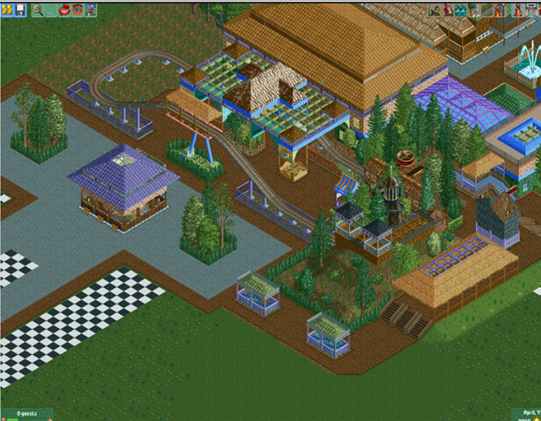
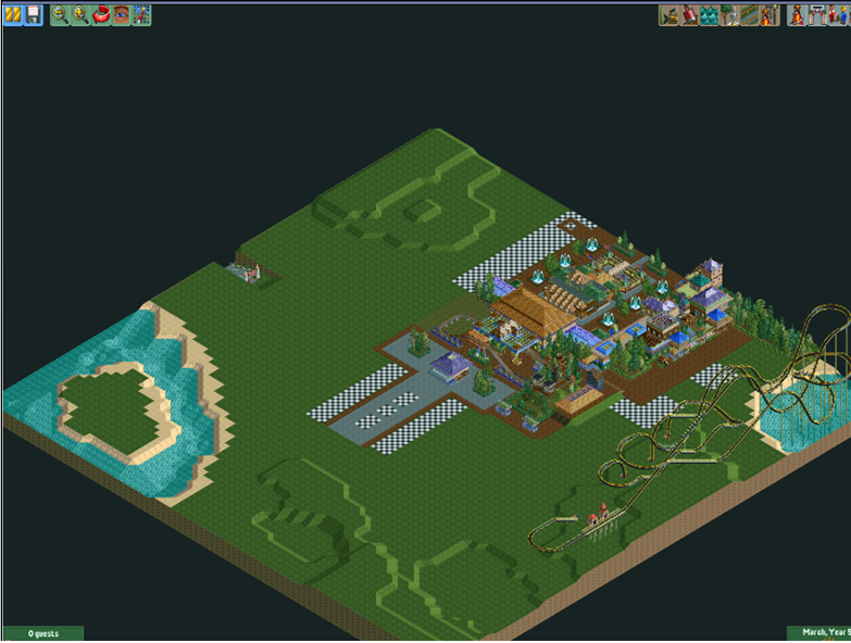
//Rubix -

 SSSammy
Offline
i (L) the car ride, but i really hate the coaster, youve already been steered towards the spotlights, now loook at afew designs now, they should help you along on the coaster front.
good work overall
 Tags
Tags
- No Tags

