(Archive) Advertising District / Mineral Basin
-
 22-November 08
-
![][ntamin22%s's Photo](https://www.nedesigns.com/uploads/profile/photo-thumb-221.png?_r=1520300638)
 ][ntamin22
Offline
i'd agree.
a few tiny concerns- there could be a bit more going on underwater, and i can't tell if you meant for the wooden walkways to be going different directions- not taht it looks bad now, just wondering. -

 Todd Lee
Offline
Thanks for the comments.
James - I'd say the project is 15% complete. I'm trying to build in such a way that if I lose drive or inspiration I can release it as a smaller, complete or at least give the apperance that it's a finished park.
][22 - Thanks, I did mean to mismatch the wooden walkways. I found that when you view a larger area and they are all facing the same way, it looked a bit weird, almost makes your eyes go crossed or something.
Nokia - Thanks.
Nin - I played with the textures there quite a bit, I've decided that this look suits this area the best. Thanks for the suggestion nonetheless. -

 Louis!
Offline
Really nicely done, but I do agree on the 'smoothness' under the top spin. However its still great stuff.
 -

 Todd Lee
Offline
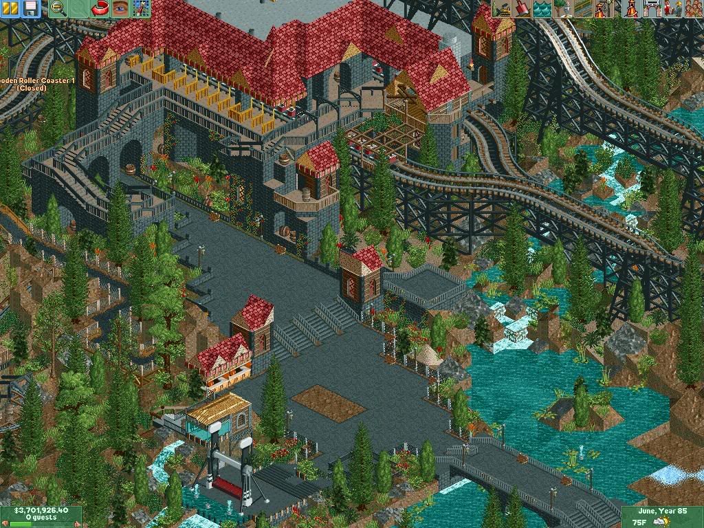
I've been working on this area lately, after a long hiatus from building. The lower right corner is unfinished, as well as the center of the path. I'd like to build some kind of sign joining the 2 buildings that are on either side of the stairs, but I have no idea how I want it to look.Edited by Guy Smiley, 28 May 2009 - 12:00 PM.
-

 RCTNW
Offline
That is outstanding!!!!!!!
Your work is very clean yet detailed to the level that brings it right to the edge without being over detailed, something I wish I could accomplish.
Really looking forward to this one.
Keep it up
James -

 J K
Offline
I rarely see landscaping like that these days. It's beautiful. Your architecture has also improved. The only thing I could say is change the gold colour of the fence in the station to the plain dark brown. It would suit the screen more.
Nice work. -

 Mike Robbins
Offline
Overall everything looks great. In that last screen right in the middle where the steps go up one level and you have the structures on either side of the four steps..... I would put something overhead. The way you have the roofs set up with the flat part toward the inside, there just needs to be something there, you know?
 -

 posix
Offline
the way how the station is half-covered/half-revealed, like a station veranda, letting you see the "train-row separators" is extremly cool. also i could immediately understand that little bridge was were people walk upon exiting the ride. very good concept here.
 -

 Todd Lee
Offline
Thanks for the replies guys.
James - I'm not sure what your talking about... Your work is exactly what you just described! You might be surprised at the amount of inspiration I find in your screens.
J K - I'm glad you like the landscaping. I feel like my landscaping abilities have really exploded with this park, I'm feeling super comfortable with it right now! I'll mess around with the gold fences.. Thanks!
Milo - Thanks!
Mike - I see exactly where you're talking about. Underneath the screenshot, I have some text talking about that exact spot. I'm not sure what I want to do with it, I pictured some kind of signage there, but I have no idea how to pull it off and not spoil the screen. Any ideas??
posix - I'm glad you like the station, you understand exactly what I was going for! It's a relief that my thoughts translated that well. I really struggled with this station. I've never built with the brick objects, I had to 'learn' how to use them in a sense. Thanks!
I doubt anyone noticed, but I've changed the pathing and platform color around the topspin, working it's way down and across the bridge. This park still won't be peep friendly, unfortunately. I'd have to rework too much of the park to make that happen.. unfortunately. -

 SSSammy
Offline
yeah, its origional, fluid and describes the theme of the ride in an effective way.
fan-tast-ic screens by the way. -

 Todd Lee
Offline
Update in my sig.
If anybody is willing to help me polish my sig up a bit, pm me. I want it to be more of an oval, with the text "mineral basin" included so you can see the screenshot behind the text, rather than a white block that covers the shot. -

 Alpengeistfan1
Offline
I like everything in that picture except the lines at the top of the queue. I like the objects, but the color seems to stand out to much.
 -

 Daisy
Offline
Amazing. The station area and landscaping are damn-near flawless and there's something about the S bends in the track out of the station that makes me go all funny.

-

 Leo
Offline
I love your work good job, I hope to be able to do something similar one day but that's a long way off
-

 Todd Lee
Offline
RCT-Fun seems to have disappeared recently. They were hosting my images, causing me to explore other options.
I figured now is as good a time as any to post a different screen.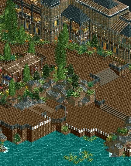
-

 In:Cities
Offline
looks fantastic bro.
my only complaint is those fences you used near the bottom of the screen.
they stick out so much, they kindof look a bit like bones sticking up lol.
maybe change them to that black fence used in the rest of the screen, or a tannish colored one.
just an opinion:]
and do those rotated wooden quarter tile blocks in the center of the pathway have a specific purpose? or are they just randomness lol.
regardless, i really like this:D
please finish this por favor
 Tags
Tags
- No Tags
