(Archive) Advertising District / Mineral Basin
-
 22-November 08
-

 Comet
Offline
For queue advice...
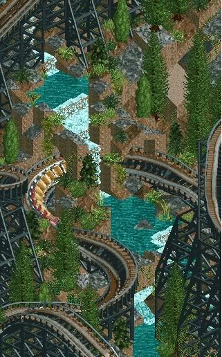
I think you should keep it wood under the queue (that textures finde under the flat though), and instead of having custom stairs use real wooden paths for the rise. Then just zero clearance any necessary invisible path at either ends.
If you don't know what I'm saying just say so and I'll try to explain it a little more. -

 Milo
Offline
maybe cover the queue.... I like the looks of this as well. Each screen has gotten better
 -

 Todd Lee
Offline
Thanks Comet and Milo. I figured it was the ground texture that was off. I never really was in love with it. I've already changed the queue path to wood, and I used the wooden stairs that lead down to the waterfront path as a replacement for what is pictured leading up to the ride.
I hadn't thought about covering the queue, I'll take a look at that next. I based this ride setup off of a ride at my local park, that's why the queue looks so bland. -

 Liampie
Online

-I don't like the invisible entrance. The wooden base looks horrible, and the sign is annoying too. Just keep the normal entrances...
-The 'queue' doesn't lead to the ride, it suddenly stops.
-The steps' colours don't fit the surroundings
-Only boring colours.
-The building at the back of the ride is useless.
Edited by Liampie, 30 November 2008 - 04:39 AM.
-

 Todd Lee
Offline
Thanks for the response liampie.
I'll address these 1 by 1.
-I don't like the invisible entrance. The wooden base looks horrible, and the sign is annoying too. Just keep the normal entrances...
I don't want to block the front of the ride with entrances, but I would love to get rid of the floating sign and the wooden bases. Is there any way to do this?
-The 'queue' doesn't lead to the ride, it suddenly stops.
This is how some of the queue's are at my local park. The ride op counts how many people will fit on the ride as they pass the end of the queue. It's up to the riders to walk up the stairs and pick where they are going to sit. Perhaps this would look better if the stairs were only half as high? Or, If I could find a way to have slanted railings lead up the stairs.
-The steps' colours don't fit the surroundings
I've addressed this, they now match the steps in the same screen.
-Only boring colours.
The colors fit the area of the park. It's a mine area, you never see bright vibrant colors in an industrial or mine area. Having said that, there are some flowers very near here, just out of your sight. They help a ton.
-The building at the back of the ride is useless.
The building at the back houses the mechanical system for the ride, I think it actually looks really cool when you include the motion of the gears. Maybe I'm wrong though, and have no idea what cool is.
-

 JJ
Offline
If the park isn't peep friendly you can sink them. If it is then you can zero clearance an invisible path just under the entrance/exit. And for the banner hex edit it away.
 -

 Todd Lee
Offline
Thanks JJ, I owe you! I zeroed a path over the entrance, and it looks loads better. I've also added a cover over the queue, which looks much better too. Thank for that Milo.
I'll see if I can figure out hex editing... -

 Steve
Offline
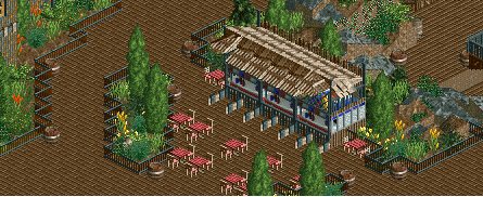
Great disguise on those sub stalls. Very nice work, there. I think the only thing missing is some well-placed full tile pine trees. Nice, Todd!
 -

 Ripsaw
Offline
OMG I LOVE IT! wow! It looks so tidy and quaint! Dont change a thing, possibly my fave screen from this project yet, keep it up mayte!
 -

 Cocoa
Offline
Those are awesome tables I want those.
Otherwise, great screen. I like how you disguised the stalls.
 Tags
Tags
- No Tags
