(Archive) Advertising District / Crayola's World of Color
-
 03-November 08
-
 RCTmike
Offline
After roughly 3 years of not playing RCT2 ive decided to get back in and design some stuff. Ive only been working on this park for about 2 weeks so there isnt much done at the moment, but ive been playing a lot so i hope i can keep the updates frequent. As always comments and constructive criticism welcomed!
Part of the entrance: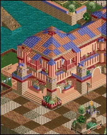
Entrance area to Phoebus: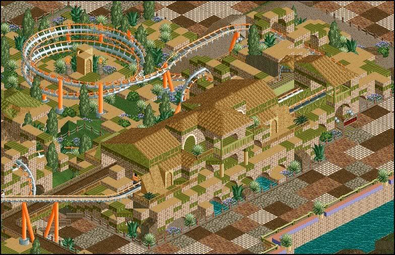
2 more of Phoebus: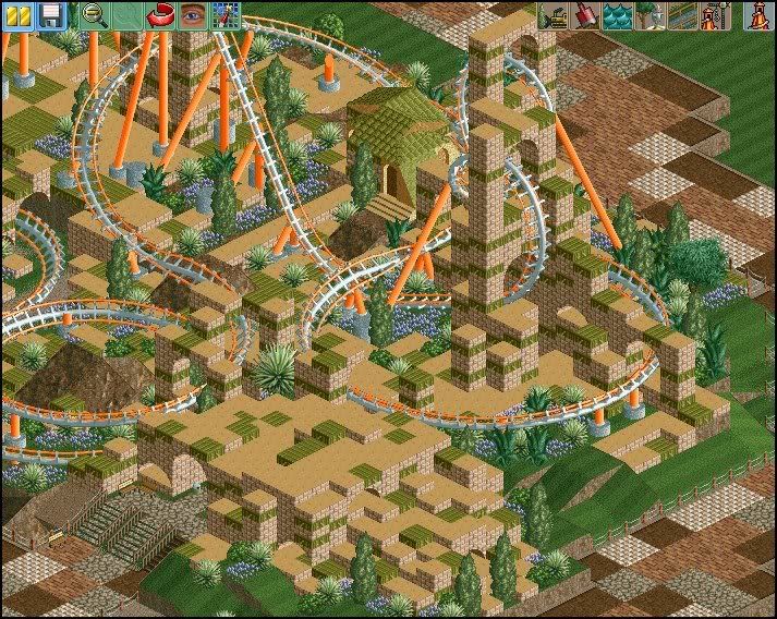
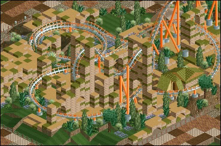
The first and only ride in the park so far. It will be the smallest themed area in the park. Phoebus is themed around an ancient ruined city of sorts. More history on this area to come. There is still some work and changes that i will make, just looking for some advice and criticism really. -
 Gwazi
Offline
the name reminds me of that park BreakAway had going. Kreola Cove i think it was called.
anyway, looks alright, though i don't think the coaster's colors fit in too well. -

 ChillerHockey33
Offline
Good idea using Crayola to make a park. Lots of potential for crazy color combos. Though looking at those screens make my eeys cross. Try making it a bit less random.
 -

 Todd Lee
Offline
I'm really liking it! The area around the coaster really works here, so long at it's contained. If the entire park is built like this, it would confuse too much.
 -

 Xophe
Offline
I think it would look better if you toned down the paths. The combination of crazy architecture and crazy paths is just a bit too much right now.
 Tags
Tags
- No Tags
