(Archive) Advertising District / Disneyland v3
-
 17-August 08
-

 nin
Offline
The only true gripe I have is that the monorail isn't operational, though I do like the idea of custom tracks.
 -

 ivo
Offline
I think he is going to make it with the normall track. If i remember correctly Highball always works in the scenario editor and put the rides in later. I could be wrong
Looks great. Especially the first screen. Normally I don't like when people build in that huge scale but it fits with your style perfectly. -

 zodiac
Offline
I've finally found time to update this with some worthwhile shots. For the past month I've been moving New Orleans Square to the other side of the Rivers of America and adjusting Frontierland to help with the new land transition. I demolished Adventureland to both reorganize the sub areas and to improve some of the really bad architecture left over from version 1. I decided to go ahead and move Pirates to New Orleans Square to provide a transitional bridge from Adventureland to NOS. I've also started over on the Disneyland Hotel. The old version wasn't realistic enough layout wise, but this new version will be. Gone is the Mickey shaped lake so that I could have more land for Adventureland since New Orleans Square is imposing on AL's old stomping grounds. Once I finish Adventureland/New Orleans Square I'll be putting Big Thunder in NOS old spot and put Tom Sawyer Island in BTM's to make up for the loss of Adventure Isle.

The Village Haus, an Italian themed restaurant neighboring Pinocchio's Daring Journey. Flowers in this area are confined to the red, yellow, white, and blue found on Pinocchio's outift.
Disneyland Monorail Station, based on the Magic Kingdom's monorail station. My monorail has two lines: the resort line and the express line. The resort line is for guests of Disneyland Resort hotels only. Since all hotels are near the park entrances, this makes park hopping easier and less stressful for those paying a pretty penny to stay in a Disney hotel. The express monorail shares the same stations with the resort monorail but is open to all guests. It also has an additional stop at the Ticket & Transportation Center, which the resort line does not.
must i carry updates over every time? the first screen is amazing. the station is a little more lackluster than i expected, maybe it's the colors, but it's still good. -

 Brent
Offline
Only gripe is the chimney's... for some reason the marble sqaure isn't sitting well with me. Is it based off actual photos or you just thought it'd look better than a brick chimney? Love the flow of the flowers that you'll have going on around there to go along with Pinocchio's outfit, really neat/good idea. Love everything else about the screen...just awesome.
 -
 Highball
Offline
Once I'm out of the scenario editor, the monorail tracks will rest on top of what you see in that screen, so those aren't custom tracks coming out of the station. They are meant to be the high voltage things seen here:The only true gripe I have is that the monorail isn't operational, though I do like the idea of custom tracks.

Plannings half the fun. One of the reasons I'm doing this makeover is because my original versions were a bunch of ideas jumbled together. This time all lands will have good, smooth flows from one area to the next.
You seem to put MORE thinking into some things than RCTNW does... oO
Yeah, the chimneys are based off of photos of Au Chalet de la Marionnette. The chimneys there are like an off-white, so I thought marble was the closest thing to that.Only gripe is the chimney's... for some reason the marble sqaure isn't sitting well with me. Is it based off actual photos or you just thought it'd look better than a brick chimney? Love the flow of the flowers that you'll have going on around there to go along with Pinocchio's outfit, really neat/good idea. Love everything else about the screen...just awesome.
-

 Louis!
Offline
Both screens are nice, but the second is lacking. But I guess that's just because the tracks arent their and their isnt much life.
But the first is supwerb. And the custom tree is awesome, like steve said. -

 Highball
Offline
I've been working on the new Disneyland Hotel for the past couple of weeks. It's taking a bit longer than I expected, but the results are far better than I expected too. I also got enough done to finally show the castle, just note that the landscaping on the left side is still unfinished because I haven't figured out how I'm going to do it yet. Last is the park overview. From this you can clearly see just how much is being redone. Most of the older stuff that's still on the map is only there for reference (the Jungle Cruise and Peter Pan for example) and will be gone once the new version has been constructed. Once I get the Disneyland Hotel done and start on updating Main Street's facades, I'll go back to Adventureland and New Orleans Square.
The new Disneyland Hotel. For now I'm just doing the main structures which are divided into three 'towers': the Adventure Towers (the section bordering Adventureland), the Dream Towers (the center structure that you walk under), and the Wonder Towers (the section next to Tomorrowland). Once I've got the park done and I see how much map data I have left I'll start adding in resort stuff like the pool, parking lot, etc.
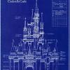
Sleeping Beauty Castle. Again, the landscaping is still being worked on especially on the left side.
Park overview. You can see that I'm not kidding when I say I gutted Adventureland. -

 JDP
Offline
Damn. I don't know how you keep building and building. Screens look fabulous like usual, and that overview is just outstanding.
-JDP -

 Video_Kid
Offline
I know a lot of people say "This is the best park ever!" But honestly, this is the best park ever. With the detail involved in this project, just finishing it is an accomplishment. Great job!
 -

 Katapultable
Offline
really looking forward to this..
_____________________________________________________________________
Is this supposed to be a multi mapo project, like James does?
I really love the detail you put in your work, as with DisneySea. -

 Liampie
Offline
I know a lot of people say "This is the best park ever!" But honestly, this is the best park ever. With the detail involved in this project, just finishing it is an accomplishment. Great job!
The best park ever should have good both good execution and good ideas. Obviously the execution is very good here, but the ideas are all Disney's, not Highball's. This is not wrong, I just think that recreations or semi-recreations can't be the best park ever. However, it can be the best recreation ever; this project has a good chance of becoming that.
Highball, I didn't think your last park was spotlight-worthy, but this definitely is. The major weakness of Disney Sea was the objects you used. In this project I see a lot less ugly objects, and your talent becomes visible. It's really well done.
Good luck on finishing this. -

 Louis!
Offline
The best park ever should have good both good execution and good ideas. Obviously the execution is very good here, but the ideas are all Disney's, not Highball's. This is not wrong, I just think that recreations or semi-recreations can't be the best park ever. However, it can be the best recreation ever; this project has a good chance of becoming that.
I disagree completely here. It doesn't matter whether the ideas were Disney's or Highball's. The ideas are still imagined by Highball, the ideas are still great ideas, and the execution is still fantastic.
This isnt a recreation, therefore is cant be called the best recreation ever, this is a vision of Disneyland not a recreation.
Highball, this is superb, the screens keep getting better and better, that overview is outstanding. Great job
-

 Highball
Offline
I'm glad ya'll are enjoying this. Thanks for the comments.
Kind of. Unlike RCTNW's, my maps won't connect but they're understood to be part of the same resort. That's why there's no Indiana Jones Adventure in Disneyland and no Tower of Terror in DisneySea. Plus, those monorails and ferrys have to go somewhere.Is this supposed to be a multi mapo project, like James does?
I see what you mean, but I have to disagree with you a bit. Yes, 90% of what I have done is already used Disney ideas, but the layout, organization, and storys of each land are completely mine. Land transitions, for example, are a really big point for me. In only one park does Frontierland (Westernland in this case) border Fantasyland, so the transition in mine had to be original and smooth. I put the Country Bear Theater on one side of the border because singing bears are very fantasy-like in a realistic land like Frontierland, and Pooh's Hunny Hunt on the other side. Bears on both sides of the land border help bridge these two land much better than a simple gated structure. That's just one example of how I'm thinking this out and using ideas that Disney has not. When it comes to ride selection, I've opted to go for a 'greatest hits' of the Magic Kingdom's attractions. There will only be one original ride in the park (The Legend of Sleepy Hollow), and that's due to space constraints rather than desire.The best park ever should have good both good execution and good ideas. Obviously the execution is very good here, but the ideas are all Disney's, not Highball's. This is not wrong, I just think that recreations or semi-recreations can't be the best park ever. However, it can be the best recreation ever; this project has a good chance of becoming that.
-

 Alpengeistfan1
Offline
That hotel and castle look awesome, but I don't like how on the castle you used a smooth roof for the cone on top and shingled roof for the bottom. I don't know if that can be changed, but if you can, you should.
 -

 RCTNW
Offline
This is by far my most anticipated release. I wish I could take the detail in my head and translate it to the game like you have done with all your parks. Well done and keep up the great work.
James
 Tags
Tags
- No Tags


