(Archive) Advertising District / Disneyland v3
-
 17-August 08
-

 robbie92
Offline
Probably my favorite screens in the topic besides the ones of New Orleans Square. This work is so inspiring!
 -

 J K
Offline
Jeez this truly is something else. The fact that you make scenery so different work so beautifully makes me so excited to see everything else you have to offer.
I love the slanted supports on the Carosuel. Keep them. -

 CedarPoint6
Offline
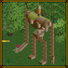
I feel like it would look better if you had a small vertical support to go with each of the slants. I know it's supposed to be a light wood + canvas structure, but it looks very heavy for the members holding it up.
Still, it looks really cool.
I'm always a bit wary about all that other custom scenery that never looks so hot in the game. You've made it work pretty well, I think, so nice job for that! -
 Highball
Offline
Glad ya'll like the screens and I appreciate your comments.
I see what you mean, and I'll probably try to address it in the future, but for now I'm going to leave it as is. I was basing this design heavily off of La Carrousel de Lancelot so I'm trying not to veer too far away from that. Here's a shot that I used for the carousel.I feel like it would look better if you had a small vertical support to go with each of the slants. I know it's supposed to be a light wood + canvas structure, but it looks very heavy for the members holding it up.

-

 olddtfan51
Offline
The park is looking fantastic don't find yourself getting too overworked about the small details i think you have improved things way above the original cant wait to see the completed park.
 -

 Alpengeistfan1
Offline
The park is looking fantastic don't find yourself getting too overworked about the small details i think you have improved things way above the original cant wait to see the completed park.
But the small details are what make it such a great park!
-

 Cocoa
Offline
I like the diagonal supports. Makes it different than normal.
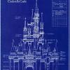
The castle is looking cool so far. I never thought I could find a use for those part-of-circle glass things but you pulled it off well. -

 olddtfan51
Offline
True the small details are what make a park look great but sometimes you can get so involved in it that you lose perspective on the overall park sometimes you have to step back and say what looks really good with this amount of detail and whats overkill.
 -

 posix
Offline
wisely spoken.True the small details are what make a park look great but sometimes you can get so involved in it that you lose perspective on the overall park sometimes you have to step back and say what looks really good with this amount of detail and whats overkill.
and, screens are just amazing. should win spotlight with ease. -

 Highball
Offline
I appreciate the vote of confidence but I wasn't aware this park could be submitted for spotlight since it won sru back in 05.wisely spoken.
and, screens are just amazing. should win spotlight with ease. -

 posix
Offline
oh, so you're just "upgrading" this? i had thought it was something completely new, sorry. i still think there's nothing wrong with re-submitting it, if you're changing it a lot.
 -

 Highball
Offline
Well, I was just upgrading the park, but now its turned into a complete revamp. I probably won't submit it but it's good to know that option's there.oh, so you're just "upgrading" this? i had thought it was something completely new, sorry. i still think there's nothing wrong with re-submitting it, if you're changing it a lot.
-

 Highball
Offline
I've finally found time to update this with some worthwhile shots. For the past month I've been moving New Orleans Square to the other side of the Rivers of America and adjusting Frontierland to help with the new land transition. I demolished Adventureland to both reorganize the sub areas and to improve some of the really bad architecture left over from version 1. I decided to go ahead and move Pirates to New Orleans Square to provide a transitional bridge from Adventureland to NOS. I've also started over on the Disneyland Hotel. The old version wasn't realistic enough layout wise, but this new version will be. Gone is the Mickey shaped lake so that I could have more land for Adventureland since New Orleans Square is imposing on AL's old stomping grounds. Once I finish Adventureland/New Orleans Square I'll be putting Big Thunder in NOS old spot and put Tom Sawyer Island in BTM's to make up for the loss of Adventure Isle.
The Village Haus, an Italian themed restaurant neighboring Pinocchio's Daring Journey. Flowers in this area are confined to the red, yellow, white, and blue found on Pinocchio's outift.
Disneyland Monorail Station, based on the Magic Kingdom's monorail station. My monorail has two lines: the resort line and the express line. The resort line is for guests of Disneyland Resort hotels only. Since all hotels are near the park entrances, this makes park hopping easier and less stressful for those paying a pretty penny to stay in a Disney hotel. The express monorail shares the same stations with the resort monorail but is open to all guests. It also has an additional stop at the Ticket & Transportation Center, which the resort line does not.
 Tags
Tags
- No Tags
