(Archive) Advertising District / Disneyland v3
-
 17-August 08
-
 Sey
Offline
Beautiful stuff you've got there!
I think the only objects which aren't fitting here is the way and the stone wall in screen 1.
I love the way, how you use those walls in the parlor scene.
Keep it up! -
 Highball
Offline
i appreciate the comments, guys.
that building is something different in each park. in paris, it's la chaumiere des sept nains and merlin's magic keep. i went with merlin for mine so the sword in the stone gets more rep than a 10 minute show.Fantasyland looks like its coming along nicely as well. Is that where Tinkerbell's Treasures used to be? Looks like the signage says "Merlin".
which stone walls are you talkin about?I think the only objects which aren't fitting here is the way and the stone wall in screen 1.
-

 lucas92
Offline
The architecture is brilliant here.
Though there are some bits that I don't like.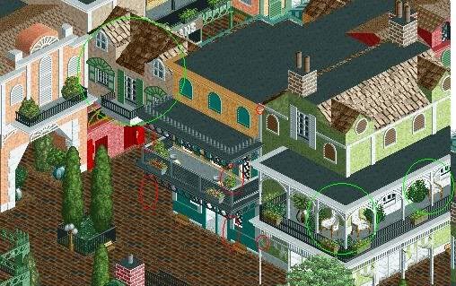
You see the red circles? Well, logically, there would be a post supporting the structure... Also, there are some places that there is a post, but doesn't even reach the building...
Oh, the green circles are the bits of your screen that I like.
-

RMM Offline
you honestly gonna spend your time drawing red circles
on someones screen and resposting it showing him
the tiny details you dont like?
and them sceens are amazing man... -

 tracidEdge
Offline
Looks to be that way.you honestly gonna spend your time drawing red circles
on someones screen and resposting it showing him
the tiny details you dont like? -

 Highball
Offline
the facade with the black balcony doesnt have any supports in real life, so i figured the designers knew what they were doing and left them off on mine as well. and that post you circled does connect to the balcony, but its covered by a green and white awning that you have to almost squint to see. its more noticeable in game.
 -

 lucas92
Offline
you honestly gonna spend your time drawing red circles
on someones screen and resposting it showing him
the tiny details you dont like?
you honestly gonna spend your time giving nonconstructive comments on someone's park?
I just tried to give a constructive comment. Anyway, have a nice day! -

 FK+Coastermind
Offline
this park looks great, this park looks cool, but you need some rides. sure, you gave us a straight line of 'realistic' huanted mansion ride, but you need something other then buildings. you need some coasters, or some water rides, something interesting to hold ones attention.
FK -

 Todd Lee
Offline
LOL!
The fact that there hasn't been an update in 4 months, suggests that it's not being worked on right now. -

 Highball
Offline
yeah, i havent had much spare time lately to really work on anything rct related. the most i've done is booted up the game and placed a tree or two before having to run again. once school starts back in january things should wind down enough for me to relax and work on this some more.
 Tags
Tags
- No Tags


![][ntamin22%s's Photo](https://www.nedesigns.com/uploads/profile/photo-thumb-221.png?_r=1520300638)
