(Archive) Advertising District / Disneyland v3
-
 17-August 08
-

 Liampie
Offline
The only distracting object left in your screens are the paths. The rest is great! I think you have a very good chance at winning spotlight.
 -

 Alpengeistfan1
Offline
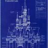
Small update. As you can see on the first page, I've added another land to the park: Discoveryland. This land didn't turn out very well in my original park, so I'm hoping I can pull this area off better this time as well as bring in some great and unique attractions to the park. Technically the land is still up in the air since it all depends on the map data limit, but I'm fairly confident that I'll have enough room for it. And to be honest, this land is being added specifically to bridge Liberty Square and Tomorrowland. Since Tomorrowland already includes a bulk of Discoveryland's attractions, Discoveryland will boast a few Disneyland firsts.
I've been working on the entrance area for a while now adding things that are found in the real world parks. I'm trying to make this park as real as possible so I've added stuff such as a will call, wheelchair and stroller rentals, bus stops, and turnstiles.
Will Call and the entrance turnstiles.
I'm hoping to get to Town Square soon and after that I'll restart Adventureland now that I've got it mapped out. -
 Highball
Offline
It's been a while since I updated but I haven't built too much lately. I've mostly been tinkering with older areas while I figure out where to go next. Here's a few shots to show that progress is still being made.

-
 Timothy Cross
Offline
I think theres an overload of glass in that entrance area from the second screen. Really, not too big of a fan of either. Looks like ya needs some inspiration... like even a trip to one of the parks. Just google more pics. I feel you're in need of a pickmeup.
 -

 JDP
Offline
You are one of the very few Parkmakers here that always add some breathing room in their work. And that sir is a good thing imo.
-JDP -

 Cocoa
Offline
I'm not such a big fan of the first screen-that uneven stone wall sticks out way too much
 -

 Liampie
Offline
I like the second screen, but dislike the first: The wooden textures look bad, the rock looks random and
Liampie
Offline
I like the second screen, but dislike the first: The wooden textures look bad, the rock looks random andI'm not such a big fan of the first screen-that uneven stone wall sticks out way too much
-

 posix
Offline
exactly how i feel, and the reason why i love the 2nd screen so much but am kinda scratching my head over the 1st because it misses this space. it looks like things need more room.You are one of the very few Parkmakers here that always add some breathing room in their work. And that sir is a good thing imo.
but really, i look at the 2nd screen and am just awed. makes me think "aaah, right, he so deserved to win spotlight"
-

 Highball
Offline
Thanks for the replies guys. I've finally managed to get the ball rolling on Adventureland now that I've figured out which style of entrance I want to do. Since I have an Arabian area in DisneySea already, I opted to go for Walt Disney World's entrance. It's definitely not an exact copy since the Swiss Treehouse won't be across from Aloha Isle and New Orleans Square lies dead ahead. I went for this theme since doing a Caribbean island theme would be easier to transition into New Orleans Square than some of my other options.
-

 RCTNW
Offline
Very nice. I'm getting a bit concerned about your scale as it seems to be getting taller with each passing SS but it still looks great. I know you mentioned it but will it be peepable when it's done?
Keep it up
James -

 posix
Offline
something a little different from you. i like it very much. but i'd love to see some ride design screens from you once in a while. it feels like you've only been showing buildings.
 -

 Highball
Offline
I can see where you're coming from, but trust me, all new construction is on a similar if not exact scale. All of the older buildings are slowly being updates so that they fit in with the new stuff. That's one reason why it's taking me so long on this park. So far the things that are on the new scale are the new parts of Fantasyland, Main Street, U.S.A., New Orleans Square, and Tomorrowland. Everything else still needs to be reworked.Very nice. I'm getting a bit concerned about your scale as it seems to be getting taller with each passing SS but it still looks great. I know you mentioned it but will it be peepable when it's done?
Keep it up
James
For the peeps, I'm still thinking on a few ideas to get them into the park without having them bitch every two seconds. If I do it, it'll be one of the last things I do.
Sadly that's how it's going to be for a while. I'm still working in the scenario editor and until a good 95% of the park is done I won't be leaving it.something a little different from you. i like it very much. but i'd love to see some ride design screens from you once in a while. it feels like you've only been showing buildings.
Exactly!dole whips?
 Tags
Tags
- No Tags




![][ntamin22%s's Photo](https://www.nedesigns.com/uploads/profile/photo-thumb-221.png?_r=1520300638)