(Archive) Advertising District / Through the Ages
-
 23-July 08
-

 MF72
Offline
Agree with Milo and X. Looks very cool. It would look a lot cooler with a banked drop, but alas, it is not possible.
 -
 jusmith
Offline
Thanks for all the comments, I'll try to tidy some of the stuff up.
Here is a more developed screen of the same coaster: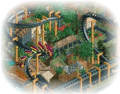
No official name of the area or coaster, but hopefully the theme is somewhat obvious. -
![][ntamin22%s's Photo](https://www.nedesigns.com/uploads/profile/photo-thumb-221.png?_r=1520300638)
 ][ntamin22
Offline
Nigeria?
This continues to look awesomesauce. Continue messing with codex- the barrels in the next-to-latest screen, for example, can be fixed. remember that whatever you built most recently show up on top. -

 JDP
Offline
Yeah, wow. In all honesty that is the best Loopy Landscape screen I have ever seen. Amazing work my friend, amazing.
-JDP -

 jusmith
Offline
It's back!
Time for a new update. I am currently going through the park revamping parts and also starting brand new stuff. The project is finally back on track and moving fast, for now at least.
NEW!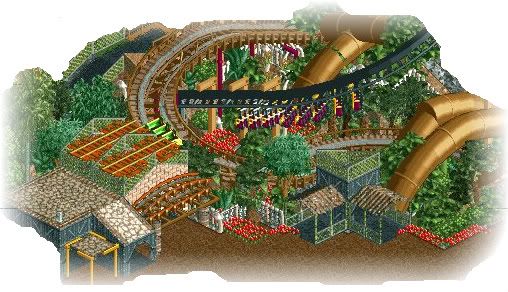
The two main attractions of the area.
It's not completely finished as I had some problems with the finished version and lost it all, so there may be some details I forgot to redo.
-jusmithEdited by jusmith, 25 October 2008 - 09:47 PM.
-

 Cocoa
Offline
The interaction and everything is so great. I take it the tan tubes are supports?
Also, I love what you did on the roof with the orange track- how the walls are slanted and it isn't. -

 spartan
Offline
glad to see you working on this again. everything looks great. hope you finish this soon cause i really cant wait.
 -

RMM Offline
this one aint workin for me.
the building on the left is ugly and awkward compared the the others.
and the ride looks like it was forced between the invert.
it just doesn't flow well here. -

 Gwazi
Offline
agree.this one aint workin for me.
the building on the left is ugly and awkward compared the the others.
and the ride looks like it was forced between the invert.
it just doesn't flow well here.
 Tags
Tags
- No Tags


