(Archive) Advertising District / Through the Ages
-
 23-July 08
-
Xcoaster Offline
Looks pretty good. The chain link fences are odd if you think about them, but look good if you don't.
Once a long time ago I'd planned on making a inverted coaster called "Tash." The way they described him in one of the books reminded me of an inverted coaster snaking through the woods. I think that was from the last book though. -

 jusmith
Offline
Replies, and an update down below!
Sternkrieg72: Thanks. I did have the colours of the windows the same, but it looked quite monotonous, but maybe I will try some different colours.
JJ: Some of the fences will be taken out. Thanks.
Nokia: Thanks!
RCTCA: Thanks, and look above.
Gwazi: Thanks for the advice!
Milo: I understand where your coming from about the fence, but I was trying to think of it more as a poorer form of architecure, and less luxurious, so I think I will keep some of them, but I will definately change some to other fences. In the richer parts, barely any of those fences are being used.
disneylhand: Thanks. I felt the same way as I was building.
Xcoaster: 1) That's what I thought too. 2) The last book is the one book that I never really read closely, and it was a while ago that I last read it. Recently I bought this book that has every chronicle in one book, so I have been reading each book in order, and that inspired this area. The coaster in this area is based on a character, not the same one as yours though.
As promised, here is a ride update!
A custom flat in Olde Lavernock: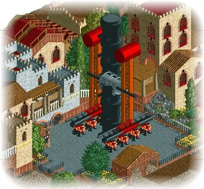
Screen not totally finished, but pretty close, and I have some details to fix. -

 geewhzz
Offline
It's good, but the buildings on the right side seem extremely too close for the radius of the swings.
 -

 spartan
Offline
Is good but i agree with geewhzz, i'm sure the arm on the left would hit that building. otherwise it looks great
 -

inVersed Offline
Thank you for showing that screen, it was just what i needed to inspire me to pick up work on my LL parks again. Very nice -

RMM Offline
yea very good screen. makes me wanna play.
but that building on the right WILL get in the way. -

Xcoaster Offline
Wow, very solid work. The flat ride looks great, and the archy is superb. There's enough variety to keep it interesting, but not enough to make it busy. -

 Sey
Offline
It`s awesome!
I like this flat most, but the archi is also very nice...
Balm for my eyes^^ -

 Milo
Offline
Very nice stuff... apart from the space issue that's some of my favorite work from you.
 -

 rK_
Offline
how big is this map?
looks solid so far man, only insight would be scaling the custom down like geewhzz said. -

 jusmith
Offline
Thanks for the comments, and the space issue has already been taken care of.
The bench size is either 126x126, or 125x125, I can't remember. -

 rK_
Offline
Thanks for the comments, and the space issue has already been taken care of.
The bench size is either 126x126, or 125x125, I can't remember.
nice, cant wait man.
i cant believe LL is still moving like this in 2008. -

 jusmith
Offline
Well, this hasn't been worked on very hard for a while, but I think enough has been done that an update can happen.
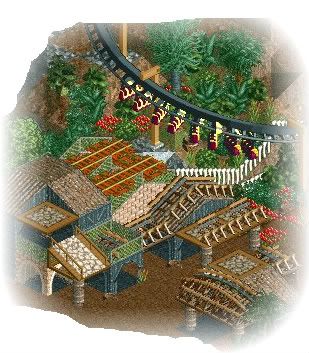
Mostly just a teaser of a new area, an official update of this ride will be coming up... -

 Cocoa
Offline
I like the orange roofs and the side friction roofs but the crazy paving is not that great and it's got a little too many textures, but a great atmosphere and I like it.
 -

 Gwazi
Offline
The only thing I dislike is the side-friction track piece with the jungle fences around it.
Oh and use Codex to fix up those jungle fences. They're kinda glitchy. -

Xcoaster Offline
I think it looks magnificent. The side friction track on the bottom right is especially nice.
 Tags
Tags
- No Tags


