(Archive) Advertising District / Disneyland Resort Gulf Coast
-
 11-July 08
-

 wed10
Offline
Ok here is the finished facade of Peter Pan's Flight in Fantasyland. I am trying different paths and the landscaping isn't finished. (all the open squares are potential landscape areas) If you have any feedback on landscape or anything please let me know because I'm kind of struggling with tree and flower placement. I don't want too much but am trying to find a happy medium. Oh and please ignore the pink building, as it is not quite finished.
Thanks!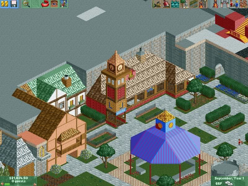
-

 Nokia
Offline
to much roof on the one next to the clocktower.
but i see your still improving
maybe some windows on that pinkish colored building? -

 wed10
Offline
Yeah it will get some, I built the tiki room but don't want to show it until I get the area around it landscaped. I think I am going to call it good for a while though and take a break. Go play some Call of Duty probably
God summer has just vanished on me...Edited by wed10, 18 August 2008 - 03:25 PM.
-
 Highball
Offline
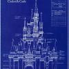
its a good start, but i think it needs more. the peter pan facade seems very flat with no personality. i dont want to tell you how to build this, but since i suspect youre going for accuracy, heres what i would do. i uploaded the following picture of the paris facade of peter pan to show what i mean. its not the best angle to go by, but it shows the general outline of the front facade.
that entire upper section of the roof needs to be more pronounced. instead of having the windowed part just one tile, make it two. i also think the rooves would look better in green and that small corner section could use a nice spire stickin up from it.
the carousel covering is well done, but i would change one thing: i would use the less steep awnings first, and then use the steeper ones at the top. that will give the illusion that its sloping upwards.
overall it looks promising. do you have any original rides planned for the park? -

 wed10
Offline
Thanks for that picture!! The pictures i have are ok at best I have a terrible time finding pictures. And I see what you're talking about with the slope on covering. I have a couple of original rides planned for this park. Some of those are not all the way flushed out yet and finding space for them may be challenging but we will see.
Here is the plan:
Tommorowland:
Space Mountain
Buzz Lightyear Astro Blasters
Star Tours
Rocket Rods (will probably use 8 cars to adjust lift speed on the rocket coaster)
Finding Nemo Submarine Voyage
Fantasyland:
Snow White
Pinochio
Carousel
Tea cups
Peter Pan
Mr.Toad
Matterhorn
*Its a Small World*
Storybookland Canal boats
Adventureland:
Jungle Cruise
Pirates
Tiki Room on Adventure Isle
*Indiana Jones Coaster or rapids ride*
Frontierland:
Big thunder Mountain
Hoop De Doo Revue
*Depending on Indiana Jones Saw mill rapids ride*
{Pixar Place}:
This land is just like the Studios version but I think it will fit well where I plan to have it. If it gets built, but it is still very iffy and on the design board still.
Monsters Inc Swinging Door Coaster
Tough to be a bug
WALL-E E-ticket
Maybe another show not sure yet. As I said this area is very iffy and may be replaced with something all of my own.
Oh and if this land gets built the Finding Nemo Sub Voyage would change because it is not that far away so it would become a Pixar Place attraction not tommorowlandEdited by wed10, 18 August 2008 - 04:16 PM.
-

 RCTNW
Offline
Looking good. Although not as refined as some other Disney projects, you can still tell what the park concept is from just the SS's.
Listen to Highball. The man knows what he is talking about.
Keep it up
James - rctnw -

 wed10
Offline
Thanks RCTNW,
I am still working on this it's just that reality (school) and sports have settled back and I pretty much have zilch free time so look for this to pick back up again sporadically until Christmas time.
Thanks -

 wed10
Offline
Alrighty so sorry for the break...(wow it doesn't seem like it has been almost a year!) Anyways, I have many things I want to implement in this park...However, I no longer have the time to implement them how I wanted. I am looking for someone to do/finish Adventureland, Frontierland and Main Street. This would be considered a "group project" from the point the agreement is reached on. Thanks I understand if no one is interested. I just have so many ideas for tommorowland and fantasyland but not the time to finish the other parts and I don't want to release it unfinished!
Contact me or post if you are, Thanks! and sorry again! -

 wed10
Offline
Thanks!
Brent if you read this...I replyed to your message however it doesn't appear in my sent messages or in the message tracker so I don't know if it is actually sending messages. Post in here one way or another or message me I don't care but thanks! -

 Dark_Horse
Offline
wed10. Wow, this is an awesome DL/MK style park. Definitely beats any of the Disney stuff I had going. If you still need help, I'd be glad to lend a hand here and there.
 -

 wed10
Offline
Thank you...yes I'm still looking for help but waiting on responses...I'll message you?
 -

 wed10
Offline
Alright so I decided to just start doing it on my own again for right now...probably will require help at some point though. Today I worked for a long while until I felt the train station was MUCH better...however after taking a long break I still see some things I really don't like. (cough:landscaping:cough)
Anyways for your enjoyment/critique...Here is the Main Street Station. I decided to base it off of DLP's shown in this picture. I know it's not exact but I felt I got a pretty good start:
http://farm2.static....b4eceef.jpg?v=0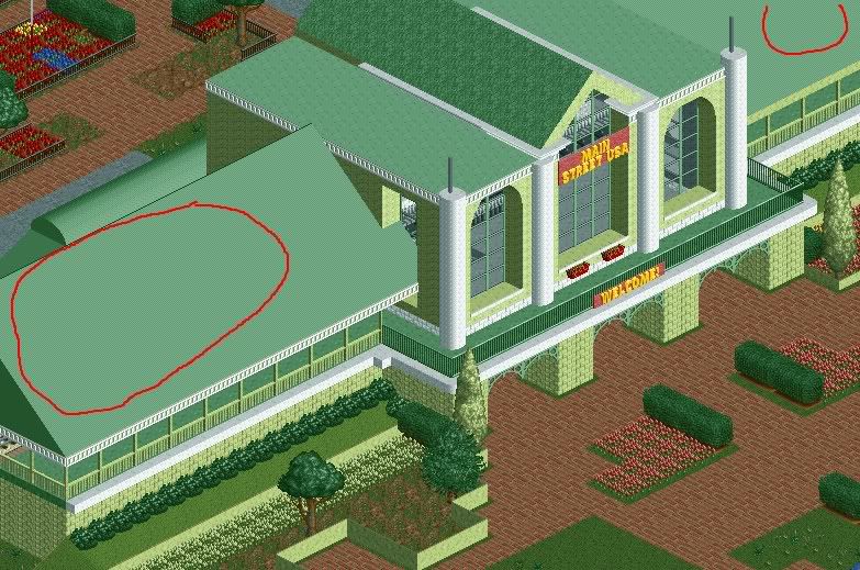
The red circles are the HUGE things I wanna fix maybe tommorow...anyways what do you think?
It looks more stretched out because I had to use a different PC to take the screen...Anybody know why my Vista laptop won't recognize RCT files outside of the game???
-

 wed10
Offline
nasty roof texture, it looks so ... plastic.
Yeah I'm going to change that...are you talking about within the red circles? -

 wed10
Offline
pretty much, yeah.
Yeah I figured...I gotta redo that...I didn't think it looked that bad...when I was tired after being up for 21 hours haha. but after I went back today I was like DANG....it will be fixed. WAY too much green there in one place. Other than that though? (and landscaping and some trim to finish...little details.)
And the Main Street Sign is going to be jazzed up somehow. -

 Cocoa
Offline
the one from the picture had nice details all over the windows and bottom floors and stuff. you should try and add that, but i think you got basic building design down pat.
also, very green. ughEdited by Cocoa, 09 August 2009 - 01:03 AM.
 Tags
Tags
- No Tags

