(Archive) Advertising District / Disneyland Resort Gulf Coast
-
 11-July 08
-

 wed10
Offline
This is my new Disneyland Park, I have pretty much finished up Town Square and am going to finish Main Street within the next 2-3 weeks. Here is the Opera House and Town Square.
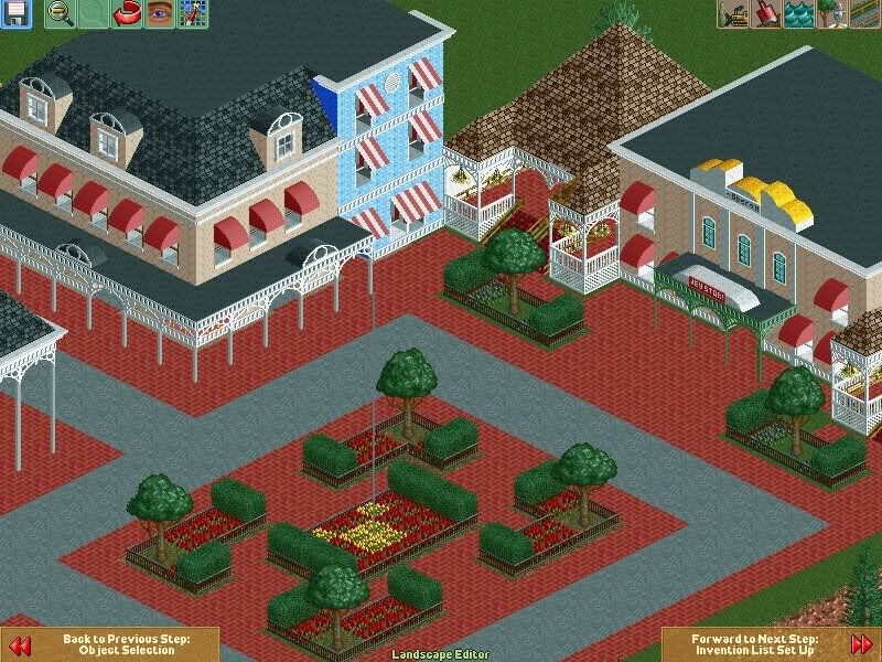
I am going to be doing more indepth updates here:
http://piratesofrct....;pid=286#pid286 -

 nin
Offline
Better than your previous work, and I'm somewhat beginning to catch a Disney feel. Just look at pictures,etc. of the real parks, and try to base your structures of them.
 -

 wed10
Offline
I know that the Opera House is really Blocky but in most of the pictures I have looked at (And from my memory of being there it looks like a pretty rectangular structure.)
 -

 wed10
Offline
I have redone the Opera house entrance and bumped it out more I also added some other little things to the building. Improvement or no?
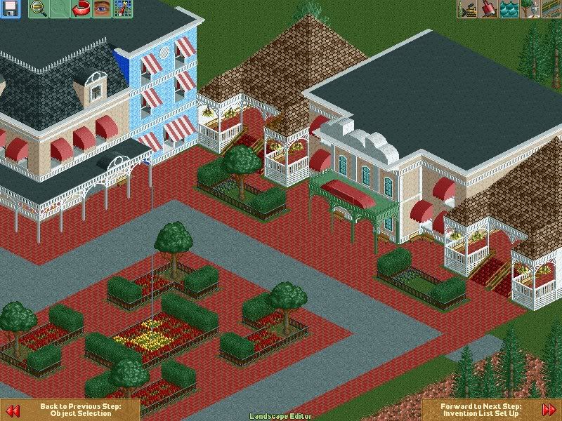
I really want to nail Main Street in this park and then I have alot of ideas for the other lands. -

 spartan
Offline
change the ground under the paths to something other than grass. I also dont like the brown roof and what looks like black flowers. Other than that the buildings look good although a little blocky.
by the way one of the brown roof pieces is the wrong color -

 nin
Offline
Get some art deco in there. And is there any other brick path? The one your using is horrible.
 -

 Cocoa
Offline
There's a poop brown roof where there's supposed to be a dull brown roof in the building at the top middle of the screen.
 -
 Highball
Offline
Just a couple of suggestions from me. For one, the path around Town Square is too square. Remember, Town Square is circular, not square despite what the name suggests. The corner building needs a lot more work. It's devoid of personality (although the archwork on the bottom is nice). Also, the flowers in Town Square should probably be a different color. The red flowers and the red path combine to form a very dark overall tone for the area. Choose brighter colors for that area and mix them up, don't stick to one color. Last, the Opera House is good, but maybe zero the clearances and squeeze another window onto the side of the front section. These are just suggestions, but I think if you try them this park will turn out great.
 -

 wed10
Offline
I am still working but I have decided to do it right from the start with this park and make the street wider and set the paths first.
 -

 wed10
Offline
Here is a picture of the finished Toad Hall for Mr.Toad's Wild Ride. Fantasyland is about 85% done and then I will be moving onto Frontierland/Adventureland. The castle was 99% finished and then I decided I didn't like how certain elements fit so I added and lost some things.
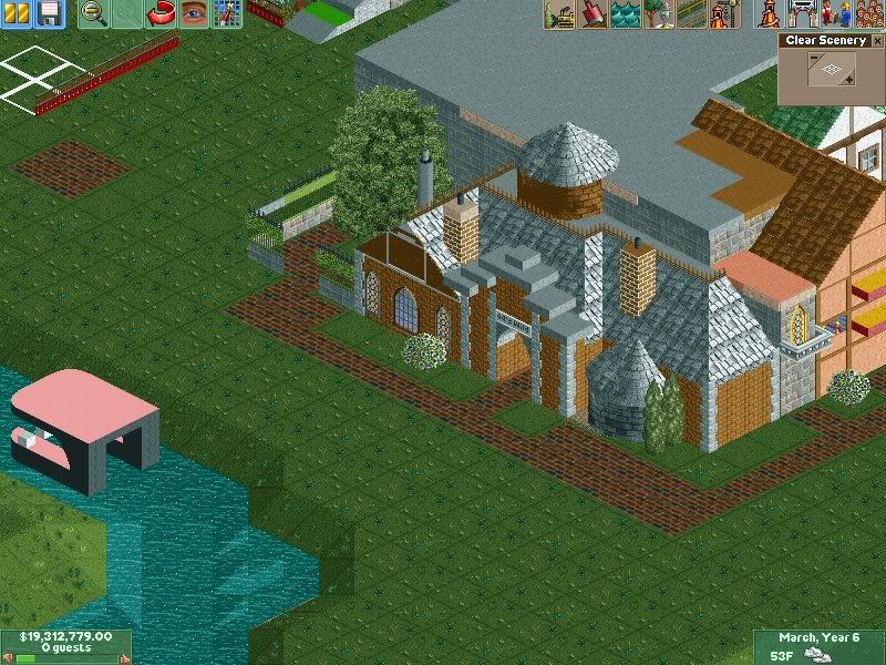
-

 Nokia
Offline
WOW, you are improving VERY fast.
i actualy like that screen a lot.
maybe different paths though. -

 Highball
Offline
not bad, but is that your final color choice for monstro? i would go with a light blue personally.
 -

 wed10
Offline
Thanks, I'm not sure I started with black but I am toying around with it right now to try to get it to resemble the whale. We'll see how it turns out I guess.
I was having serious problems with the castle until I downloaded Iceman's park and adopted how he did the turrets and then it was like bam bam bam the castle main frame was done and I moved to fantasyland.
I am really excited for Tommorowland, I have done some bits and pieces of it and it is by far the most fun to build.Edited by wed10, 15 August 2008 - 04:02 PM.
-

 Highball
Offline
glad i could help.I was having serious problems with the castle until I downloaded Iceman's park and adopted how he did the turrets and then it was like bam bam bam the castle main frame was done and I moved to fantasyland.
-
 Maverix
Offline
Looks great. The only thing I don't like is the paths. They seem a little to "dark".
 Tags
Tags
- No Tags
