(Archive) Advertising District / Legacies Themepark - Europe
-
 04-July 08
-

 Corkscrew
Offline
Just when I thought to honour your ingeniosity, you tell me it is a matter of determinism.
Dammit you xD
Still I believe it looks a lot better than without the double down ... Hmmm, weirdness. -

 zodiac
Offline
the only criticism i ever have about your work is the paleness of it. there's no color.
 -

 Torn@do
Offline
i LOVE it. and not only because it's a flyer, but i like the theming very much. Can you please show more pics of the log flume?
Ps. i like eggs very much
-

 Liampie
Offline

I submitted Ikaros as an NE Design, but it got only 50% percent of the votes instead of the required 60%. A near miss!
It proves I almost reached the minimal level of an NE Accolade, so I'm still quite happy with this reslut. It's my best work to date, I think.
While building this I was dreaming about expanding this design to a bigger park, and Ikaros being rejected as a Design this is a great opportunity do execute tat dream.
After Finishing Project X, I'm continueing this project and submit it for Spotlight.
Overview
Key:
1. The lethal drop of Ikaros in the Aegean sea.
2. Palace of King Minos at Knossos. The palaca contains the famous Labyrinth (last part of the queue) and Ikaros' station.
3. Daidalos, Ikaros' father.
4. Flumeride 'The Flood'. At 1600 BC the vulcano at Santorini erupted, causing a tsunami which partially destroying the Minoan civilisation at Crete.
5. Remains of an older civilisation
I'm working on the download, expect it really soon! -

 Liampie
Offline
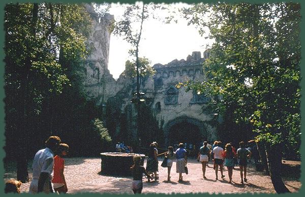
As I said before I'm continuing this. I started a new area recently, this is the first pic of it:
Some small things will change. (red roof, the clean wall upper left, and the graveyard)
Based on:
Edited by Liampie, 30 July 2008 - 03:11 PM.
-

 postit
Offline
That's nice; even if that style is unsustainable.
I really dislike the roofing right now. It may be hard to break up if it's such a large rooftop but honestly, it is so boring. If you are going for realism based on your inspiration, maybe add some vents, smokestacks, whatever you want. It's a tough call.
Also, the fencing doesn't look great. I know everyone loves to use those objects, but in this case, a lot of other fences would probably work better.
Looks like you can clean up the clutter a bit, too. I think you could improve the top of the walls going up because there seems to be some nice detail in the photo near the top of the structure, but right now you just have randomly placed blocks instead of strongly layered, refined detail. -

 Fisch
Offline
If the tower just went up straight it would be a lot better!
Also I don't like the turret with the red roof. The texture of the wall and of the roof just doesn't fit in there.
The rest is good.
Fisch -

 Liampie
Offline

I changed the blue building recently because I had an idea for the second area: Old England! A screen of the renewed façade is coming soon.
Another new screen:
-

 nin
Offline
By far your best work. That last screen is great.
But maybe change those wooden fences to the side of the paths? They just don't really fit. -

 lucas92
Offline
Black, brown and white, overused colours all over the place...
The architecture is awesomely well done though.
-

 Liampie
Offline
The second area after Knossos will be England.
'Het Spookslot' (The castle seen on some of the last few screens) will be a part of this area. Therefore I changed the façade on the back a bit. (no screen)
The façade on the front would be changed anyway:
England will contain a walled city. The first screen:
(the hack gave me a real headache)
I also wasn't content with the layout of Ikaros. I changed it a lot, added a tunnel and rethemed it.
Landscaping will change over time, and the shop in lower left corner will be changed too for it doesn't fit its surroundings well enough.
Old layout
-

 JDP
Offline
I agree. B&M flyers are a tough ride to design and mostly everyone fails at them. The only person that has pulled off the greatest and only good flyer out there, is Mr. Whzz in my opinion.all your buildings look great its just that ride isnt really that great.
-JDP -

 Liampie
Offline
Thanks Gwazi and Nokia.
Liampie
Offline
Thanks Gwazi and Nokia.I agree. B&M flyers are a tough ride to design and mostly everyone fails at them.
Why did I fail exactly?
 Tags
Tags
- No Tags


