(Archive) Advertising District / Legacies Themepark - Europe
-
 04-July 08
-

 Luketh
Offline
Nice. I love all of those screens, and the statues in the top right one are SWEET! Nicely done.
 -

 turbin3
Offline
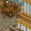
Top left screen:
- colour the land under the plants
- put plants / different land textures underwater
Can't wait to see it finished!
-

 Liampie
Offline
@J K: Jealous? Why?
@Luketh: Thank you.
@Cena: ...
@Turbin3: I already did both, you just can't notice in the screen. Thanks.
BTW, I have a question for everyone. Colouring the coasters in this park is incredibly hard. I changed the Motorbike coaster from yellow-red to yellow. Do you think it's better?
Old:
New:
-

 Marlin
Offline
I'm with sssammy on this one... I like the yellow better, but I'd have to see more of the invert to have an opinion there.
 -

 Cocoa
Offline
Personally I would go with a color that contrasts your architecture colors more. But the yellow is still good.
 -

 Liampie
Offline
@SSSammy: It doesn't get better.
@Cocoa: That would be blue or purple...
I'm pretty sure I'll keep it yellow, but I'll ask the beta testers to check it out ingame. Thanks. -

 Louis!
Offline
The yellow is much better, it actually makes me like that screen, where as before I thought that was absolutely awful.
I still hate that invert due to the colours not being all that great and the layout being a bit odd.
The other screens are nice, the foliage in the top left sucks though. -

 Liampie
Offline
The other screens are nice, the foliage in the top left sucks though.
Thanks. Can you define what you don't like about the foliage? Is it the 1/8 bushes? The amount of green?
I did change the underground textures a little. Some dirt/grass. I can't do more without the area becoming an overgrown ghetto. -

 Six Frags
Offline
Louis, come on man, don't exaggerate that way, makes you look kinda pitiful..
I think if you keep the coaster's rails and spine one color it would look best, and I think the dark red would look great..
SF -

 Cena
Offline
Louis, come on man, don't exaggerate that way, makes you look kinda pitiful..
He is right though .. Between the blue/white stand and the blue/yellow stand the foliage is bad ...
Liampie, I still have problems with liking these screens ... Most of it is architecture you are showing (I know that's the thing you like) however it still doesn't feel like an actual themepark for me ... Sure you have some rides in it, I don't see a themepark in it yet, maybe because the screens are so small and only for teasing ... Maybe I should wait with giving my opinion on this after this have been released. -

 Liampie
Offline

Screen re-post.I think if you keep the coaster's rails and spine one color it would look best, and I think the dark red would look great...
Dark red track? So the whole coaster is red? Trust me, that looks shit.
He is right though .. Between the blue/white stand and the blue/yellow stand the foliage is bad...
Can you be more specific about what you don't like? I actually like the foliage in that area (beyond the screen) so this is interesting to hear.
Liampie, I still have problems with liking these screens ... Most of it is architecture you are showing (I know that's the thing you like) however it still doesn't feel like an actual themepark for me ... Sure you have some rides in it, I don't see a themepark in it yet, maybe because the screens are so small and only for teasing ... Maybe I should wait with giving my opinion on this after this have been released.
I realised this myself too, and therefore I tries to include more actual rides in my screens. However, this park is for intellectual peeps: the architecture are a 'ride' too, like a museum. Architecture is more important here than in most parks.
But in the end, you indeed just have to wait with your final opinion. We'll see.
-

 Louis!
Offline
Thanks. Can you define what you don't like about the foliage? Is it the 1/8 bushes? The amount of green?
I did change the underground textures a little. Some dirt/grass. I can't do more without the area becoming an overgrown ghetto.
Just the combination is odd. The fir tree with a weeping willow etc. And how there isnt any colour to break things up. It's all a similar green. Some wild flowers in there would be nice.Louis, come on man, don't exaggerate that way, makes you look kinda pitiful..
Don't exaggerate what? :S -

 Liampie
Offline
Just the combination is odd. The fir tree with a weeping willow etc. And how there isnt any colour to break things up. It's all a similar green. Some wild flowers in there would be nice.
Ah, I see. I'll try some stuff.Don't exaggerate what? :S
From your first post:
... absolutely awful ... I still hate ... sucks ...
You're a drama queen, but I can see the core of your post right through the facade of exaggerations so don't worry. ( )
)
-

 Louis!
Offline
Seriously that wasn't exaggerating.
Exaggerating would have been:
"I thought that was an ugly piece of shit."
"Words can't explain how much I hate that invert"
"the foliage in the top left is the worst i've seen"
I was actually just being honest about what I thought of the screens. -

 K0NG
Offline
^ But, that's practically what you said originally. I don't see how it would hurt to have said....
"The yellow is much better, it actually makes me like that screen, where as before I didn't".
"I'm still not feeling that invert due to the colours not being all that great and the layout being a bit odd".
"The other screens are nice, the foliage in the top left could use some work though".
Particularly coming from someone that posts in another thread...
"It's always nice to hear people say good things about my work".
I mean, you don't have to say that you like something if you don't, but you don't have to be a cunt about it either. THIS is the kind of shit that stops people from posting in the AD. Critiquing others work is one thing. But to say that it sucks or that you hate it and it's absolutely awful, while being merely your opinion is...well, it's not exactly a fucking motivational speech. Sometimes blatant honesty is better held in check. I mean, some people may think I'm a complete dick, but you never have nor will you ever see me say shit like that about anyone's work. -

 Louis!
Offline
No cause I'm pretty sure Liampie knew how I strongly disliked his work and so I think my comment was a compliment. I said what I liked and I said what I disliked and when asked about what I disliked I backed myself up with a reason. If you don't get negative comments then you can't improve.
And if I didn't think that liampie could take my criticism I wouldn't have given it as strongly as I did.
 Tags
Tags
- No Tags
