(Archive) Advertising District / Sagrada
-
 13-June 08
-

 Louis!
Offline
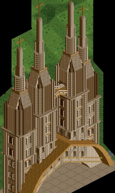
Construction is nearly complete at the front of the church, with most of the ornate masonry in place. Construction has just commenced upon the right side and further project updates will be supplied in due time...
Comments welcome.
It's a shame it has to be so brown. -

 Marshy
Offline
One word:
WHAT THE HELL IS THAT.
Oh, wait..no.
(i don't really see how a church can be the start of a park, unless you have an uber coaster snaking its way through it) -

disneylhand Offline
It's super-detailed and all, but too bad it doesn't look very good . . .
-disneylhand -

 Carl
Offline
I assume you are recreating Sagrada Família? If so, nice job so far, but I am also curious how this is going to be a park?
 -

 Louis!
Offline
Ripsaw - Thanks.
Nokiaa - Thanks.
Lloyd - Yes. Yes it is.
Marshy - you'll see.
disneylhand - thanks i guess
Carl - yaha. Its so fucking hard, but i'm not going for exact resemblance because that would be fucking impossible. -

 Camcorder22
Offline
I dont really like it, the textures are too varied from top to bottom when they should be the same and the colors are off. I think Sixfrags made a pretty good one for the Spanish road rally at rctspace and I made a shitty one the same round. So at least its better than mine .
p.s. 420 posts
-

 Ge-Ride
Offline
I personally am not especially impressed, since I've actually been to Barcelona and seen the real Sagrada Familia up close in person. Realizing that this is not a direct recreation, I'm still not particularly impressed. I personally would have chosen a lighter shade of tan, but your choice in color scheme is close enough to keep me from griping. The biggest problem with the whole structure is that you've chosen detail over form to a foolish extent and the tops of the towers just don't work. Personally, I think you should work harder on recreating particular architectural elements, and then combine those into a pleasing overall form. Quite honestly, I think you have talent, but you haven't used it here, and it would be better to work on something which more naturally suits your RCT abilities.
 -

 RCTFAN
Offline
TBH it's not something you can recreate accurately unless you create some specific objects. But I still like it, the scale is unprecedented.
 -

 lucas92
Offline
It's good, but you should put something in the background to make it more pleasant, and also to distract the viewers eyes from the main subject.
 -

 Louis!
Offline
Camcorder22 - Six Frags was nice, however I wanted to create it with as much detail as possible, like the real thing. It's hard to create the exact detail of La Sagrada Familia so I think what I have done is best.
Sulakke - Thanks.
Ge-ride - Yes, I have also been to Barcelona and been up and close to the real thing. The lighter shade of tan is too bright, however this brown is too dark. So I went with this colour. Both the detail and form is hard to get in RCT however I think I've done a good job.
JJ - Thankyou for your continuous feedback on everything I do. It's really appreciated JJ
JDP - Thankyou. I have finally done something that you like
RCTFan - Thanks.
Lucas92 - As the project continues La Sagrada Familia will get more completed so the background will be more complete. -

 Milo
Offline
it's very nice.... a little crazy on the textures but the overall effect is pretty good (I wish the big arch blended in a little more)
what kinda ruins it for me is the overuse of brown, it just makes the whole thing so stale
keep up the good work though -
 Levis
Offline
Louis please explain how you can make all people say wow by using 1 color and I can't
 .
.
J K .
.
it doesn't look bad but I think you will get some troubles with this.
to make it better you probally need to do it on a larger scale
 Tags
Tags
- No Tags
