(Archive) Advertising District / Comet Craters
-
 10-May 08
-

 FredD
Offline
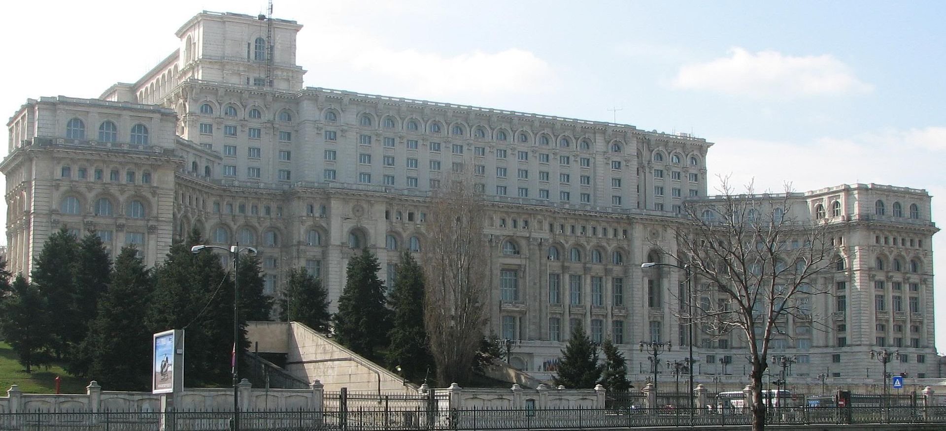
Agree with Posix, it looks amazing. Especially that Romanian palace you made
 I also like the industrial area very much!
-

 ivo
Offline
Posix: Well thank you. I think it is pretty outdated in some parts though
SSSamy: lol, why is that? This is a pretty much standard stuff where I am trying new things in Taboo.
Chorkiel: ^this
FrEdD: thanks for the comment. I think the industrial area is indeed one of the best areas I have made.
Louis:Yeah, I would have loved to finish up the last parts and release it but there is so much work still need to be done that I prefer working on other projects. Maybe I release a download sometime.
And bringing it over...Just looking trough my photobucket account I found some pictures of this park. Pretty outdated but hey...
Some are shown on rct-guide before but I think most of them ain't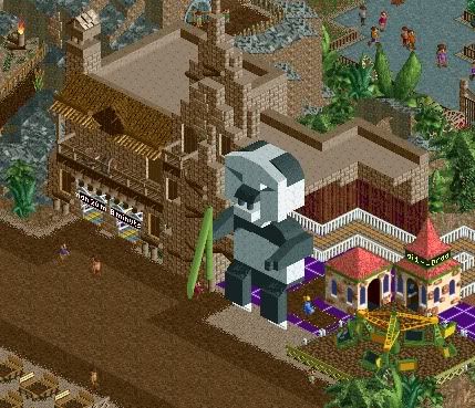
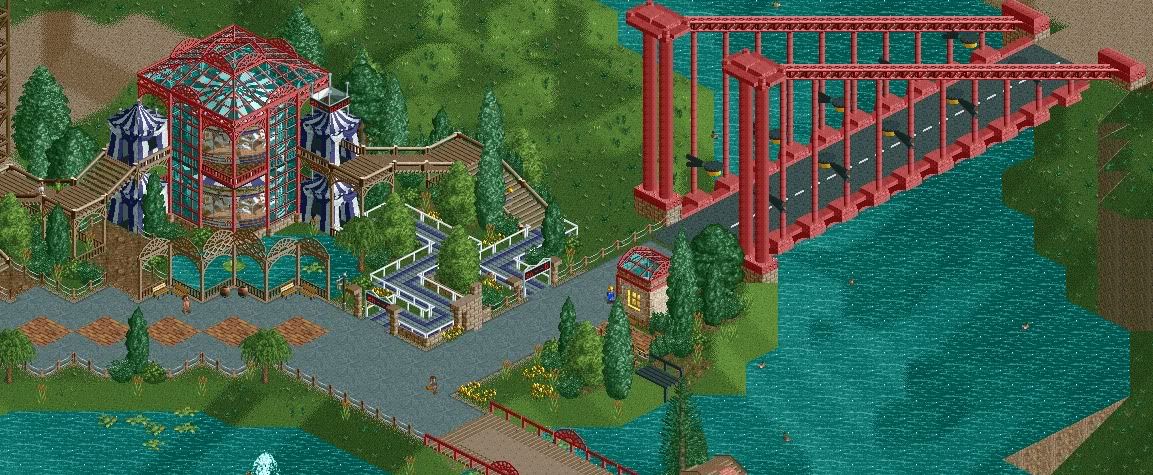
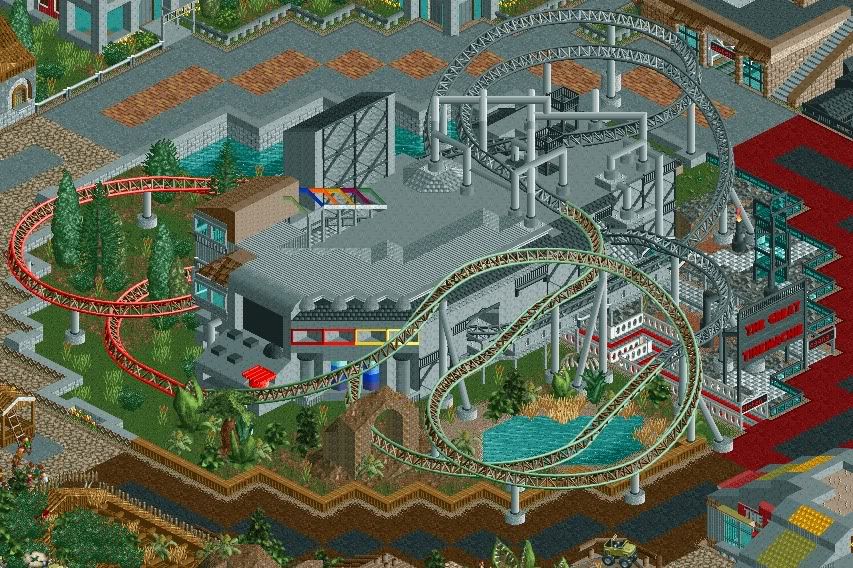
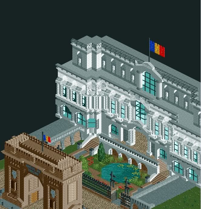
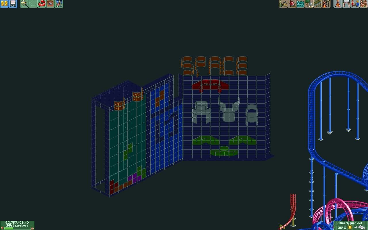
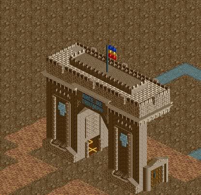
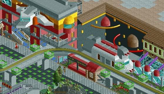
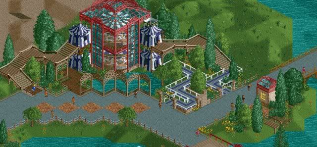
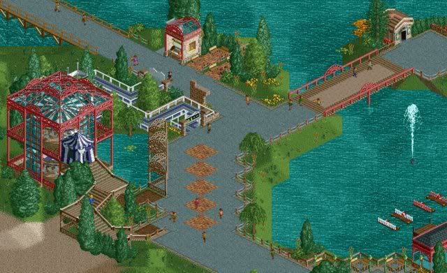
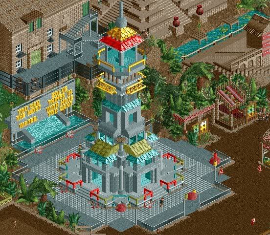
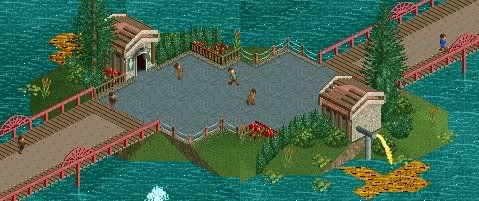
-
Airtime Offline
I the large white building was perfect! Beautiful stuff. The large glass building looked good as well.
Sucks you lost most of it
-

 ivo
Offline
I never intended to give this one up but I wanted it to come as a surprise. But as always it takes longer than you think. So I decided to advertise this one again.
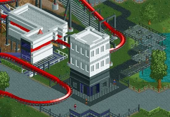
One of the main coasters.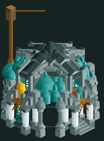
-

 RCTMASTA
Offline
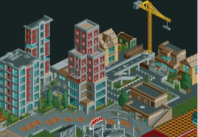
1st screen: What is there is okay, but there isn't really enough for me to comment on.
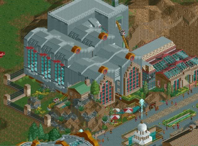
2nd screen: It feels like this artistic mix of realism and fantasy, and I find myself having to look at it a lot to really see all of the details. I like that. -

 Liampie
Offline
First screen: what makes your work so great is that it has either very original ideas and content or great looks. I'm sorry to say this screen lacks both.
Second screen: great looks. I also love how you used the domes. It looks like the building is filled with big blue bubbles. I don't know what the brown crane-like thing represents, but it looks cool somehow and with its colour the screen is saved from being too 'cold'. A perfect colour accent, in other words. The colours are really perfect in this screen. I hope that won't change when you turn the ground textures back on...
Great to hear you're finishing this. -
 ScOtLaNdS_FiNeSt
Offline
I agree with Liampie normally your screens make your brain think or it just destroys it lol, But this screen just doesnt deliver.
Second screen - Yes like rctmasta i too am finding it difficult picking out details, It just looks crazy in a good way lol it looks like something from the future. Stuff that really makes you think as i have come to expect of you ivo. -

 Goliath123
Offline
1st screen: What is there is okay, but there isn't really enough for me to comment on.
What you post:
What Ivo posts:
Yeah i don't think your going very far in life. -

 Turtle
Offline
That second screen is absolutely fantastic. Such a brilliant, organic building. I can only imagine how long that took to make.
 -

 Dimi
Offline
I'm so glad you're finishing this! I love the second screen and the fences in the first screen.
 Tags
Tags
- No Tags


