(Archive) Advertising District / ThorpePoint is back! 03/12/5 New Pics!
-
 04-May 08
-

 nin
Offline
Screen 1, no major complaints, just I'd either build a taller station to hide the entrance huts or better yet, make them invisible. Not liking the queue path much either, but that's more of a personal preference as I hate that path when used by itself, and the wooden fence is working well here either. Other than that, it's not too shabby, just a bit heavy on the gray.
Screen 2, again with the entrance/exit huts. Personally I hate that column piece when used to make actual columns as it's out of scale and makes everything look 'heavy'. You also have the fume's supports on a cement block in the pond yet in the other body of water it's traditional, why is that? This seems like a more futuristic theme as well (sorry, not too familiar with the Sonic universe), so why is that the bridge doesn't math the theme at all?
Screen 3, I love the details made by the glass, they're great, though maybe a little overdone. As you said you want a more industrial, corporate feel, yet you've used brick columns with a building that's made of more steel-based objects. It ruins the feel a bit, the normal deco blocks may work better here than the bricks.
Screen 4, it's nice, but a bit heavy with the gray and the 'domed' (?) building is a bit undetailed for my tastes. -

 posix
Offline
that's just so fantastic. my favourite is the sierra splashdown screen. just very very good. thanks for the update.
 -

 Casimir
Offline
You know, if you could make those entrances invisible, it would be even better. Even though it already looks FANTASTIC.
 -

 Insanity
Offline
Ok I finally Registered so I can comment on this park. At first I thought that this would be another small park with WAAY too many rides and I was wrong. This is becoming A great park.
Whens It going to be released???? Im SOOO anxious
anyways amazing Job Ripsaw, I believe this can possibly become a spotlight.
P.S. DANGER ZONE IS THE BEST RIDE IN EXISTENCE!!!!

-

 Ripsaw
Offline
ok heres the thing my work place shuts down next week for 1week, in that week i am gona try and work my ass off on this project one thing for sure it will definitly be finished this year, hopefully buy end of august, but if i can get just enough time into it, i might be able to have it finished by the end of that week.
Thanks for the comments.
Nin-The blocks in the water were due to the fact the supports looked to long above the water, plus that was before i had a way off hacking so it didnt ghost or crash.Secondly Sonic lives in a sort of jungle/Tropical Island, Marble Gardens was an area on the first sonic games which sadly they never added to Sonic Rush and other later games, i felt it was an iconic area so it would have to be used, and in this area it was green rolling hills and huge white marble columns sticking out of the ground.
And on the Underdetailed Domed Cyberdyne Building is the old Version the one next to it is the new one, as a comparision shot.
I know everyone wants me to make the huts invisible but... i wan't this to be a peepable park and my hacking is not that good. I dont perticuly like them but there a minor imperfection that i just have to deal with.
Keep them comments comming there really helping.
DanThorpe
aka
Ripsaw -
tdub96 Offline
I really always thought the Sonicoaster was one of the best ride ideas ever. Throw in the rings, I think this should be a nominee for best idea for NE Awards 2010 (should this be released this year, which as you say, should be).
The park, overall is reaaally nice, and that Sierra Splashdown screen is awesome. Great update, like the others, I cant wait for the finished product. -

 Thrill-Factor
Offline
That first coaster to me looks brilliant!
The main thing for me is the third screen, i dont like the use of a log flume like that..
Because from my experience they are usually built on the ground with small lifts and when they do lift they are covered by buildings.
Altough i really do like the entrace to the log flume in the 2nd screen, impressive.
But yeah, thats just my opinion
-

 Ripsaw
Offline
It's about time i reworked the station on one of the parks premier attractions, that is the 4D Extreme Machine ..Danger Zone,through the power of the comparision shot you can see why i had to change it, mainly the exit out of the loading station just wasn't wide enough plus it looked bland and well not fitting to be the start of probobly the parks best ride, I wanted a more Industrial/Chemical feel to it and here it is.
I hope you all like it comments please =]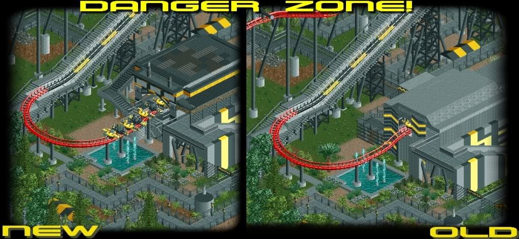
DanThorpe
aka
Ripsaw -

 Louis!
Offline
^I wouldnt worry too much about invisible entrances. If they are that bad just send them to someone else to hack invisible.
 -

 posix
Offline
i can't realy make out terribly much a difference, but the screens just ooze atmosphere for me. again. aaah ripsaw, if only you will finish this park. do you have backups of it? i've seen sooo many parks i was anticipating getting cancelled because of hd crashes, corrupted systems or broken rct discs, etc.
 -

 Louis!
Offline
And you edited your post so now mine makes no sense
The new looks a ton better. That is fantastic. -

tdub96 Offline
I agree, it is an improvement, but i really liked the black and yellow arrows on the original station, it gave it the industrial, futuristic, danger feel to it, but thats my opinion. -

 Ripsaw
Offline
Well its time for a tiny update
Here is some more work on Danger Zone, now with the added blown up factory scene.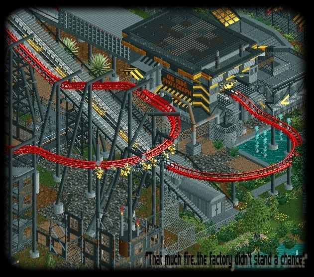
And somthing that has taken me a little while to do, but, i love The 12Th Hour so much i have done the Official Ride Poster, please let me know what you think. The picture relates back to the story a few pages back.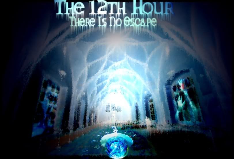
Well there ya go, please let me know what you think, i gotta go know because ive put dinner on and i have rehersals at 7.
DanThorpe
aka
Ripsaw
 Tags
Tags
- No Tags

