(Archive) Advertising District / ThorpePoint is back! 03/12/5 New Pics!
-
 04-May 08
-
 Ripsaw
Offline
Ok ready for the next Update ...here it comes.
The Destruction of the Psyclone!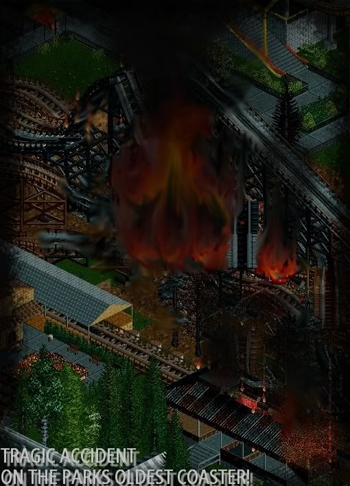
The New Psyclone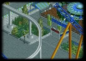
The New Entrance to the Castle and themed queue line to
The 12th Hour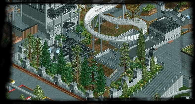
The Entrance to The 12th Hour and the PreShow building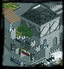
Emporium "park gifts" and Burtons Bakery, which is in my home town of Bourne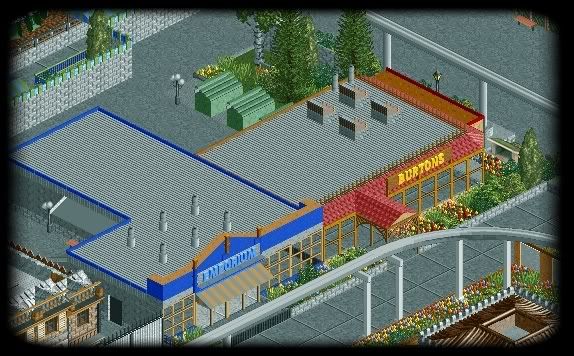
Smiths and The Jubilee too Bars i regularly visit in Bourne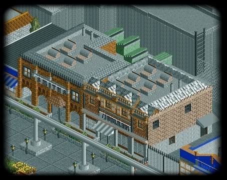
And there ya go, i hope you like the screens, please comment as all comments will be apriciated.
=]
DanThorpe
aka
Ripsaw -

 posix
Offline
this park is hyping me like crazy ...
the bobsled ride looks so beyond ... can't wait for this. do you have a backup of the park somewhere? usually the parks i'm anticipating are lost because someone has a hd crash or something. -

 Louis!
Offline
Love how you actually took the time to 'burn' the Psyclone.
And an interesting theme for a bobsled, great stuff. -

 JDP
Offline
I know that the color gray serves a purpose on everything in the screens, I just feel there is just too much of it. The buildings in the second last screen seem a little "flat faced" and a bit too bland; compared to the last screen where it seems over detailed in a sloppy way. This isn't one of your best updates but I'm still looking forward to it.
-JDP -

 Ripsaw
Offline
Posix i tell you know there is about 5 diffenrent copies on flashdrives lol it aint going nowhere.
Ok here be the update.
The Water tower has finaly arrived for the "Surge" part on Quicksilver Canyon.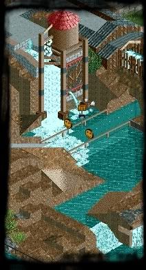
And the NEW themeing on Sierra Splashdown is slowly coming together.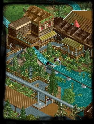
And due to a court order the giant White SkyTower had to be removed to a more astheticly pleasing observation tower, so that is now in place and now offers better views of Mama's Liz's,Supreme's gourmet bistro and The west Elevation of The 12th Hour( Yes i am aware the bricks aint touching the floor yet that will be sorted.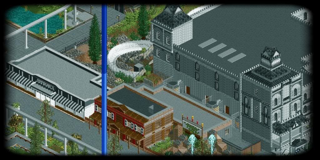
Well theres an update please comment and let me know what you think.
DanThorpe
aka
RipsawEdited by Ripsaw, 27 February 2010 - 07:48 AM.
-

 Liampie
Offline
1st screen: Looking good.
2nd screen: Also looking good, except for the wooden roof over the path (bottom left). The 'colours' work great here.
3rd screen: I still don't like the castle at all... I'm sure you can do better. -

 Ripsaw
Offline
Posix- Your comment there just made my day =]
Hulkpower- Thankyou Muchly
Jaguarkid140 - Maybe..... never know i might release some other past rides that never made it.
Liampie- The wooden roof will go that was just somthing random thats been there since the building of the darkmine, and about the castle , errm i dont really know how to change it to make you like it.
Ill see what i can try and sort out.Edited by Ripsaw, 02 March 2010 - 01:06 PM.
-

 Xophe
Offline
It all looks ace but I agree with Liampie about the castle. The towers are kind of overdetailed. And the roof of the 3x3 tower is a bit weird - I think it's the 1x1 part poking out the top. It might look better if you made it just a 3x3 tower with a normal pointy roof and a turret or two coming off the side of the main tower. Then it would be less symmetrical.
As I said, though, the rest looks amazing. It's just mainly that one tower that's throwing me off. -

 Ripsaw
Offline
Thanks Xophe, thats really help ill see what i can do work up, ill have a look at pictures such as darkastle ect.
Any pictures would be greatly helpful. -

 Xophe
Offline
Maybe something along the lines of this? A big main tower with a little turret coming out the side.
EDIT: just found this site too which could be useful for ideas of details etc:
http://visual.merria...ture/castle.php -

 RCTMASTA
Offline
The tower looks great in my opinion.
But yes, the wooden path cover in screen 2 is.... out of place. -

 RCTMASTA
Offline
I suppose it could use another tree to the left of the bobsled turn, just like the tree already there, but another one to the left of that. (Read it slowly and you'll understand what I'm saying.)
 -

 Ripsaw
Offline
Ahh fiesta is over and now were all back, well here is the updated version of the Fiesta screen i did.
and from another view.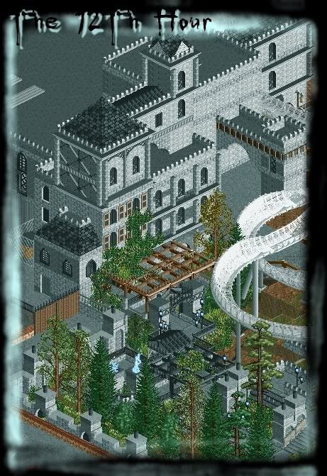
And a close up from another view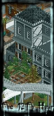
The green bush thing is supposed to be an overgrown tree/bush thats taken over the front of the tower, all to add to the spooky ambiance.
Please let me know what you think.
DanThorpe
aka
Ripsaw -

 posix
Offline
green bush works well i think. had hoped to see a screen of something new but i know you've been concentrating a lot on this building and queue recently.
sorry to say but those effects you add to screens actually don't look so good. consider leaving them out completely next time. -

 Ripsaw
Offline
ok Posix i will lose the borders.
I have been working on this for quite some time because its probly the biggest darkride in the park and the building is what will really make this ride.
DanThorpe
aka
Ripsaw
 Tags
Tags
- No Tags

