(Archive) Advertising District / ThorpePoint is back! 03/12/5 New Pics!
-
 04-May 08
-

 Louis!
Offline
It's a great improvement, and all you've really done is added a few details to the flat roof. It's just little things like that that make a decent screen a great screen.
 -

 Todd Lee
Offline
I love the look of the dark ride, you've got a winner there! And, you've chosen the perfect colors for the area with the suspended coaster, the gray, brown and black all work so well together!
 -

 Katapultable
Offline
Fraid not Mozilla haha, the change was the Psychosis layout haha
I was about to say that!
-

 Ripsaw
Offline
UPDATE:16/04/09
11.59 AM : PSYCHOSIS IS COMPLETE
Thats right peeps Psychosis is finaly complete, all the custom supports are finaly done. The Station is complete, the trains have arived...
Thorpe Point gives you the 8 Inversion B&M Floorless Monster that is P S Y C H O S I S.
The Custom logo for the ride and the Height marker,all the rides have them,a dark orange band = 1.4m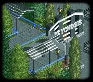
Next the layout in all its glory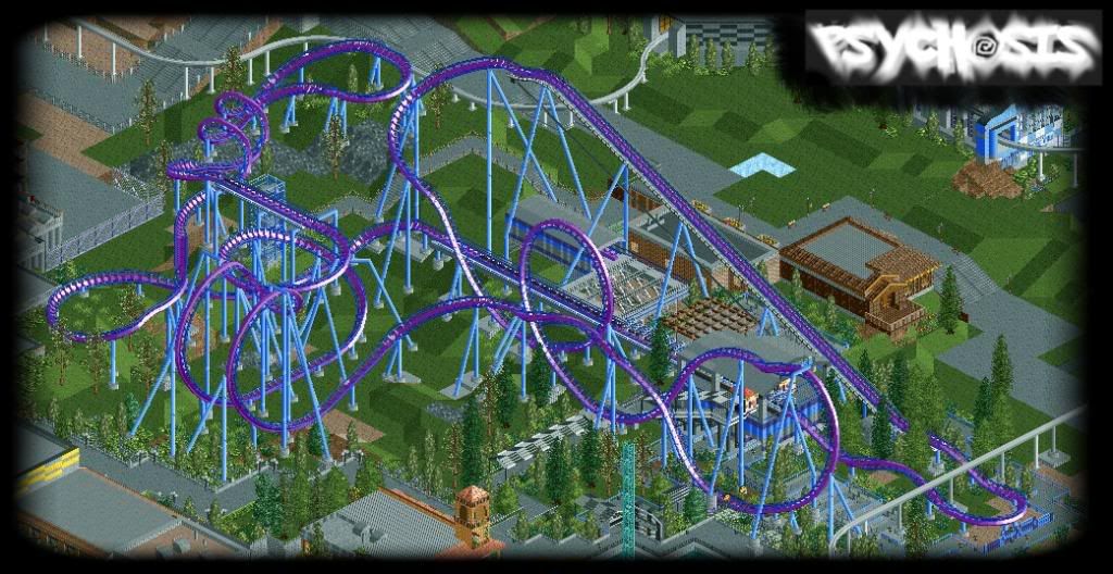
Behind Psychosis is a new restaurant,yes they are supposed to be dumpsters on the right hand side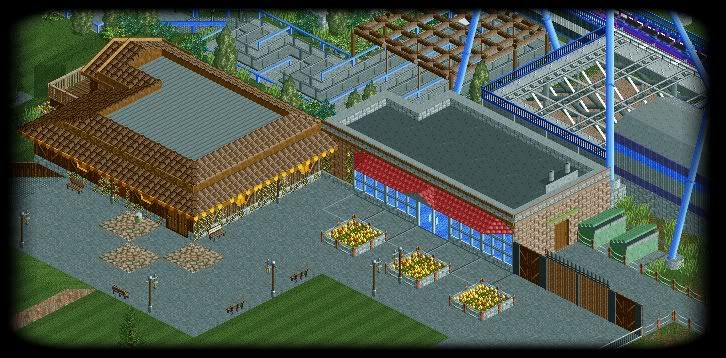
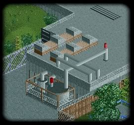
Finaly the new roof on the 2nd monorail station,with a bit more texture now=]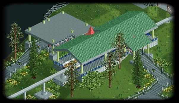
Well there ya go, comment as usual, as tesco says.."Every little helps" -

 Louis!
Offline
All screens are good.
But that layout is awesome. Really really really good. And the colours are cool too. -

 Louis!
Offline
Oh one thing I forgot to mention was that I dont like how your cobra roll is like this:
/\ when it should be more like this \/
If you get what I mean, the top should be wider than the bottom. -

 Xophe
Offline
I agree with everyone else. Great layout and nice supports too. I love the signs you make for the rides and this one is particularly good.
 -

 CedarPoint6
Offline
You know my thoughts-- this is maybe my favorite layout in the park. Love the colors too. Glad you were able to use my ending idea for the layout. Everything else is looking pretty excellent too-- liking it more and more.
Also, catch me on MSN when you get a chance! -

 Ripsaw
Offline
Thanks for the comments peeps, i'll see what i can do about the cobra roll altho i fear it means changing quite a bit of the layout to make it fit..I was very worried about what people would think about the the restaurant but there have been no bad comments =]
Keep ya comments coming there all welcome
 Tags
Tags
- No Tags

