(Archive) Advertising District / ThorpePoint is back! 03/12/5 New Pics!
-
 04-May 08
-

 Katapultable
Offline
Holy shit! That's awesome! I'm glad you're back!
Awesome logo for ''Virus''!
The area around the Sky Coaster looks better too. -

 Louis!
Offline
The buildings seem a bit flat faced. Maybe try some overhangs/awnings etc.
Also I think the monorail station needs another texture, something like a tile roof. It's nice and is well constructed it just needs another texture to stand out. -

 misterthom
Offline
i dislike the combat shop, it looks very undetailed, however it fits in great. The entrance of virus is stunning!
 -

 JDP
Offline
I would mess around a little more with the roof of the monorail. Other then that it looks good.
-JDP -

 Brent
Offline
I like how you have the supports acting like they're going through the queue's roof like that.
 -

 posix
Offline
so glad to see you back. screens look very cool! i really hope you can finish this park.
 -

 turbin3
Offline
Really good!
Maybe make your houses bigger & add benches or lamps.
Finish thisss park!
-

 Ripsaw
Offline
Hey peeps thanks again for the comments, a new ride that is basicaly complete is the new family Darkride which takes you into the heart of Mount Etna. A volcano famous for its constant acctivity and unpredictable behavour, You shall board your small truck insearch of the natural bueaty of the caves and formations deep with in the volcano, but a wrong turn sends you into a small lava flow,as if it couldnt get any worse, Etna erupts and the small flow becomes a fiery heated torrent!
Will you escape the inferno on Expedition:Etna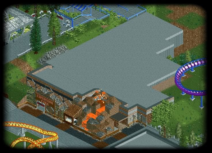
The building might not look big but it goes deep below ground level.
Oh see if you can spot another change in the screenie -

 Louis!
Offline
I really like that. Maybe put some detailing on the roof (vents etc) to stop it looking boring.
But the facade is really nice. -

 CedarPoint6
Offline
Ah, I see you were able to use that layout idea... glad it helped!
Looking good on the dark ride. Like Louis said, roof access (ladder or stair) and vents on top would be nice. Really love the facade actually-- that's looking great. I think you can probably do with some more intense foliage... catch me on MSN when you get a chance and we'll talk about it!
Looking great. -

 Katapultable
Offline
The outside of the building could be more 'explosive' if you know what I mean. It's a cool idea.
The other change I see is the color scheme of ''Heatwave'', wich now has darker rails, brighter spine and gray supports, am I correct?
By the way: I love this park! Please finish it. -

 eyeamthu1
Offline
It'd be nice if you gave the dark ride a bit more of an 'entrance plaza', seeing as it seems like quite a 'big' ride... it kind of just looks like - as a guest - you'd be walking along the path, and then the dark ride is suddenly just there, squeezed in right against the path. HOWEVER, I think you've got the actual building and facade perfect. That's how it'd look in real life. Decent, enticing theming on the front... and the remainder is hidden, so it's left bare. Sorted.
 -

 Xophe
Offline
I really like your style. It's very clean and refreshing.
The Etna screen is nice! How about having some rocks jutting out into the path a bit (eg in the far left corner)? At the moment the transition from path to facade is a bit square... -

 Ripsaw
Offline
Thanks for all the comments,to be honest i thought the darkride would be risky and not overly welcomed, but obviosly i was wrong.
Heres the Updated picture of Expedition:Etna.
Theres now AirVents,SmokeVents(Flat Ones on roof),Gas Pipes and ladders, at the back altho not shown yet is the gas tanks, access doors ect.
And The area has been more tied together now, the entrance to etna is really to be taken from the left but the wooden fences and wooden paths should show there in a specialist area.
Please Tell me what you think
Expedition:Etna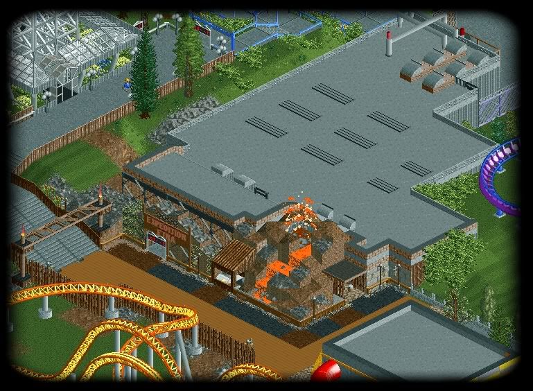
-

 SSSammy
Offline
i really think that this is going to be a good ride, but as a good ride, it should have abit more of an entrance like someone above said. id does look linda like an afterthought, and unimportant.
well done on the new vents, but i dont think there is an escape hatch unless im being dead stupid (likely)
i <3 this thread. -

 Katapultable
Offline
I wanna know if I was right. And I see another building in the bottom of the screen with some sort of slide.
It looks better already, but it can always be better. Maybe it's an idea to build the volcano over the entire entrance. -

 Ripsaw
Offline
The Volcano at the moment is just a little peice of scenery if i make it cover the entrance it will make the area too crampt..
The change Mozilla is the change to the layout of the last section of Psychosis and the slide is part of McDonalds. Im about to add 2 new screens so keep looking over next 15 mins. -

 Ripsaw
Offline
Ok Next 2 piccys, ive tried to make it more of a set area with in an area, theres the banner/path coverings at both ends and other little bits. The other pic shows the backstage gas tanks and pipes,access doors, ladders etc.
Please comment as usualy =]
Front of the ride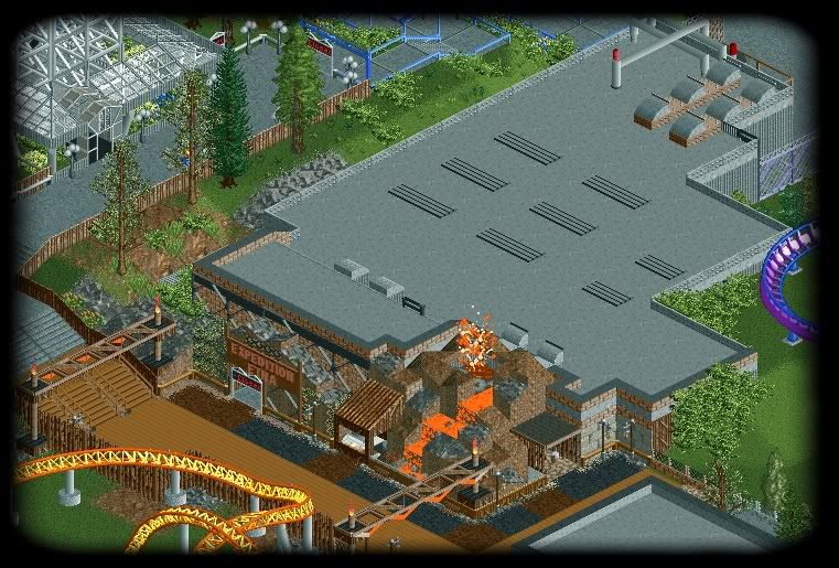
Backstage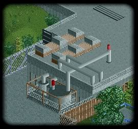
-

 J K
Offline
I like the ideas and everything you've produced so far. Maybe another storey on the flat part of the roof as it's a big flat space. Just to mix it up a bit, it's up to you.
 Tags
Tags
- No Tags