(Archive) Advertising District / ThorpePoint is back! 03/12/5 New Pics!
-
 04-May 08
-

 Ripsaw
Offline
Happy new year!!
8 Yeah..8 NEW PICS!!
The Artists Impression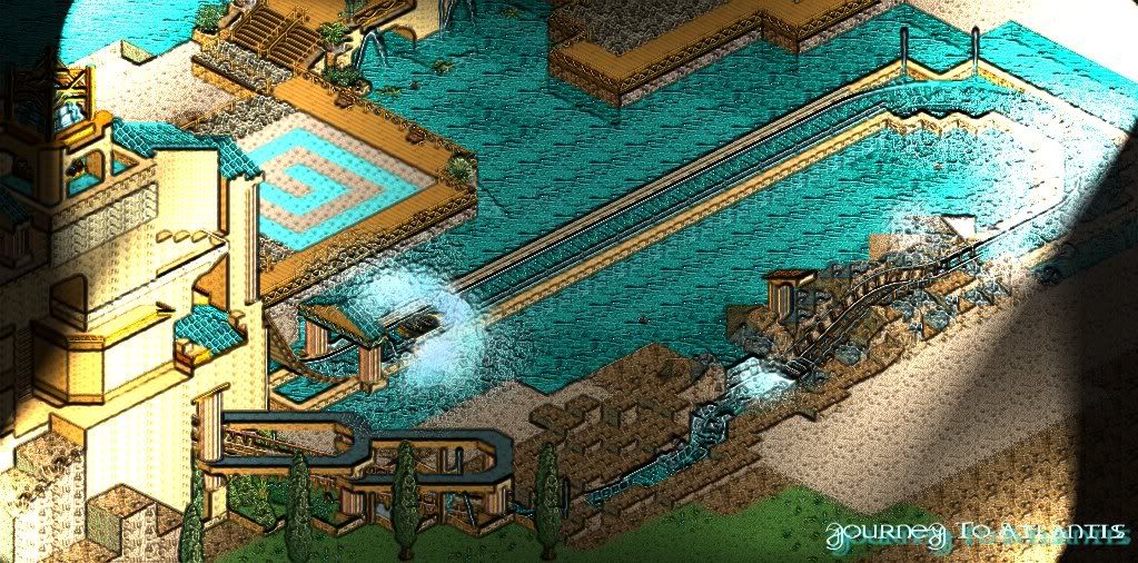
South West Overview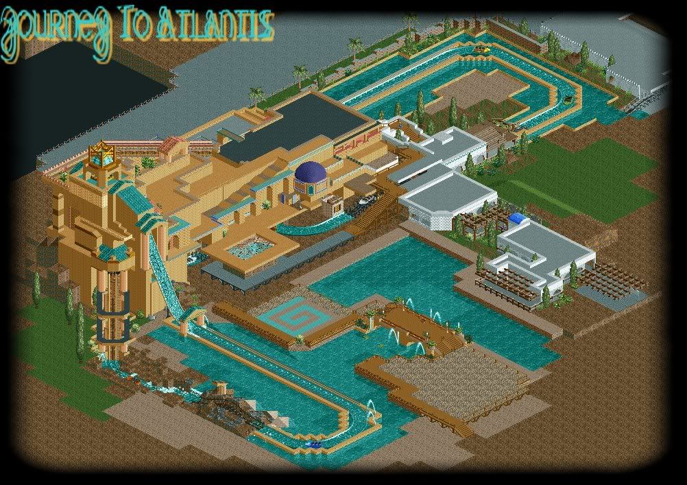
South East Overview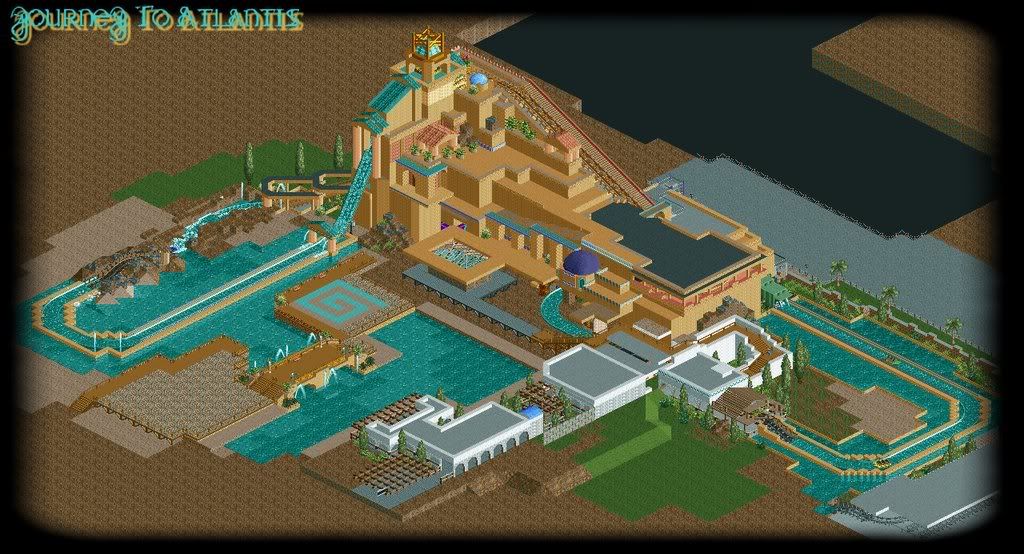
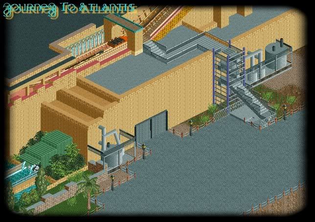
Back Stage Mechanics and Stairwells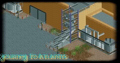
The Bridge Crossing the Lagoon to Atlantis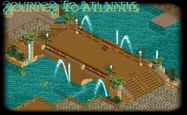
The 2nd Splashdown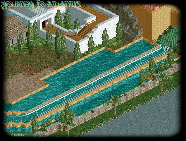
And Finaly the End Part of the Queue Building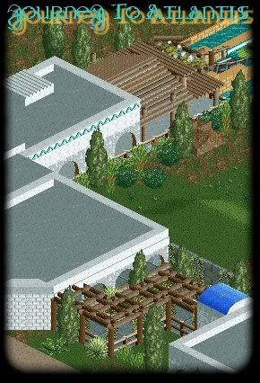
There ya go theres the pics..
All comments apreciated as usual!
DanThorpe AKA Ripsaw -

 Midnight Aurora
Offline
3rd screen shows just how plain and dull the building is. It looks great on the diagonal shot in screen 2, but the game is viewed from more than one angle.
The backstage shot makes no sense... and the lift in general. Why would you want them to see all of that from the lift if you're putting so much effort into the facade? Even on the flat part you can see every bit of the walkway and access stairways, and on the lift you'd see the whole lot behind it. I would add an overhang on it thats closed to the back, but open to the front... Pillars, of course. Gotta keep it tacky in a theme park kind of way. -

 Ripsaw
Offline
Yeah but if you have a look at the back pictures of JTA at Orlando, you can see all the pumps and mechs..Plus when your on the second lift you cant really see down out over to the right unless you try to stand up lol i see where your coming from and the Building will have some more texture im just not sure how to pull it off yet..Im usising the NE Workbench"the best one ever" i think its called, and i knew a Orlando based JTA would be hard but im determined to pull it off the best i can..
My fave bit has to be the rock pool 2nd drop, which i think was the hardest bit ,that and the daigonal back in.
Thanks for the comment, any more advise greaty apreciated.=] -

 posix
Offline
ma, that post was just so "wanting to be negative".
ripsaw, i think your ride design is really damn good and i hope to see some finished projects of yours soon, rather than just screens. -

 Nokia
Offline
i feal like i would like this project more if you didnt post like 8 screen in one updated showing the same thing in each screen.
if you wanna post a teaser of the thing your about to build..okay thats cool, but dont keep showing us the unfinshed crap every update. i think you should wait intill you finsh the journey to atlantis then post an update. i mean the fourth and fifth are bascily the same screen just dif. angle.
as for the screens, i really only like the fifth one and the last one.
i hope you'll take my advice in the future. -

 CedarPoint6
Offline
^ I'm not sure I would take your advice if you keep calling it 'unfinished crap' and stuff like that. It's hardly crap, and always seem to be negative in about the most extreme way possible. Maybe if you were a bit nicer about it, he could be more inclined to take your advice.
As for the ride, you know I'm pretty impressed. Your style is really starting to become its own. You're quite good at adding a lot of little details, although I think you're still gonna need to pay attention to the details you add to the building, so it's not plain, but not over detailed. The visible stairs makes perfect sense. You need a visible exit route for means of egress, in correlation with building code. So a visible exit is perfectly acceptable in this situation. Looking forward to seeing more... hope you did a little bit of interior at least! -

 JDP
Offline
I said something like this once before. Most underrated parkmaker on NE and while I am at it... most over looked project at NE. I don't think you will get a Spotlight, however I do think you can pull off a Gold. Good work.
-JDP -

 Ripsaw
Offline
Hey Guys, ok ive taken the comments into account, and the Building is slowly becoming more complete, The station and queue line is almost complete, well heres the pics hope you like them, and keep the comments coming, JTA i reckon will be complete by the end of the week.
Overview South-East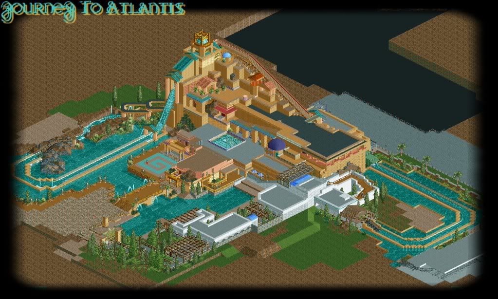
The Entrance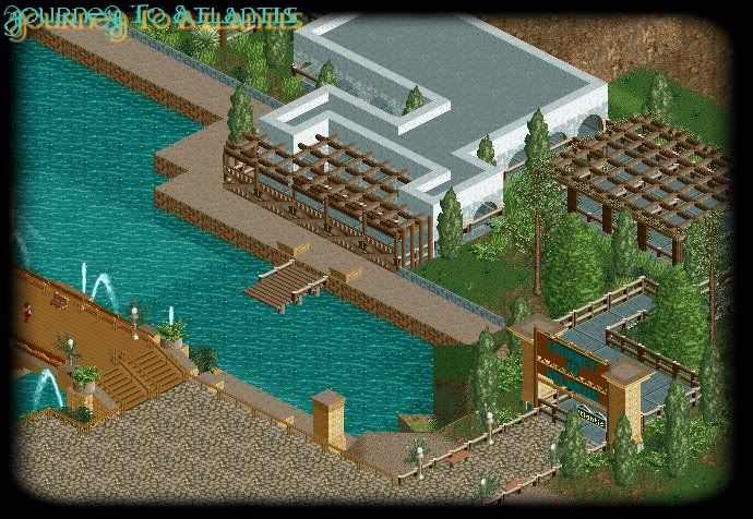
The Jewel of Atlantis Shop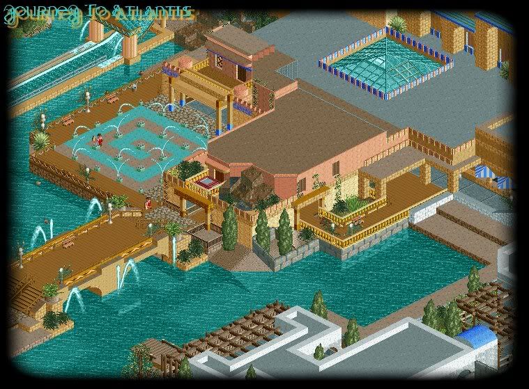
Overview-South West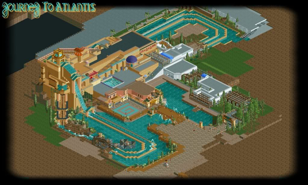
Like i said all comments are apreciated
DanThorpe AKA Ripsaw -

 Sey
Offline
I can't tell what it is, but your foliage looks kinda messy. All the rest is just great!
 -

 Todd Lee
Offline
What you've got looks great, but it's already gotten old to me, I've seen like 50 screens of the same thing. (all in your topic, by the way)
 -

 Evil WME
Offline
Maybe some people just want to show what they've built, instead of teasing everyone with hardly anything. Or more likely, not being a tease at all.
For me, i see a design and a potential spotlight here. Some stuff is still rough around the edges, but it looks like you have the skill to fill that in. I love how you build your basics first. The park is nearing 'finished', but there is hardly a 'completely finished' part to show. The best way to build, imo.
Good luck with making the park work in its entirety! -

 Todd Lee
Offline
Maybe some people just want to show what they've built, instead of teasing everyone with hardly anything. Or more likely, not being a tease at all.
You make a reasonable arguement, I retract my previous statement.
The ride is looking great, I guess my eyes are directed to the main building every time I look at these screens, resulting in my overlooking the smaller details that ripsaw has been adding in each update. -

 Ripsaw
Offline
Well guys JTA has now been submitted and after a long wait a NEW PIC from ThorpePoint ThemePark, this time its the new station for Snowstorm BobRun..
I wanted to give a sort of rustic feel, but without it look looking too"woody" hope you like it, please comment, and enjoy JTA when it becomes avaliable =]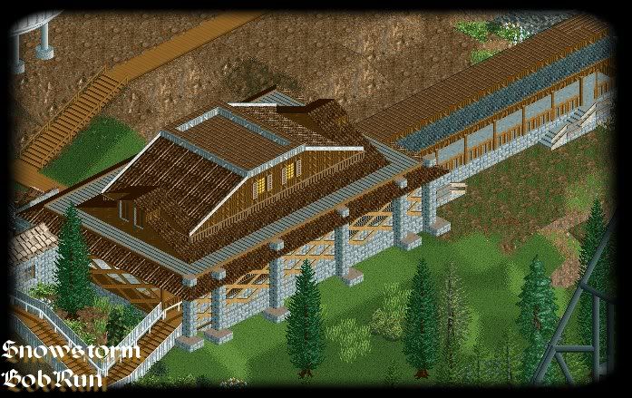
-

 robbie92
Offline
This project was one of the projects that caught my eye when I was new at NE. I feel that your sense of realism is great. However, looking at the overview, everything seems a little crammed to me. I just wish that maybe you could've utilised more negative space, or rideless areas, rather than coaster after coaster. However, I love this project, and hopefully I'll see it on the front page too.
PS: Lookin' forward to JTA as well. It makes me hate that I live in Californai, where we have the shitty version.
 Tags
Tags
- No Tags


