(Archive) Advertising District / ThorpePoint is back! 03/12/5 New Pics!
-
 04-May 08
-

 Ripsaw
Offline
Just make this quick 2 NEW pics of the Cyberdyne Building and just for JDP a lil more DangerZone lol
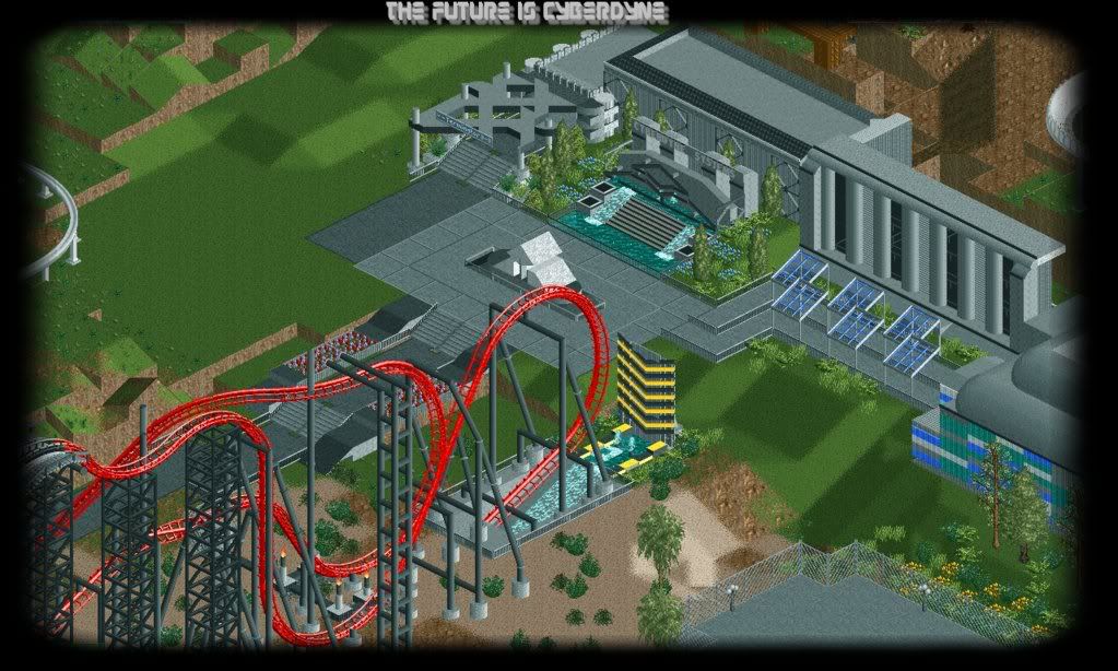
And a close up...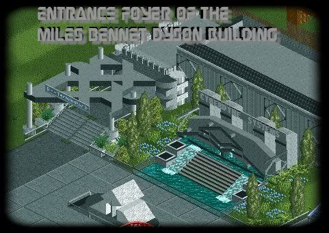
Keep the comments coming
Ripsaw AKA DanThorpe -

 Ripsaw
Offline
Right ive been busy and i though you would all like to know how Cyberdynes coming along..
I re-did the Cyberdyne Logo, many many times but none resembled it, i belive the new one does.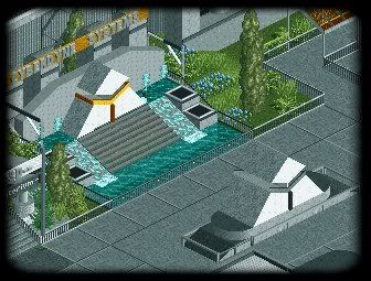
Next Two show The the Cyberdyne Building with the T3:3D Sign now on.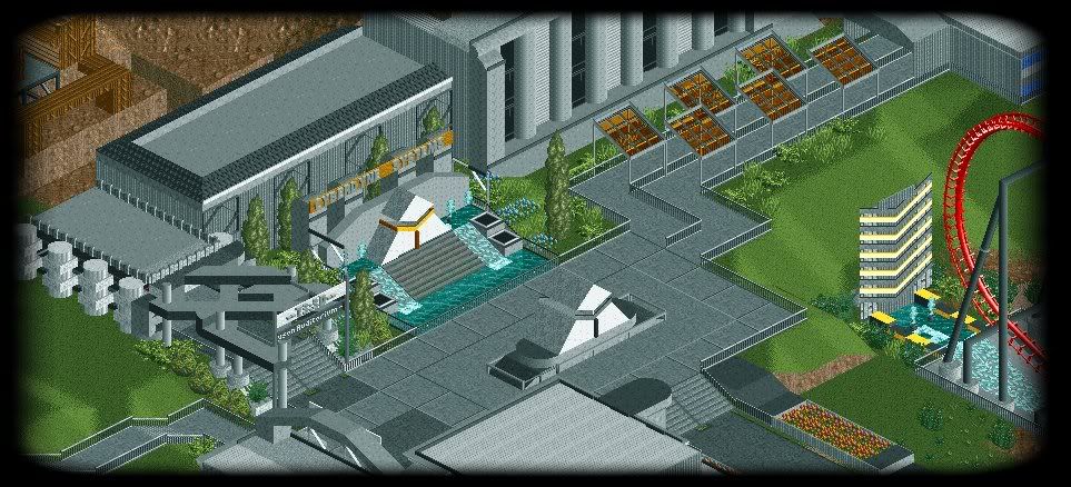
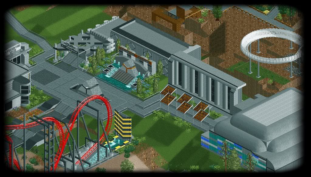
And The final shot shows Cyberdyne Tech the T3:3D shop, i find shops really hard to do and i really like this one,hope you guys like it too.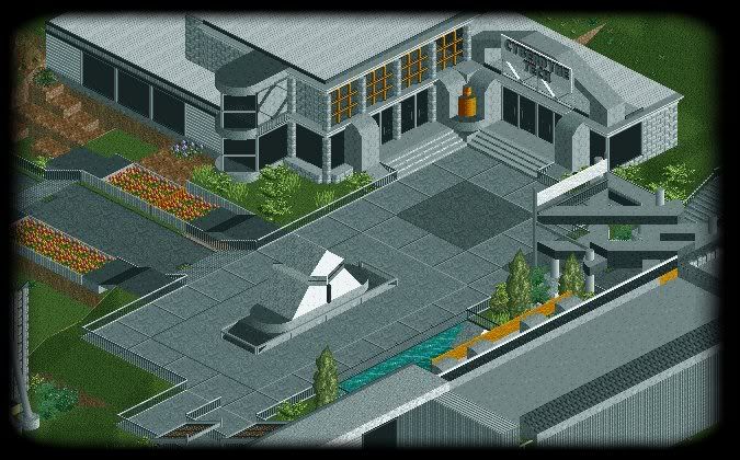
Get ya comments in,there always welcome and remember.....
The Future Is Cyberdyne.....
Ripsaw AKA DanThorpe -

 Katapultable
Offline
Looking great. It's getting better and better. Cool new sign for Cyberdyne. But I saw on the Vekoma site that Hotel Embrujado is actually a real Vekoma-madhouse.
 -

 Xophe
Offline
You've pulled off the corporate/industrial theme really well. I love the shop! Keep it up!
 -

 Pudding
Offline
3rd screen is great! Hope you'll improve all your foilage, cause almost every screen you show, is so bald.
 -

 Ripsaw
Offline
Another updated pic of the Cyberdyne area..
First pic is the 1 in the dump place, the Second is the full size pic.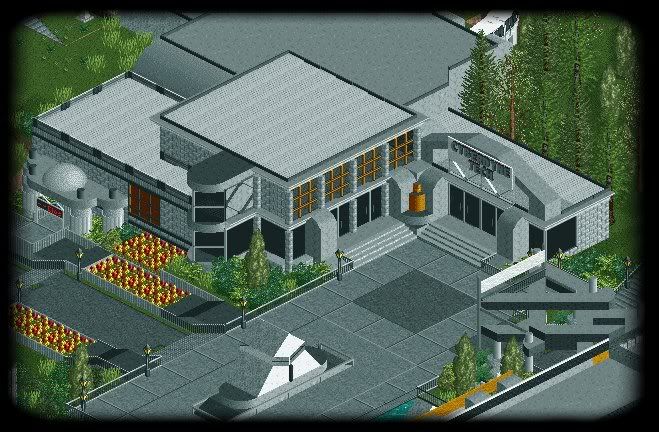
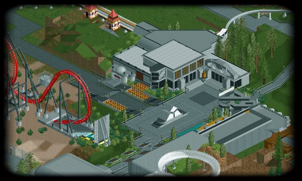
Keep the comments coming...
Ripsaw AKA DanThorpe -

 Katapultable
Offline
Can you show is an overview of the entire park? I'm really starting to like this. The Cyberdyne area looks cool. But what's up with the entrance in the left of the shop, is that for the monorail?
 -

 Ripsaw
Offline
I may do a overview soon,and yes that is the monorail entrance.
Cyberdyne is about 80% Complete and i guess will be the next area to be complete after the Mines.
I am aware its rather grey, but i was goin for a dark,corperate look, i will try to add some little accents of colour tho.
Keep the coments comming..
Ripsaw AKA DanThorpe -
![][ntamin22%s's Photo](https://www.nedesigns.com/uploads/profile/photo-thumb-221.png?_r=1520300638)
 ][ntamin22
Offline
Cyberdine is looking nice. the buildings are rather greyed out, but I think you've thrown enough color in to make it endurable.
 -

 Video_Kid
Offline
Try adding some dark purple to the area. Maybe that would spruce it up a bit.
You know my opinion
-

 RCTNW
Offline
I love the look and the $d looks like a blast. With regards to the red and yellow flowers, try flipping the colors around so that they appear a bit more random. They actually look fake in the SS.
Looking forward to seeing this one finished.
James - rctnw -

 Ripsaw
Offline
Ok Update time with 4 new pics for your viewing..
Cyberdyne Monorail Station is 98% Complete
The front of the station is themed to a friendly "air" like wall, with the cyberdyne motto..We are the future.
the idea was past the calm,"SAFE" airy wall is the true dark corperate side of Cyberdyne Systems.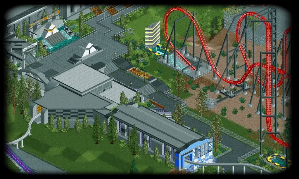
The next picture shows the progress of the Cyberdyne area.
Ive had tried added to add some different hints of colour and i took note to the flowers, well enough said heres the shot.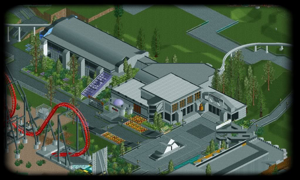
Now as theres has been such a sudden intrest i took a another pic of DangerZone, simply because i liked the screen when i came across the spot.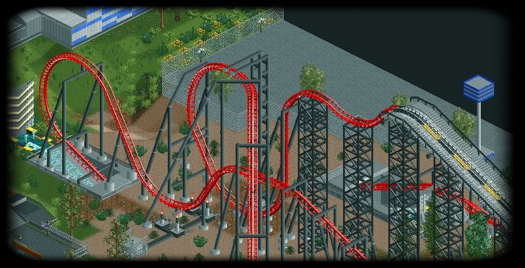
And finaly i have been starting on various foliage around the park, i did the splashdown pool of JetStream in the picture, and i really liked it so i thought id do a screen for you guys.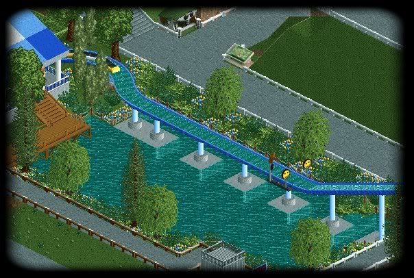
Oh and a lil bit of news, Sierra Sidewinder has gone.. but a new one will be back to wind down,around and though a new rapid ride that shall send riders though a old goldmine that has been flooded, but things turn for the worst when you ride straight into the mines gears.....
Right theres the piccys, i hope you like them but as always keep the comments coming.
Ripsaw AKA DanThorpe.Edited by Ripsaw, 10 November 2008 - 08:11 AM.
-

 Comet
Offline
I don't like the huge footers in the last screen.
Just use 1/8th tiles to make a sqaure under the circle footers and zero clearance the water. Also maybe make a boardwalk running along the splash down for some closer interaction.
Then your foliage really isn't that great, definitely something you should work on. Zoom in all the way on your screens too, it will make them seem much less incomplete. -

 JDP
Offline
I think the bottom of the 4D's drop should be a bit wider. Seems a bit too tight and I would recommend making it wider for G force sake, but other than that it looks really good.
-JDP -
![][ntamin22%s's Photo](https://www.nedesigns.com/uploads/profile/photo-thumb-221.png?_r=1520300638)
 ][ntamin22
Offline
yes to both comet and JDP.
The garden bits look quite alright but any time you've got full scale trees in the mix it just doesn't look right.
The standard of foliage around here isn't so much what is natural-looking or scientifically accurate as what looks good. Generally this means trees of similar or complementary colors in varying sizes, but usually mixed with shrubs and gaining height as they move away from the path. Real parks may have oaks hanging over the path and feature tree-lined boulevards, but it just doesn't come off as well in RCT.
The log flume footers do look awkward- it seems to me taht that's a good setup for a more architectural support system- say, a series of arches or a wooden platform. The supports as of now are probably fairly true to life but look awkward in context. being right next to the path and a splashdown area, it would be a natural guest focus area anyway- it just doesn't look like it should be right now.
 Tags
Tags
- No Tags
