(Archive) Advertising District / ThorpePoint is back! 03/12/5 New Pics!
-
 04-May 08
-

RMM Offline
ripsaw, you don't need to alter it too much.
instead of immediately going into the banked downturn after the barrel roll,
put two straight down pieces and then do the banked downturn. -
 Maverix
Offline
Ripsaw, this just adds to the reasons why this is one of my favorite parks right now. I just love the way that Psycosis looks, and those two resturants behind it are great too. I can't wait to see the way the rest of this turns out. I smell at least a Gold park in the making...
 -

 Ripsaw
Offline
Hey peeps, right the park will be Peepable,but due to the fact the rct peeps have the IQ of a pineapple and get lost on the most basic of routes, i will do one with peeps and one with out. Ill upload the new screen today of the next shop =]
 -

 Ripsaw
Offline
Ok heres the new screens, i did the first one and thought it might be more appriciated if shown closer as well.
Please tell me what ya think guys im really trying to get back into this and really work on it.
Heres the screens =]
The 3 Shops from left to right..Homemade Fudge,Restaurant and one of the those nik-nak wooden shops with funky lil souviniers.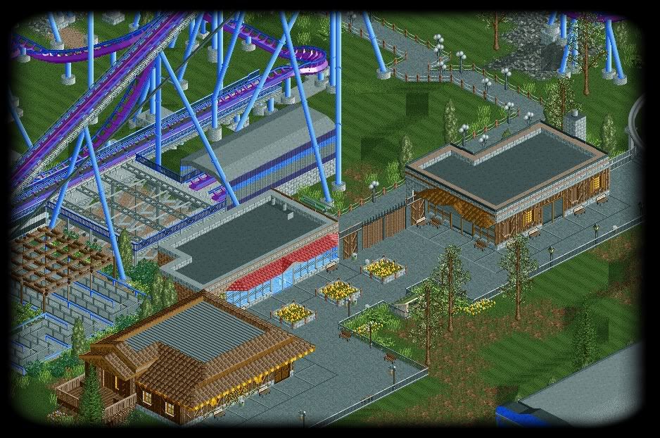
The Close-up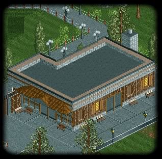
All comments welcome as usual =] -

 T.N.T.
Offline
I think you should stick with one roof texture. The buildings are great, but they look a bit confusing from up top. Also, the shop on the right; the floor looks like its elevated. What if my grandma tripped
 ! Lol, jk. But you should try a different floor texture. Lovin' the fudge building! Keep up the good work. I can just tell this will get at least Gold.
-

 nin
Offline
It's a bit flat-faced. Add some texture to it, even if you just use walls, depending on what you use can make a world of difference!
 -

 Brent
Offline
Hands down, one of the best layouts I've ever seen.
Dig the dumpsters too, but I think it's kinda weird how you have that fencing next to it, in an area that is already blocked off to the regular peeps... -

 Louis!
Offline
Definately something you have there. I find your style refreshing and even different in a way to other realism, it's really nice, although at some points the buildings seem a bit flat faced.
 -

 posix
Offline
really, i think the screens look awesome, but the shops would be nicer if they would tell from the outside, from their appearance, what they're offering, what kind of shop they are. like, the way it is now, which is the restaurant and which the home made fudge one cannot be told that easily. it could be either. maybe add some banners or a sculpture of a fudge at the entrance of the shop. some "identifiers", so to speak.
 -

 SSSammy
Offline
every chance i get, louisthe rct peeps have the IQ of pineapple and get lost on the most basic of routes,

seriously now, that layout is sexelent.
one of the best layouts ive seen in a berra long time.
although i agree on the fact that the shops do look abit flat.
easily one of my favourite topics. -

 Ripsaw
Offline
Ok heres another update..
My other halfs been on rct for the whole weekend and wouldnt let me carry on with my project, so since 9am to till 1pm i have been contructing the next 2 shops, both are franchises
KFC at Chemical Warfare
and
Costa Coffee on the DepthCharge waterfront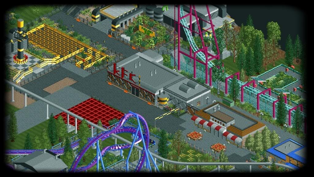
There is a backstage area for staff right from KFC down to Shooters bar.
Also note the change on Energy Blast now more realistic with the "slope" to the spike.
Keep the comments coming as usual -

 posix
Offline
the signs and banners are perfect. and i like how the buildings are flat. it makes them more realistic. well done.
 -

 RCTMASTA
Offline
*tumbleweed rolls by* So... how's the park coming along?
EDIT: Hey! Why'd my slogan-thing change?Edited by RCTMASTA, 28 April 2009 - 04:30 PM.
-

 Liampie
Offline
*tumbleweed rolls by* So... how's the park coming along?
There hasn't been an update since 9 days, so it's probably dead. -

 RCTMASTA
Offline
DAMMIT!!!!!!!! I was really hoping that this'd get finished! it was so close...wasn't it? But you know what...? I'm not sure it's dead... But maybe it'll end up like Snowdrift...
 Tags
Tags
- No Tags

