(Archive) Advertising District / Zippo's Wacky World of Wonders
-
 15-April 08
-

disneylhand Offline
The second one looks far better than the first. Part of that is because of the step object/colors you've used.
-disneylhand -

 Milo
Offline
first feels kinda busy to me and the brick and brown steps clash so i have to say the second
 -

 lucas92
Offline
First, since the second one just seems to make the grey building harder to see since tarmac path has the same colour than the building.
 -

 X250
Offline
Xophe! omg long time lol. Good to see you back, if i remember it was you're Billerica Bay that got me into rct in the first place lol. This park is looking superb, the screen with the rapids oozes of atmospheric goodness, and the Haggis Hunt ride looks unique and very fun to ride from what i can see.
Go for the first screen for the path. =]
-X- -

 Xophe
Offline
Thanks for the feedback!
I've decided to go for the brick path. Its main drawback was that the stairs clashed with it, but I'm now using the stairs with gaps between them with red sand underneath, which looks much better I think:
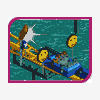
And because I've shown variations of that screen several times, here's a new one so you don't get too bored, haha!
It's a peep-friendly rotating rapids station.
Work on this has slowed down quite a bit since I've just started a new job, so updates might be less frequent.
I hope to get this finished (or very nearly done) by the end of the summer. We'll see how it goes... -

inVersed Offline
Xophe, that last screen is simply gorgeous. Everything comes together so perfectly their... the peep-friendliness of the park, the rotating station, the color scheme, the foliage.. it all works so beautifully.
I cannot wait to look at this park -

 RCTNW
Offline
This is quickly jumping to the top of y list of anticipated parks! The last screen is sweet!
Looking forward to seeing more when your ready
James -

 spartan
Offline
That last screen looks like one of the best rapids stations i've seen and those peeps really help to liven up the park.
 -

 Xophe
Offline
Whoa! I think this is long overdue an update!
In case anyone missed the last fiesta, here's those screens again:


And now a new one. I haven't had much time to work on the park recently thanks to uni starting up again. But the park is nearly done! There's just quite a few bare patches and unfinished areas to complete. I decided to redo the area with the wooden coaster as I originally built it about a year ago so it looked a bit dated. Anyway here's the screen:
Let me know what you think! -

 sfgadv02
Offline
Fantastic. I love the path interactions with the coasters. The station for the railroad is neatly done, too.
 Tags
Tags
- No Tags


