(Archive) Advertising District / Värmland Park
-
 31-March 08
-

 posix
Offline
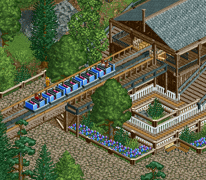
i like that last screen. just wondering when that boat splashes, the water should hit the bridge underneath and make it drop back into the boat. should be pretty nasty.
 -

 Dimi
Offline
Thank you for the comments!
@ Liampie: I don't know, I like the colours so far. I'll see if another colour of flowers matches better.
@ Ruben: I've never seen the station of Joris en de Draak before, but to be honest I love my station, so I won't change it!
@ Kong/SSSammy: I counted six supports on real B&M Flyers, but maybe they're higher than mine. In-game it doesn't look that annoying though.
@ Dark_Horse: First it was purple but that didn't look good at all, so I made it grey. I really think it's better this way.
@ posix: I haven't thought about that yet, but I'm affraid I can't avoid it. It doesn't really matter because it's very clean water. -

 Maverick
Offline
Perhaps the underside of the bridge has a series of gutters to catch and redirect the water down elsewhere.
-

 Cena
Offline
Tell me, what is the point of having a water splash ride in a park, where guests don't get wet in?
Dimi, I have respect for you, to finish old stuff first! Hopefully this can become a gold I like the screens! Good luck.
-

 schoentje
Offline
the use of a water splash ride in a park where guests don't get wet in, is that guests don't get wet in it. I'm happier coming out of a splash ride nice and dry then wet and cold.
Nice work Dimi! to bad rct-guide is gone. i havent checked the new group park yet but im very excited to check your part! i've been gone for a long time, but now really excited to get cracking again after my holiday to Nepal !
cya -

 Dark_Horse
Offline
I'm confused by Cena's post. That second creen has a real nice charm to it, Dimi.
 -

 Casimir
Offline
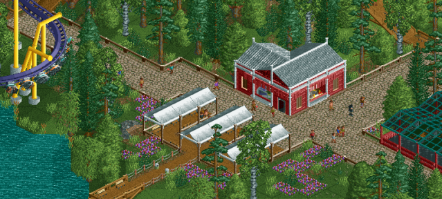
I love how clean and organised it is. It's kind of NCS-ish with some little, subtle additions like the little wooden plank catwalk. I don't really like the first screen as mouch, though. The foliage still looks a bit bare in some places.
 -

 Liampie
Offline
The first screen is nice but you can do better! The foliage doesn't look as detailed as usual and there's not much to see. The building is on the border of blocky and the straight paths don't really help camouflaging that. Good but not great.
The second screen is much better.
-

 turbin3
Offline
1st screen:
Looks good, but I neither like the flowers nor the rest of the foliage. I agree with Casimir and Liampie about the foliage.
2nd screen:
I love it. This clean style is really nice.
-

 BelgianGuy
Offline
Lookq great and I agree with the comments above,
BTW schouldn't you be building something else? -

 Dimi
Offline
@ posix: thank you.
@ BelgianGuy: I am builidng on it right now, actually. This update has been ready for weeks. -

 Dimi
Offline
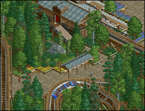
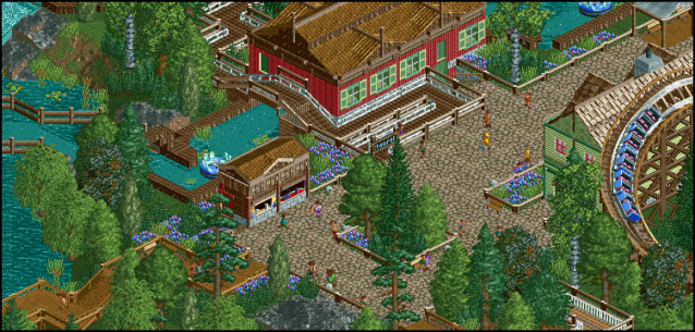
I guess the park is at 97% now, and I hope to submit it by the end of this week. These are most probably the last screens I show.
 Tags
Tags
- No Tags
