(Archive) Advertising District / Värmland Park
-
 31-March 08
-

 Splitvision
Offline
I've been there once, in a cabin unconnected to both the national water network and the electricity network, in the middle of nowhere. It was like 2 hours of driving straight into a super-dense forest. It was very remote and desolate but it was a pretty cool experience too to live like that for a few days.
 -

 Ruben
Offline
Hey Dimi,
Back at Rct-guide I really thought it was a shame you never completed this park! Great to see you're trying to complete it. I just hope you'll stay true to your old style, because the old part of this park was very nostalgic and that's (imo) what made this park great to watch!
Keep up the good work! -

 Dimi
Offline
@ RCTNW: thank you, too bad it doesn't look that good from the three other angles.
@ Ruben: nice to see you here, I hope we see something from you soon! I promised myself to maintain my old nostalgic style in Värmland Park, but of course my style has improved in my newer work. -
 highroll3r
Offline
Nice flying coaster. The supports look realistic. Is there a catwalk on the other side???
 -
 yocoaster
Offline
WOW this is really good....u pretty much pulled off the Dutch look....(lol u can tell imma newbie by the way im tawkin lol....hopefully that changes w/in a few months)
 -

 Ruben
Offline
Why are all Dutch people good at this game..?
He's Belgian. Btw, a lot of Dutch aren't, there's a certain (huge) dutch site with a lot of very crappy builders, but those don't come to NE too often.
  maybe that's why?
@Dimi: Could you give us a new overview? I'd like to know where/how the multilooper is located in the park.
-

 Liampie
Offline
Why are all Dutch people good at this game..?
WOW this is really good....u pretty much pulled off the Dutch look....(lol u can tell imma newbie by the way im tawkin lol....hopefully that changes w/in a few months)
Haha! Dimi is Belgian and the park is Scandinavian!
-

 Dimi
Offline
Haha I don't know if I should take that as a compliment or not, but I'm happy you all like it!
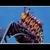
New screen, slightly unfinished: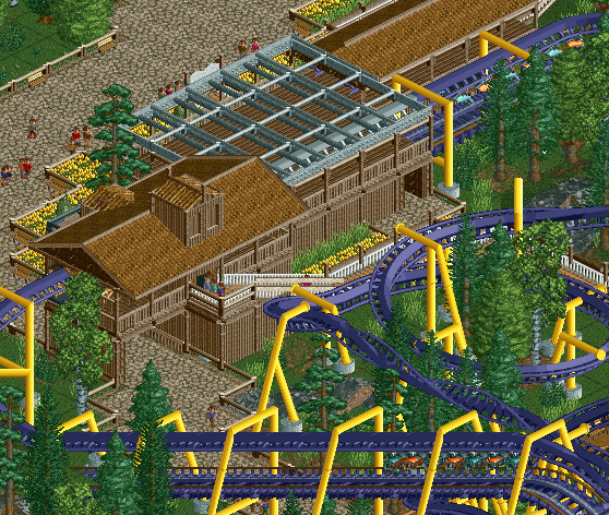
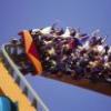
Old screen, but I never showed it in this topic: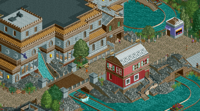
-

 Liampie
Offline
Very nice, but I think the first screens needs one more colour. The yellow/blue doesn't really blend in well in its surroundings.
 -

 Ruben
Offline
For some reason I really like the snack stand on the 2nd screen! The building/ride looks good. Only thing I dislike is the coaster station, It makes me think of Joris en de Draak in the Efteling, and that's not a good thing I suppose....
 -

 K0NG
Offline
I'm with walto, I love the colors of that first screen. I think the lift might be a tad over-supported but otherwise it looks great.
 -

 SSSammy
Offline
I'm with walto, I love the colors of that first screen. I think the lift might be a tad over-supported but otherwise it looks great.
-

 Dark_Horse
Offline
Keep the transer section the same color as the rest of the track. Right now it blends in too much with all the gears and gizmos. Other that, looks pretty good.
 Tags
Tags
- No Tags
