(Archive) Advertising District / Brush Blaze
-
 27-February 08
-

 Lateralus
Offline
Ok...
It's been at least since 2005 since I made a coaster, let alone a decent one. Mind you, although this is new stuff, I am very, very rusty, and not up to par to what some people can pull off. Anyway, I am open to criticism. Onto the coaster!
-B&M Inverted
-4 inversions (loop, 0-G roll, dive loop, wingover).
-mostly terraformed; the station is terraformed.
-many tunnels
-some sister rides around.
One more thing; I can't do supports, and if I will do them, they will be the last thing I do.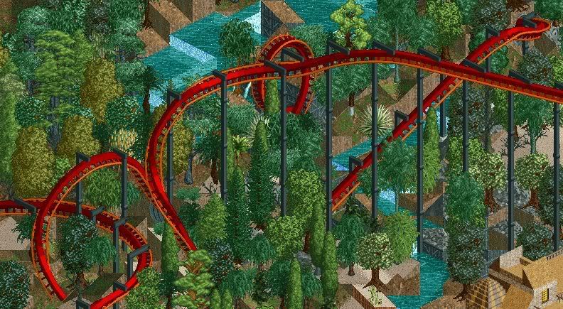
-

 Gwazi
Offline
The landscaping needs to be reworked. It should flow more, rather than look like a jagged rock, except without the rock. Otherwise I like it.
 -

 SUPA-X
Offline
its decent to look at.
thing you need to use more textures in your buldings.
and the ride doesnt look like it flows with the landscaping just like gwazi said.
i also think it would look 2x better if you put supports on the coaster [if you have them in your scenery] -

 Lateralus
Offline
As I said, the supports will be the last thing I do. I can't do them well, but I'll try my best.
The scenery will be reworked. And there will be more buildings; don't worry. -

 Lateralus
Offline
Update:
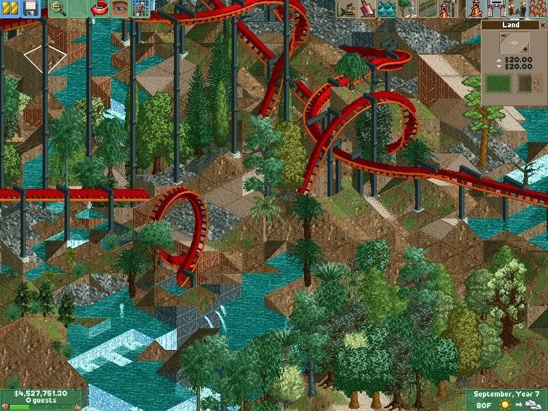
Land around coaster has been smoothed out. I don't know what to add though...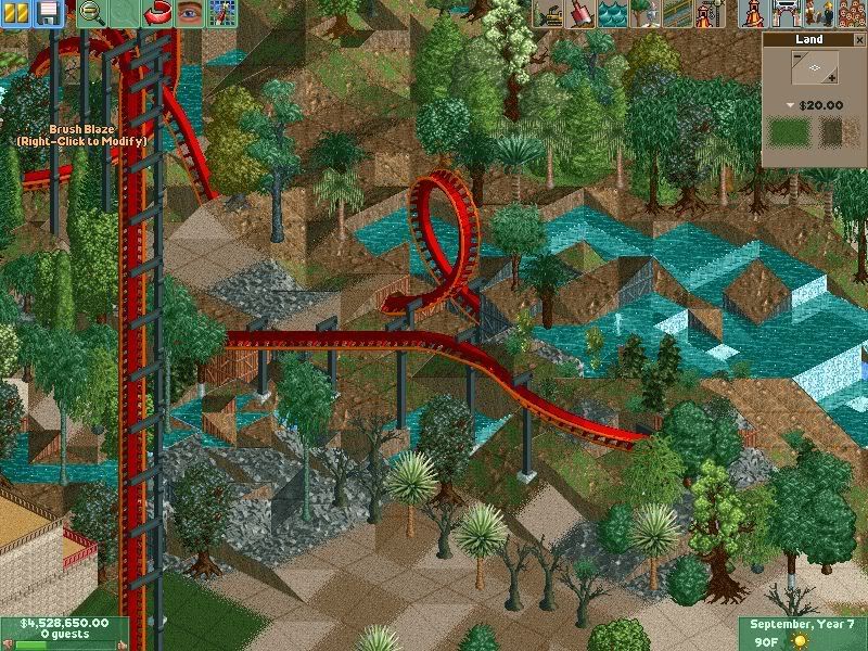
-

 dr dirt
Offline
Looks pretty awesome. Maybe add some more paths that go by certain parts of the coaster, that would be neat.
 -

 Lloyd
Offline
I don't think the foliage has any real continuity, try and plant trees that would actually grow in that area. It'll help any 'theme' emerge.
 -

 Lateralus
Offline
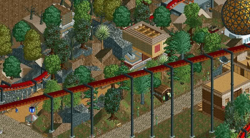
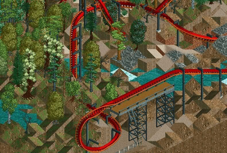
More pics. I tried Dr. Dirt's suggestion, and built a few buildings also.
The trees will all be redone; don't worry. It's just that I remember this one nature park in North Carolina that had a huge mixture of trees; pines, palms, anything. And it was on the Outer Banks, so it was near the sea. That was the look I was going for.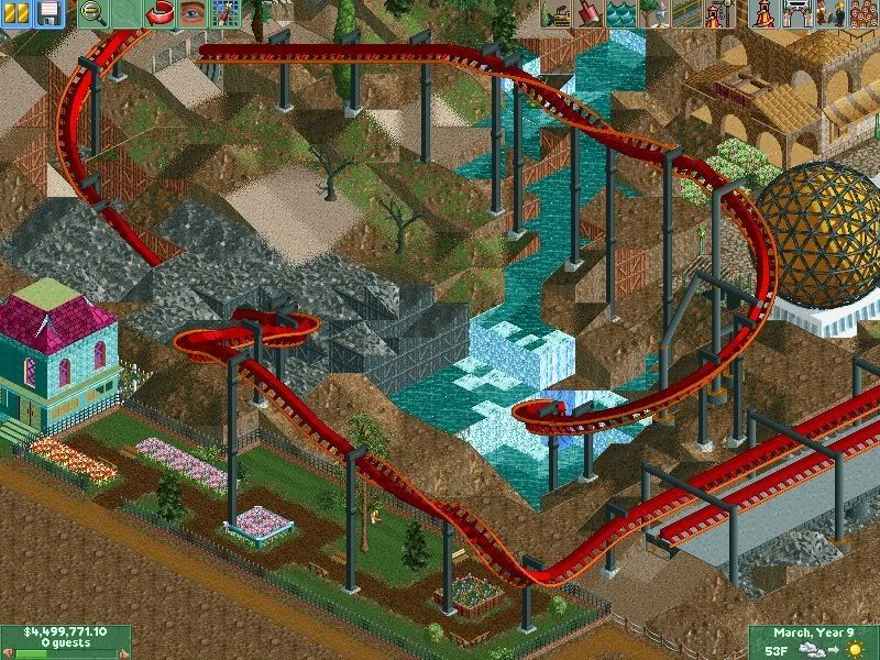
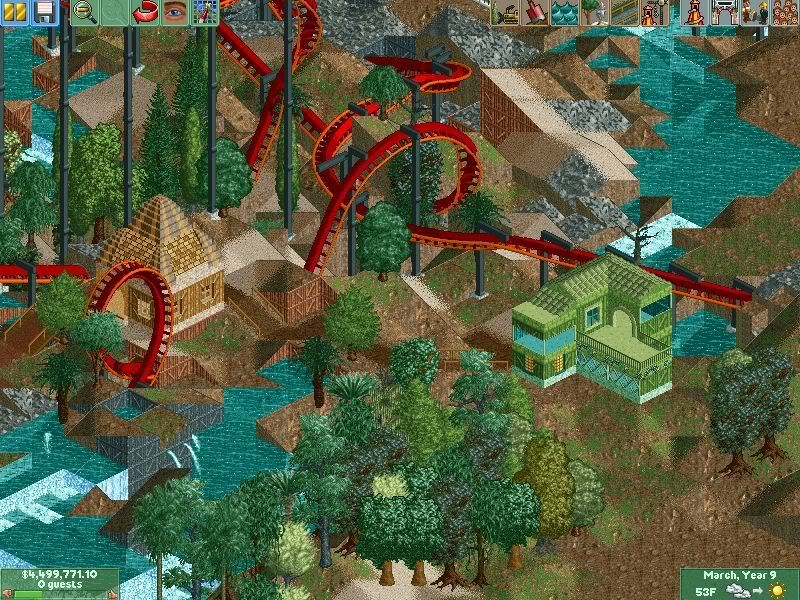
Also, the name and color scheme are somewhat temporary, just to let you all know. -

 ChillerHockey33
Offline

Noo no no. Take that out.
The new screens look like you just built buildings just to have buildings there.. -

 Lateralus
Offline
Take what out? The dive loop? I personally like it.
Honestly, the buildings in the new screens are experiments. I might raze them later; I don't know. -

disneylhand Offline
^
http://newelement.co...ule/week06.html
Mamba Kilima has one like that.
Not necessarily saying I like it either . . . Just saying, well I don't really know actually.
-disneylhand -

 Lateralus
Offline
I realize many won't like the dive loop. However, it is something different, and I like to experiment a little.
However, if enough people start saying that they don't like it, I'll consider doing something different. Thing is, taking it out will jeopardize the design of the coaster.
Maybe I'll work on a different ride. -

 Lateralus
Offline
Ok; reworked dive loop (rather it's now an Immleman):
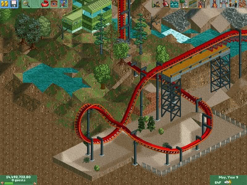
Also, I have added some buildings (will be posted soon).
Comments? -

RMM Offline
its nice. looks like old school.
where everyone played to build fun coasters
nothing else. not to post it and have it critiqued by everyone.
tellin em to take shit out and remove this bush and all that.
i like it. -
![][ntamin22%s's Photo](https://www.nedesigns.com/uploads/profile/photo-thumb-221.png?_r=1520300638)
 ][ntamin22
Offline
It was an immelmann and is now a dive loop.
Immelmann = half-loop with a half heartline at the top to return the train to normal orientation, above and facing the opposite direction of the way it entered the element.
If you did the same thing backwards (i.e. a half-roll and then a half-loop downwards so you ended up underneath your starting position) it would be a split-s. -

 Ride6
Offline
Don't give into the demands for smooth boring land!
I miss the days when jagged rocks were cool because at the very least the parks were somewhat interesting to the eye... Now they're all trying to make "realistic flowing landscapes" which 9 people out of 10 blow at. Admittedly there are those who rule at it (Natelox, Fatha, Mala, Geewhzzz) but most of them only pop up from time to time anymore and the first three figured it out by making messy horrible landforms first, then figuring out how to clean it up and make it look decent.
May I suggest reversing the direction of the barrel roll though? It wouldn't flow into the turns (that follows) banking very well with the way the game does things and would make for a bad transition...
I also like the dive loop in both of it's forms, whichever one makes you happy is best. Truth be told: coasters are a personal matter, many of the "best" ones don't do anything for me (a few really do though), and many others that have "issues" I find a lot more interesting and special.
Basically I'm telling you as a beginner here is some basic advice:
1: Don't listen to 90%, if not all, of the advice given here; if you do it'll end up turning you into another person building in the established style of the moment and that's that last thing NE needs.
2: Plan out architecture with care. It takes a long time to get good at making buildings; I, for one, still suck pretty royally at it. But when you plan things and are willing to rip them out and try again until you get the image in your head out onto the screen then you'll get amazing results (unless of course the images in your head involve lots of rectangular shacks, but I doubt that).
3: Pay attention to what you do with water! Water that's at the level of the ground surrounding it looks like it's about to overflow. If that's the idea, then go for it, but if you're not trying to create wetlands, or a man-made fountain with assumed depth control I recommend making sure the water is in a location where it either can't flow downhill or is in the form of a waterfall...
4: Build your way! If someone tells you to do something that doesn't fit with the image in your head or the way you want things done remember that they're probably not going to look at the park anyway, and if they do then they're not going to care about/notice the particular detail they decided to nag you about when you showed screens.
And, um, build your way some more, and ignore us some more. You can generally tell by the tone of someone's writing, or the title under their name (member, bah; parkmaker, oooo... mod, aaaaah; management, *gasp*). Those who are 'members' are for the most part just like you. Sure they might have a runner up or design or two to their name but experience aside they'd be parkmakers, mods or management if they'd really worked their way up around here (there are a few exceptions, but generally).
Oh and have fun with the game. Trying to build really good stuff can be really rewarding, but if you're not having fun it's not worth the effort, so make damn sure you're having fun.
Ride6 -

 Gwazi
Offline
It may just be me, but even though I'm not the most realistic builder, I can't stand jagged landscaping...
 -

 Camcorder22
Offline
Theres actually a difference between randomly jagged and organized jagged. One is randomly raising land blocks and hoping it looks good while the other is forming the rocks so it actually resembles a land form. I used to think that randomly raising blocks would look just as good, but looking back on some of that stuff it looks pretty ugly. I think one thing that might help is building plants on blocks that go with the land type. Such as pretty thick foliage on grass or dirt, maybe shrubs or palm trees on sand, and sparse bushes at most on rocks. Looks like this ride will turn out well if you keep fixing up some of the areas.
 Tags
Tags
- No Tags
