(Archive) Advertising District / McNair Amusment.
-
 19-February 08
-

 SUPA-X
Offline
so after my Bahama Breeze thing i started working on this park. not sure if its good yet. well im thinking of calling in mcnair amusment park. well it will have 4 sections alaska key west and montanna, there might be one more but havent decided yett.
well heres some pics of the alaska section[park entrance btw, and most well all of the screens are unfinshed]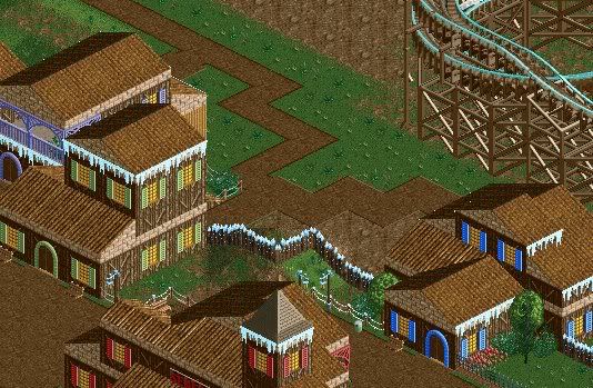
heres the entrance/station to a the gci woddie coaster polar bear.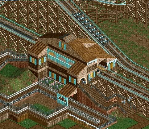
heres some more of the station.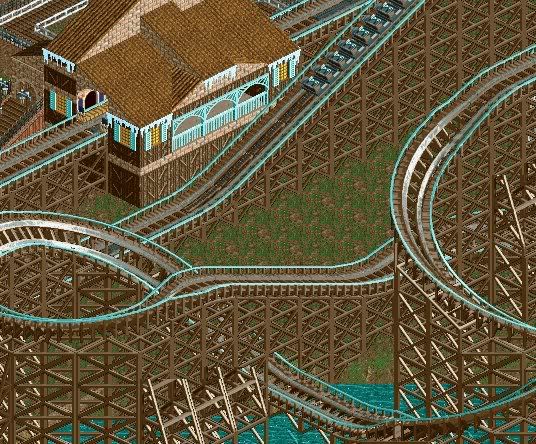
well thats about everything that i have for the momment ill try to post another update sometime this week
p.s. there are prob. spelling mistakes.Edited by SUPA-X, 22 February 2008 - 10:40 AM.
-

 SUPA-X
Offline
^haha no thats just how i do.
and the colors of what?
like the coaster are the buildings?Edited by SUPA-X, 19 February 2008 - 07:51 PM.
-
![][ntamin22%s's Photo](https://www.nedesigns.com/uploads/profile/photo-thumb-221.png?_r=1520300638)
 ][ntamin22
Offline
I see nothing wrong with the colors, but the icicle trim doesn't quite match up with the grass on the ground. You're progressing very quickly; this looks pretty darn good.
 -

 JDP
Offline
Please do not call something a GCI unless it looks like a GCI. If you need any help with that go on rcdb.com.
-JDP -

 Gwazi
Offline
It all looks pretty good, but I just have to point this out: You said four areas, but you only listed three (yes I noticed he said there might be another but then he wouldn't include it in the area count yet)...
-

disneylhand Offline
JDP, why not just giggle at SUPA-X's naivety or downright carelessness to yourself?
There's a lot of realistic inaccuracies out there around the parks at NE and I sure hope your ready to call them all out on it rather than just the ones you see in new or less skilled parkmakers than yourself.
-disneylhand -

 Camcorder22
Offline
Yeah it really pisses me off when someone says "Please dont do this..." like its a well known rule because they said so. Or that they think they should be respected enough that they actually expect someone to change something because they asked nicely. A lot of people do it though, probably just the mentality of a lot of people here.
But yeah, the icicles are almost funny because of their randomness, not trying to be an asshole. If your going for realism, then you should probably get rid of them. But you obviously put them there for a reason, if its for layering, theres plenty of better objects for that. Im not really a fan of the layout either, too much flat track so it doesnt flow very well. Looks like you have potential though, maybe download a few benches as your only using two or so walls right now. -

 JDP
Offline
And I will have no problem doing so. I was not putting him down nor did I laugh or make fun of him. I typed what was on my mind and then gave him a reference to back it up.JDP, why not just giggle at SUPA-X's naivety or downright carelessness to yourself?
There's a lot of realistic inaccuracies out there around the parks at NE and I sure hope your ready to call them all out on it rather than just the ones you see in new or less skilled parkmakers than yourself.
-disneylhand
So then when SUPA-X looks at a real life GCI, he will add the 12 car length train and make his layout a bit more compact than what it is now.
-JDP -

 SUPA-X
Offline
well thanks for everything
i removed the ice trim thingg.
well hurrs a small update.
pictura of the entrance.
still unfinshedd.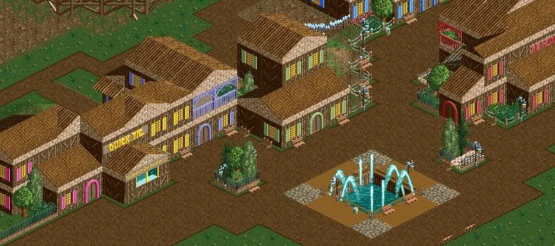
-McNiar Amusment - as good as it gets!Edited by SUPA-X, 27 February 2008 - 03:34 PM.
-

 ChillerHockey33
Offline
Ii dontt likee itt tooo muchh.. Thee buildingg aestheticss aree nott realisticc, seeingg ass realismm iss whatt youree aimingg forr, woodd wouldd nott bee ablee tooo suportt alll thatt brickk.. Andd everythingg iss tooo squaree, tryy usingg quarterr tilee blockss..
 -

 SUPA-X
Offline
haha its funny how you try to type like me and i only dubble some words like my r's and t's and y's and g's. i onlyy do itt twice not 20 times.
 -

 Cocoa
Offline
It's pretty blocky, but I like the colors and the ideas. Maybe you should also download some different custom scenery. Or you have, and just aren't using it yet.
 -

disneylhand Offline
Have you started yet? If you have, sorry--but you're doing a pretty horrible job.And I will have no problem doing so.
As I alluded to earlier, it's truly a tough thing to do... but if you're so adiment about pointing out all the realistic inaccuracies at this site in hopes that the parkmakers from all accross the spectrum will take the time to make any changes, I guess all I can say is good luck.
-disneylhand -

 JDP
Offline
^Huh? Dude, what I am talking about is that he called Polar Bear a GCI. So I told him that it did not look like one, and that was that.
Now you going on telling me about some dumb shit. Listen, if he would have been like "And here is a roller coaster that is named Polar Bear" I would have just let him go and most likely not have posted a comment. You really think I would be that stupid to go around saying to people like JKay and Kumba that their style is not realistic and they have to change it? There parkmakers for a reason. I mean yeah I may disagree with their style but they are doing their own thing and I am doing mine.
-JDPEdited by JDP, 20 February 2008 - 08:45 PM.
-

 Gwazi
Offline
^ And so is SUPA-X. I think I might make a B&M Invert and call it an Intamin one day...
Anyway, lol @ ChillerHockey33's sad attempt at making fun of SUPA-X.
-

 SUPA-X
Offline
yearr 1996
there is a new attraction this year.
The Sky Ride.
the sky ride takes you across the samll little lake thing
just a small pictura of itt.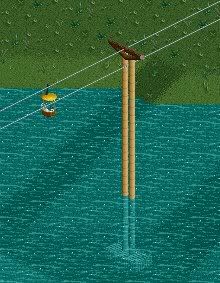
what went on was polar bear got retracked/added on track.
heres a pictura of the wholee layoutt[its kinda zoomed outy far]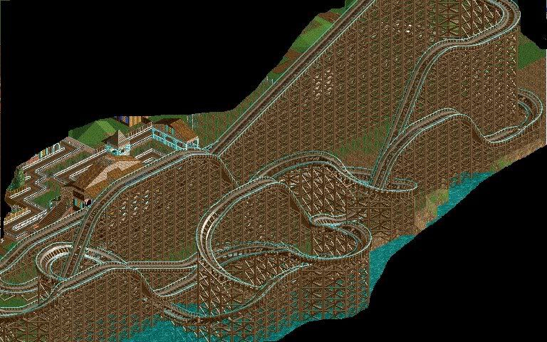
a finaly for the 1996 season of the park theres a new resturant.
McDonalds big shocker
heres a pic of the golden arch.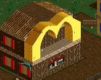
well thats it for the 1996 season.
--> McNiar Amusment - as good as it gets!Edited by SUPA-X, 27 February 2008 - 03:35 PM.
-
 jusmith
Offline
The layout of Polar Bear doesn't look very smooth and it doesn't seem to flow. Maybe try taking out some of the flat sections of track.
The other screens are okay. I like the golden arches!
 Tags
Tags
- No Tags