(Archive) Advertising District / Dreamport!
-
 31-January 08
-

 Cena
Offline
Wow Jonny, you are getting better and better with every screen. Love it, Great to see that more and more people are start using the angled crown mouldings objects I made (thanks to Liampie for the idea, back in february).
Oh btw, my laptop is fixed, so I hope I can finish your objects this week (And for some other people as well ... it is taking way too long atm)
-

 J K
Offline
Yeah the angled crown moulding is one of my favourite pieces of scenery to use. You've done a real awesome job with them and thanks to Liampie for the idea.
As for the objects, I can't wait. Your'll obviously getting the advanced screen for that ofcourse lol. -

 Fr3ak
Offline
It's really great.
Awesome screen J K as always. I love your work =)
We need to talk on MSN sometime
-

 Cocoa
Offline
I immediately thought 'silver dollar city' for some reason. The custom balloon floor that goes partly out over the building is so amazing.
j_k for parkmaker! oh wait... -

 Xophe
Offline
That is amaaaazing! I love how there's a balloon stand under the ride. The little seating area is great too, as is the foliage - those planters are ace.
 -

 dr dirt
Offline
Love that ride, the top part of it is so beautiful. I suggest you can the cables/poles to the fencing object that lines up a bit better. Also, I would change the color of the stonework on the green building to brown so it fits together more. The tables could use a little spreading out too. Maybe consider looking into something other than the railings used at the top of the screen. The same brown fencing used at the bottom perhaps. I LOVE the planters you've made - very classy.
 -

 J K
Offline
I agree with a lot of crit so far but not the roof one. It would be too big and too ugly for the area. Do you mean an awning style or an actual brick roof with supports?
 -

 J K
Offline
Reply time!
Liampie - Thanks a lot for your comment.
Nin - I didn't want a parachute drop though. I've always had in my head that I wanted a custom hot air ballooned flat and this worked out perfectly in my eyes. In my opinion we don't all have to build with the same objects and I think these don't stick out too much at all.
Inversed - Agreed there but I really need to start putting more shops in to make my park peep friendly. I thnik I'll keep them only because I like the positioning but I do agree with you.
Lets hope so about a front runner hey! I'm working my ass off to give Zippos some competition!
RCTCA - I know, I wish i could too but unfortunately I'm not skilled enough to make that happen. Maybe my next solo though
Zodiac - I guess your'll see it more towards the end of the year. I start uni again soon and I'm at a festival all weekend so after that theres a month to go for me to party with friends, do a summer brief, work and build on this. I hope to get my final area started and one near to completion so then I'm on a home strech with the finish line barely visable!!! Thanks for following this as always dude
robbie92 - Yeah I think its finally staring to meet its potential. I like how I've gone custom with most of the rides, quite an interesting concept but it works imo. Your also bang on with the variation of the parachute drop ride!
Nokia - I'm gonna experiment with adding a bit more height, I guess it does need it. Thanks for your comments.
Fisch - Lmao you and that bloody colour! I agree though and I have started to use it a lot more. You can be the judge of that pretty soon anyway.
Cena - Hurry up with those objects!!!!!!! haha Thanks, I feel like this park is always finding new things for me to try out so i agree every screen is getting slightly better.
Fr3ak - Finally dude! I think we'll be having a talk very soon because I am a great follower of your work as well!
Cocoa - Lol thanks dude, This park will officially break the parkmaker curse for myself as I'll have made a full scale after becoming parkmaker!!!!!
Xophe - Thanks a lot mate! It's really good to see your following this. Hopefully I could get a Spotlight for this park to make 2009 the year of the brits!!! haha.
Sssammy - Hahaha feel the love!!! Thanks for the kind words.
Dr dirt - Yeah I love the planters as well, they are gonna be throughout the park because I love them that much. I agree with the railings. As you said on aim last night they are plain right ugly, especially when they glitch going up an angle.
jaguarkid140 - I would if the ride was smaller but it would be too ugly, the point of this ride was for kids to be hoisted up and see they're surroundings. Thanks.
JDP - I'm glad you think that too because the park is really reaching its potential in my eyes. Your coaster is gonna be awesome buddy.
Kumba - Ok I'll try that out. Thanks Darren
------
Thanks for following this and hopefully we'll see this released this year!!!!! -

 turbin3
Offline
^what he said.Thats really awesome. Just add some colors at the top, to much black/gray atm.

I really love this park, JK, awesome job
-

 Six Frags
Offline
Really like it Jonny! Those games look great and add a lot of detail to it.
Only thing that maybe could be changed are those stairs in the upper right corner; Maybe change them with those steps quarter tile building blocks from Toon. That way the it looks a bit more aesthetically pleasing I think and you don't see that railing of the paths..
Keep it up!
SF -

 bigforce
Offline
The new screen is awesome.From the ride to the details around it just makes me anticipate this park even more.Keep up the great work.I will definitely be downloading this park when it is released.
 -

 J K
Offline

New Update
21/09/09
Work is progressing just near to the 70% mark. It's going slow for now but I hope to pick it up if I have any spare time at the weekends.
As you know I'm aiming for an end of year release so fingers crossed you’ll be seeing this in a few months. And now introducing a new area!
Twisted Acres
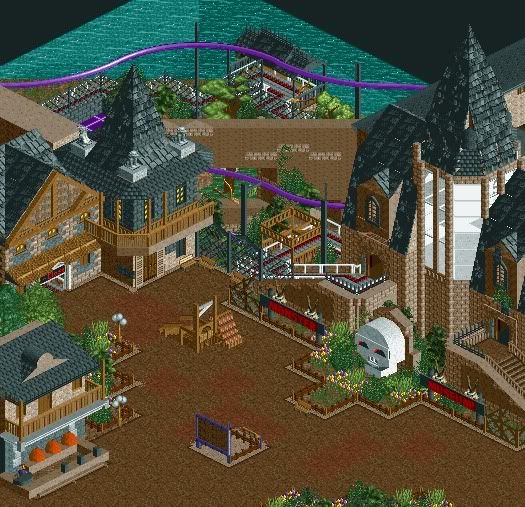
Rumour has it there are monsters around. It's a scary thought but thankfully they only exist in the Twisted Acres section of Dreamport. If guests are brave enough, you can Fight Frankenstein, Whollop the Werewolf and zap some zombies. Thrill seekers can ride the areas B&M flyer; HEX, while also taking on a lot of blood curdling rides.
In this screen you can see one of the parks adventure rides. Monster Museum asks guests to escape from the haunted museum by boarding witches brooms to fly away from danger. Guests will battle through the tombs of the mummies, soar through the swamps of the Swamp Thing amongst others, and all while swinging through tight turns and taking on small launched sections.
Around the area is a photo opportunity with the Twisted Acres Guillotine. Rumour has it the stand nearby is for the singing heads taken by the guillotine. Also nearby is the Smashing Pumpkins stand, were guests can win prizes by defacing some spooky orange heads.
Hope your guys enjoy. I know this park is reaching its full potential now. -

 In:Cities
Offline
wow dude this screen is just perfect.
simply incredible.
i love that guillotine man lol.
you pulled it off absolutely perfectly:] -

 Comet
Offline
Funny I just started doing one of these suspended coaster dark rides last week for Clouds Rest
Now both you and Gwazi posted screens of them this week
Anyway that looks great and it's gonna be hard to make mine look good when compared to this one -

 Cocoa
Offline
for that diagonal tall roof piece, i think just a regular corner piece could still look good and be better than what you have.
 Tags
Tags
- No Tags


