(Archive) Advertising District / Dreamport!
-
 31-January 08
-

 Louis!
Offline
The architecture looks a lot better now than when you showed me before, probably because it's now finished
-

 J K
Offline
Reply time!!!!
RCTA – Thanks dude. They will be a common item for the area so I’m glad you like them.
JDP – I understand your point but H2h is to experiment for me so I love trying the conceptual stuff. Solos are real parks for me so this is where I bring all of this into my work.
Turbin – I have changed the colour of the roves to a darker brown and it suits the screen more. I do love the straw roves in yellow though
Liampie – Thanks dude, glad another connoisseur of small details appreciates that.
Dr Dirt – Thanks. I do agree its slightly rushed but I just wanted to get a screen out to show how this was progressing.
Nin – Thanks. Hopefully this park will have a tonne of details for people to keep looking back on it and finding new things.
RCTNW – Yeah I agree that my ideas should be more clearly presented. I’ve been working on it so I’m glad you think I have pulled it off.
Nokia – Why thank you.
Comet – Dam I got a coaster comment haha. I’ve had two much fun building so a few of the coasters are built but there’s a lack of custom supports which doesn’t make it the best to present in the topic. I’ll work on them though so I can get you some steel in the next month or so.
Spartan – I’m glad
MCD – I’m also glad you like it.
Goliath123 – Thanks a lot dude.
Incities – I heart the straw, glad you like the rest of it however.
Zodiac – Thanks a lot dude. Hope this is meeting your expectations
Maverix – I’ll try lol.
Inversed – Glad you picked up on the atmosphere of the park. I’m really working hard with that to make sure all areas give off something different.
T.N.T – Done. Thanks very much for your comment.
LDW – When the games objects are annoying you . . Go custom! A lot better results imo.
Louis – Yeah I took a long look at it and decided what it needed and where. I’m almost embarrassed of the first screen haha.
Robbie92 – Ah that’s really good to hear. Possibly because its new work that you haven’t seen. Lol -

 Nokia
Offline
ohhh, just noticed this.
my only concern with the screen is
this:
the supports look too thin to support the roof. -

 J K
Offline
Ah good shout Nokia. I need to import some new objects in. my bench is looking slightly old.
Also an area has been deleted and the new theme has been started
More feedback would be awesome. -

 Cena
Offline
I think it could hold the weight up ... If you make the stucture poles out of Glare, it should work
 But that is a bit over the top ... XD.
For the people who don't know what Glare is: Here. It is an material used in Air aviation / Aerospace.
J K , you know my tips etc already on msn so I am not going to say it again, because I am tired atm. -

 J K
Offline
Ah is that like ABS? Looking at the screen it does need better supports imo. Thanks a lot for your help guys.
Cena your always tierd
-

 J K
Offline
Grand Central Balloon Race
New update! Work is going really well and I'm building a few really cool ideas at the minute. Just thought I'd share this last update for the entrance area and the next time you’ll see a screen I'll have a completely new area for you guys to see.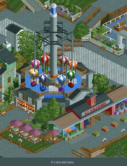
The Grand Central Balloon Race whips kids into the sky to experience soaring through the clouds while viewing the rest of their surroundings. You can also see the Grand Central balloon stand amongst a chance to win some prizes with the local amusements. -

 Liampie
Offline
It sounds silly, but to me the planters stand out.
 The rest of the screen is excellent too. Nice update!
-

 J K
Offline
I love them too much to take them away though. I don't think they stand out for wrong reasons.

Grand Central Balloon Race
New update! Work is going really well and I'm building a few really cool ideas at the minute. Just thought I'd share this last update for the entrance area and the next time you’ll see a screen I'll have a completely new area for you guys to see.
The Grand Central Balloon Race whips kids into the sky to experience soaring through the clouds while viewing the rest of their surroundings. You can also see the Grand Central balloon stand amongst a chance to win some prizes with the local amusements.
Edit, first page updated with progress and all my screens so far. They're building up now lol. -

 nin
Offline
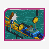
I'm really thinking you should make the parachutes out of objects instead of using the chutes object that you currently have. They don't fit the game and it just looks bad.
 -

inVersed Offline
One thing that I am not sure about is the fact that you use the games balloon show but all the other shops in that image are custom made. Since the other ones are so nicely done, the in game one looks tacky and out of place
Besides that this is great. So far this looks like a front runner for park of the year (along with Zippos) -
 RCTCA
Offline
Now that's very cool! Very nice architecture overall too...
If only you could make that ride move.....

-

 robbie92
Offline
This was the "enlivening" kinda thing I meant way back on AIM. The area's gonna be great!
 -

 robbie92
Offline
^It's a variation on a parachute ride. The thin poles are cables that pull the balloons up and down.
 -

 Nokia
Offline
^ i know what that is.
i ment the black part.
oh and i feel like it needs to be taller as well. -

 Fisch
Offline
Dude you used the perfect colors in the front and middle of this screen. I love the fact that there's more red on this screen as well. Haha I guess I can't say anything else than I said last time I talked to you about the park. It's gorgeous, but in my opinions it needs a lot of red in many places as contrast and this part here is pretty much perfect!!
 Tags
Tags
- No Tags
