(Archive) Advertising District / Dreamport!
-
 31-January 08
-

 J K
Offline

The Old Lady that lived in a shoe
New update. Now H2h is over (cough winning team) I can happily return to my solo and concentrate on getting this finished. Work has gone well today and I'm contemplating adding a new area as one isn't impressing me so much so a change may be good for the park. Anyway onto the screens.
There was an old woman who lived in a shoe.
She had so many children, she didn't know what to do;
She gave them some broth without any bread;
Then whipped them all soundly and put them to bed.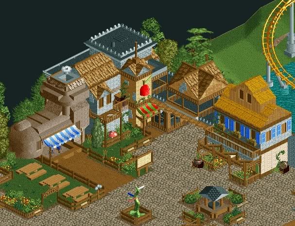
Here you can see left to right;
The Old Ladies broth shop, Snow Whites apple stand and some general architecture.
Near the shops are a seating area as well as a park map, directional sign to guide guests to their destination and Merlins Well.
Rumor has it,to make a wish or cast a spell, you toss a coin in Merlins well.
Enjoy. -

 reflex
Offline
You just ruined my new park lol. Enchanted Valley is essentially the same thing as my new project, but besides that, it looks awesome. I can't wait for the release.
EDIT: And also those custom picknic tables are aweosme.Edited by ice³, 24 July 2009 - 01:13 PM.
-

 RCTCA
Offline
Wow.
That's great. I really like the wishing well and your picnic benches. Also, that's a clever idea to use the beanstalk as a sign post. -

 J K
Offline
Nah because the things I miss your'll nail
Looking forward to seeing yours, I'm sure it'll be really good. -

 JDP
Offline
OMG I can breath! (unlike Tim Burton, haha)...
Seriously though JK, this is outstanding man. Honestly, looks better then anything you did in H2H. Really seems you put you mind and effort into this along with an awesome amount of detail (not saying you didn't in H2H). And when I mean I can breath, I mean that there's a good amount of open space to enjoy everything with an open mind set.
Good shit Johnny!
-JDP -

 turbin3
Offline
Looks really good, but I dont like the roofs on the right.
The rest is as always - amazing!
-

 dr dirt
Offline
Awesome work. The shoe and apple are great, and beanstalk sign post is just genius. The top of the right building seems rushed though and I can't say I like the roof.
 -

 RCTNW
Offline
Great stuff J K! I agree tih JDP in that altough there are details galore, it's very easy on the eyes to look at!
Keep it up! -

 Comet
Offline
This is very nice, especially the Beanstalk.
Only thing I don't like is the pathway under the buildings on the right, unless that leads to some sort of boardwalk seating area or something of that nature.
Also, I would love to see some of the coasters or flats or anything sometime soon, the one ride you showed was amazing and I want more
-

 MCD
Offline
Everything... everything looks awesome!
I love the signpost.
Edited by MCD, 24 July 2009 - 03:35 PM.
-

inVersed Offline
That screen it beautiful. There are so many wonderful details. The atmosphere was captured perfectly. The only thing that I am not sure about is the that thatch roof on the building to the right but thats just my preference -

 T.N.T.
Offline
Very good... likin' the shoe and apple... quality work, my friend.
Just sink the support back there and the screen will be perfect.
 Tags
Tags
- No Tags


