(Archive) Advertising District / Dreamport!
-
 31-January 08
-

 J K
Offline
Update time
The Three Pigs
Here you can see one of the valley's shops. The Three Pigs gift shop sells crafts made out of straw, log and bricks. Straw hats, musical pipes and engraved bricks are sure favourites for a memory of the day.
This area also has a fantastic open grill for special hotdogs and ribs that the local chef cooks right in front of the guest's. You can also have your picture taken with Mr Wolf if you’re brave enough.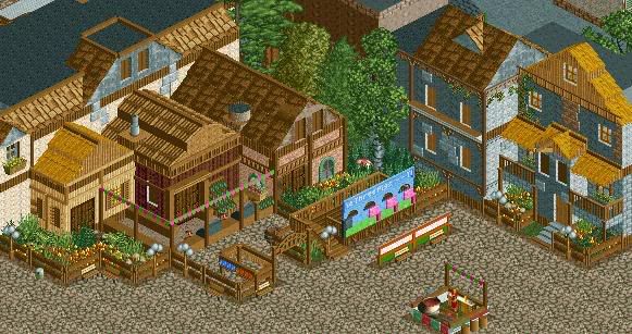
---------------------------------------------------------------------
Grand Central - 75%
The Enchanted Valley - 80%
Agrabah - 70% (New area announced!!!!!) ?
? ? - 10%
 ?
? ? - 40%
 ?
? ? - 0%
Park progress 40%
Enjoy. Comments always greatly appreciated.
JK -

 robbie92
Offline
Even though I already told you on IM how I felt, I still love it. The subtle details really make the screen shine. I especially love the head cutout thing for the pigs, and the fact that the houses behind the shop are indeed in straw, wood, and brick. The details overall are amazing, as well as the atmosphere. I'm really, really excited for this project.
 -

 Kumba
Offline
 @ the ideas. Amazing attention to detail. The only negitive I see is the path look a little big and boreing, but otherwise that screen is fantastic and the best I have seen from you. Oh and this was my 7,000th post
-

 Nokia
Offline
i dont get the wall behind the 2 benchs, and the farthest building on the right is really killing the screen for me, and i agree with the paths being boring, try to use like different ones maybe like the light borwn or the dark brown.
i also love all the little details, very nice. -

 Xophe
Offline
Haha I love the barbeque place right next to the three pigs shop! And the holes to put your head through are ingenious! Amazing ideas and great execution. Keep it up!
 -
 zodiac
Offline
are you kidding me? this shit is so insane. how you think of things like this is astounding. i can't wait to see what's next.
 -
 Sey
Offline
This is neat, bar the orange and green wall behind the two benches, in my opinion.
Still, yummy sreen!
-
 RCTFAN
Offline
This just gets better and better with every screen, great idea and great execution.
Gareth -

 J K
Offline
Hey just to add so far. The white orange and green wall infront of the Three Pigs Photo part are meant to represent Kodak's colour scheme. Every park I do I add Kodak - "Share the moment" points to make you visualise yourself as a guest looking at the area straight on from that point of view.
 -

 turbin3
Offline
Update time

The Three Pigs
Here you can see one of the valley's shops. The Three Pigs gift shop sells crafts made out of straw, log and bricks. Straw hats, musical pipes and engraved bricks are sure favourites for a memory of the day.
This area also has a fantastic open grill for special hotdogs and ribs that the local chef cooks right in front of the guest's. You can also have your picture taken with Mr Wolf if you’re brave enough.
---------------------------------------------------------------------
Grand Central - 75%
The Enchanted Valley - 80%
Agrabah - 70% (New area announced!!!!!) ?
? ? - 10%
 ?
? ? - 40%
 ?
? ? - 0%
Park progress 40%
Enjoy. Comments always greatly appreciated.
JK
Taking over.
Wow, this is one of the best things i've seen so far!
-

 Fisch
Offline
Haha, I love that. The colors are catching me on this one. They give it so much atmosphere! I love the detail like that little mushroom (?) under the tree. The whole set up is really nice, too and it's something you sadly don't see to often in RCT.
The architecture looks great aswell! I think that architecture is probably your strong point. Too bad you'll have to focus on H2H right now though (!!!), haha no, I'm glad you're having fun building on this but seriously don't let it drag you away from H2H because your H2H park might become even better the way it looks atm! -

 J K
Offline
Ok reply time.
Robbie - Thanks a lot. I'm glad you noticed all of the small details of this screen that make it so important. I've done a few things we talked about and the park is getting better and better.
Kumba - I don't want to make excuses for the path but I think it's just the flat border of path that makes it seem bad. I didn't want to include the ride below the screen so i made sure it was just path. You’ll be seeing better don't worry
Nokia - The wall is to reflect Kodak's colour-scheme. Maybe random to you, but its necessary to me. Also the path is staying. I have dirt path other places in the area and it doesn't hold as much atmosphere as this path design. Thanks anyway.
Xophe - Now from another guy who is fantastic at these awesome ideas is a real compliment. Thanks a lot.
][intamin22 - Thanks, I wanted to make the three pigs stand out so I put it in front of the buildings. It's done a good job to appeal to guest's more. The guys working behind the shop will be sadly dressed up as pigs too hence why they're pink lol.
Zodiac - I don't really know where it comes from. I guess having Alton Towers and Thorpe Park as close parks is a real bonus as they don't hold back on theming. I love adding these details and I think its one of the best parts of the game to me. Thanks for your comment as always
Sey- Yeah I knew I'd get some crit about that lol. There is a reason behind it though and I think it will stand out nice for guests.
Goliath123 - SO DO I!!!!!! How awesome would it be if plans got accepted for Disney Shadow lands, IC or Islands of enchantment? Could possibly be the best theme parks on the planet.
Xcoaster - Thanks a lot. I don't want to show too much of the park but I'm really proud with all the work so far.
misterthom - Hey thanks for your comment. Sure another screen will be on its way when I have a bit of H2h out of the way
RCTFAN - Why thank you. I'm not going to show the area you've worked on as I think that’s the joint best area along with The Enchanted Valley. Thanks a lot for your guest spot so far, you've done an awesome job.
Milo - Thanks I've took a lot of time to think these ideas through so I'm glad they're being recognised.
Turbin3 - That’s real good to hear. Thanks for bringing it over. The wow factor is always a good one!
Fisch - You learn from the best i guess. Turtle and Artist are still the best in the game for the real theme park atmosphere you get. I was wondering whether to move the mushroom or not because I didn't want it to clash with the orange and yellow flowers. Glad you think it's good. I always thought archy was my weak point so that’s another good thing to hear. Yeah H2h is a bit of a ball and chain at the minute and this is light relief when it comes to the game ha-ha. I'll get straight back to work.
JK -

 Louis!
Offline
The atmosphere is just immense, something you rarely see in this game anymore.
This 'real park' atmosphere is one of the best kinds, with no ultra realism, yet realistic in the sense that its all built with the peep's view in mind.
Great architecture, great ideas and great excecution. You are easily one of the best builders at the moment, and you get extra points for carrying on building this through H2H
-

 Ge-Ride
Offline
I think that the Three Little Pigs shop is creative, composed of three different interconnected structures that resemble the houses of the respective pigs in the tale. The variety of textures works well within the variations of the colors brown and gray, even if I do usually prefer a more dynamic scheme.
My only real critique is that the theme is so complex that it's hard to fully appreciate everything portrayed without some sort of explanation outside of the park. For example, unless the staff member's named, there's no real way to tell that the food place is specifically a ribs shop without having some prior knowledge of the park. It's often hard to appreciate all those little details without reading up on the park first. I'll leave it to you to decide whether that's a good or a bad thing.Edited by Ge-Ride, 18 April 2009 - 04:14 PM.
 Tags
Tags
- No Tags
![][ntamin22%s's Photo](https://www.nedesigns.com/uploads/profile/photo-thumb-221.png?_r=1520300638)

