(Archive) Advertising District / Dreamport!
-
 31-January 08
-

 5dave
Offline
Oh I love this stuff.
The humpty dumpty and the little boots. Just genious!
I really dig things like that!
Keep it up!
"MFG" -

 nin
Offline
indeed.OMG HUMPTY DUMPTY.
That's really good; though at first I was thinking Shrek .
.
I'm really starting to like your work JK, it's very nice. -

 J K
Offline
Hello again. Thanks for all the previous replies.
New Update
Work is moving at a rapid rate and nearly a month into starting this park from the 5% that it was, a lot of time has moved it up to a massive 25% in completion. Anyway here is a new screen showing a new area that I'm really proud to show.
-----------------------------------------------------------------------------------------------------------
The enchanted Valley is a concept I've wanted to try from Day 1 of playing the game. In my opinion it's my best work to date and the ideas throughout the area are some of my best. The concept is an area based on fairytales and nursery rhymes and is one of the favourite areas in the park for the family to visit due to it's robust themes and characters scattered throughout the area.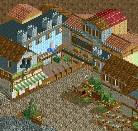
Here we can see one of the area's local eateries as well as the Puss in Boot's fast-track department. We can also see one of the parks family orientated games with the chance to win awesome prizes by knocking Humpty Dumpty off the wall. These shops feature near the outskirts of the area which lead into a mystery region yet to be released.
----------------------------------------------------------------------------------------------------------
Grand Central - 70%
The Enchanted Valley - 70% ?
? - 25%
- 25% ?
? - 10%
- 10% ?
? - 10%
- 10% ?
? - 0%
- 0%
Park completion - 25%
Thank you for all the replies so far. They’re always greatly appreciated.
JK
Just bringing this over to the next page.
Louis - Thanks alot, my execution of my ideas are getting better. Beleieve me this is just the tip of the iceberg for this area.
5Dave - Yeah you picked up on the fact a while ago that my architecture needed some identity and I completley agreed at the time and knew that myself. With this new solo I've started to do that and the results are ideas like this being brought into my work.
Nin - Glad I've converted you lol. I agree though my work's alot more aesthetically pleasing now. Guess I needed the break hey lol.
Thanks alot guys.
JK -

 zodiac
Offline
i continue to tell you this, but you're my favorite parkmaker right now and one of my all-time favorites. please finish this, you're doing some amazing things.
 -

 Sulakke
Offline
Best screen I've seen from you. It's perfect!
Sulakke
Offline
Best screen I've seen from you. It's perfect!Edited by Sulakke, 02 March 2009 - 02:39 PM.
-

 Xophe
Offline
Wow, brilliant ideas and executed to perfection too. That screen has a wonderful atmosphere. The only thing I'm not convinced about is that part of the building at the very top that changes colour half way along.
 -

 J K
Offline
Zodiac - That's really good to hear. Thanks alot for the constant support and everything.
Sulkakke - Hopefully I can carry on these ideas in my other area's. I'm pretty sure this area is packed with them. Just need to keep it all consistent. Thanks alot for your reply.
Xophe - I know what you mean. It's the building for the next area as well so I wanted to carry on the theme and I think I've done as well as I could of done. I'm going to leave it for now but now you've mentioned it I'll see how it flows in-game. Thanks alot for your reply.
The first page is updated with the progress of the park and as always the screens I've produced so far.
Any more comments would be greatly appreciated.
JK -

 Kumba
Offline
Thats really awesome Jonny, the only thing I dislike is the red and brown roof with a mis-matched wall. I think it devides two themes? Well try making them separate.
Great work bro, I am looking forward to more. -
![][ntamin22%s's Photo](https://www.nedesigns.com/uploads/profile/photo-thumb-221.png?_r=1520300638)
 ][ntamin22
Offline
If by 'family oriented' you mean 'shoot the egg and watch his innards splatter everywhere' then yes.
 -

 Milo
Offline
damn fine screen man... lot of great details like the boots, egg game and cart. It's all very nice but one thing I'll say is that your colors aren't quite harmonious. I think that the grey is throwing it off a bit as well as the brown. That ice blue is really bright compared to the rest.
 -

 Mike Robbins
Offline
Looks great. Only thing I don't like is the roof with the two colors. Looks ugly. And the roof in the top left has two slightly different colors too. Other than that, excellent!
 -

 J K
Offline
Reply time!
Kumba - Yeah its the exit of the enchanted valley into a new area I'm not going to advertise. I'm going to have to try and do something to see what happens but I honestly don't have a problem with it. I dunno, I'm gonna have to tweak around with it.
Six Frrags - Now come on when haven't I finished a park?
][ntamin22 - If you want to see it that way thats allowed.
Yannick - Thankyou very much
Sey - Thats something I'm gonna have to try and tweak as well. This area has a mixed variety of architecture so I'm gonna need something to relate them all. Thanks alot for comment.
Louis - Glad you saw that! It was kind of camoflaged. Thats not a bad thing though because I want this to be a park that you can look back on it and find something you love every time. Alot like Kumba's DRC.
Milo - Thankyou, I personally feel the colours are ok, The ice blue is meant to be a sky backdrop for the egg to rest against so it's more symbolism than a colour choice. I'll look at it in-game again and see if theres anything that really bugs me now you've said it.
Mike Robbins - Yeah gonna have to sort those roof coloures now lol. Thanks alot.
-----------------------------------------------------------------------------------------------------
Anyway I haven't worked on it at all this weekend. This is mainly due to sending the park to someone for advice/feedback and a guestspot. Let's just say i'm a massive FAN of his work
-
 Evil WME
Offline
I really like this,
one thing that i would change: the bars of the music notes should black.. I think that would make it look a bit better still :) -

 Milo
Offline
aside from the light blue I wasnt' really saying the colors should be changed, just mixed a little better. The way the grey and brown are segmented together makes the screen less appealing than it could be. The brown and red on that middle roof is one example of rather choppy coloring that makes it hard to focus on particular things in the screen.
 -

 J K
Offline
Evil WME - Thanks for the reply. The actual shop itself is puss-in-boots- fast track so they are actually meant to be boots from puss in boots with airlines behind him to symbolise the boots on the run. Guess I really need to change them if they aren't that clear.
Milo - Ah got ya. I think because the buildings are so close togather in such a confined space it's gonna look a little messy. As the comment above I'm just gonna have to go back and fine tune it.
JK -

 Milo
Offline
A park that is worth visiting in real life, it is. I like this park a lot. Keep the creative juices flowing and do not stop.
 Tags
Tags
- No Tags


