(Archive) Advertising District / Dreamport!
-
 31-January 08
-

 J K
Offline
New update
Ok so it's been a while. Mainly because I've really wanted to concentrate on university as there is a hell of a lot of work. Lately I've found alot of time for the game and I'm loving it. It's really good to see so many new up and coming players releasing some awesome stuff.
-------------------------------------------------------------------------------------------------------
Grand Central #2 -Fly-bye!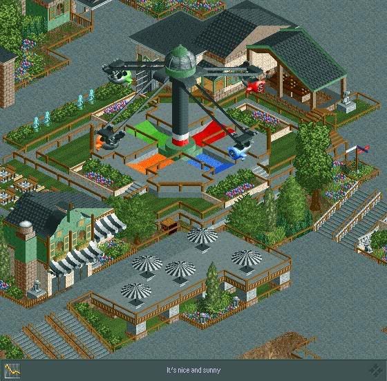
Here you can see the park entrance's Zamperla Aeromax. Fly-bye is a hit for the younger generation and nicely situated next to Diamond's, the parks most formal eatery. It feature's a sitting area near-by so parents can take a break or maybe choose to watch the kids. A nice addition to the park is the statues around the area. These interactive characters can be activated to tell guest's directions or some general knowledge about the area.
-------------------------------------------------------------------------------------------------------
The parks coming along really well with 4 areas underway. I will update the first post as I always do to include past screens, a bit more information and progress of each area.
JK -
 zodiac
Offline
YAY, you're back. the screen is amazing. everything together creates the most amazing mood. you found a way to make the colors on the aeromax work well without standing out. just incredible.
 -

 Steve
Offline
Holy shit, talk about a massive improvement! Great architecture and a lovely custom ride there. Not to mention a pretty killer atmosphere. I dig it.
 -

 Milo
Offline
haha I thought you said you were rusty
Yeah, good screen man and it's great to see you playing again. Um... I think this is going along very nicely although I think it just misses something. It ALMOST comes together but not quite imo... there is still a bit of a disjointed feeling in that screen for me. Can't really put my finger on any sort of main cause though so here are a couple suggestions:
-maybe have the path for that picnic area with the tables in the middle be a different color... like wooden planks or something. If not that then something else because there is too much tarmac color in that screen imo... something needs to break that up. It sort of makes me glaze over as I look at the screen (if that makes any sense lol)
- that white fence on the stairs to the right is a little odd... almost looks like a ghost glitch. Either way it's not real appealing imo.
- black and white canvas? I think mixing it up on the umbrellas will add some life to the screen and make them pop out more.
overall solid work though... please continue
-

 BreakAway
Offline
Looks great as always buddy.
Absolutely love that balcony table thing for the restaurant. -
 RRP
Offline
Fanntastic work except the canvas awnings and umbrellas.I especially like the little details like the sign post
 -

 eyeamthu1
Offline
Love custom flats - and that one is an especially good one. Not sure about the colours of it though - I'd expect it to be brighter.
 -

 geewhzz
Offline
the statues seem to be a bit too present. the tables need some chairs, and the awnings could use some work in the color area and maybe the fringe piece. also i don't really like the patio cement like that, it clashes and doesn't flow from the path well. maybe try wood instead.
try dark green and yellow on the awnings/umbrellas.
typical J_K architecture, although it's much better than your spotlight. -
Xcoaster Offline
I have no complaints. I especially like that building on the left, the overall composition, and the placement of the flat ride. The sign post is cool too. -

 RCTNW
Offline
J K, Great stuff. I agree with gee in that the patio is missing something. Not sure what it is but it looks off to me. I do love the flat ride though. Looking forward to seeing more.
James -

 Six Frags
Offline
Nice to see you back man!
I like the screen although it could use some more color and like geewhzz I also think the seating area needs chairs and the umbrella's should be recolored to a red or something..
Other than that it looks really nice, great atmosphere and good height variations..
SF -

 Carl
Offline
Awesome that you're still working on this park.
From what I can see, the screen is great, maybe alittle dark, not too many bright colors in there, if any, but its still the spotlight level work Ive come to love from you. -

 J K
Offline
Hello again. Thanks for all the previous replies.
New Update
Work is moving at a rapid rate and nearly a month into starting this park from the 5% that it was, a lot of time has moved it up to a massive 25% in completion. Anyway here is a new screen showing a new area that I'm really proud to show.
-----------------------------------------------------------------------------------------------------------
The enchanted Valley is a concept I've wanted to try from Day 1 of playing the game. In my opinion it's my best work to date and the ideas throughout the area are some of my best. The concept is an area based on fairytales and nursery rhymes and is one of the favourite areas in the park for the family to visit due to it's robust themes and characters scattered throughout the area.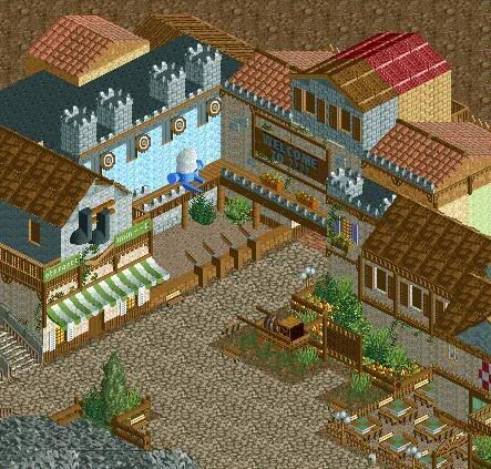
Here we can see one of the area's local eateries as well as the Puss in Boot's fast-track department. We can also see one of the parks family orientated games with the chance to win awesome prizes by knocking Humpty Dumpty off the wall. These shops feature near the outskirts of the area which lead into a mystery region yet to be released.
----------------------------------------------------------------------------------------------------------
Grand Central - 70%
The Enchanted Valley - 70% ?
? - 25%
- 25% ?
? - 10%
- 10% ?
? - 10%
- 10% ?
? - 0%
- 0%
Park completion - 25%
Thank you for all the replies so far. They’re always greatly appreciated.
JK -

 Louis!
Offline
OMG HUMPTY DUMPTY.
That screen is pure excelence. Really really great! You should be proud.
 Tags
Tags
- No Tags

