(Archive) Advertising District / Dreamport!
-
 31-January 08
-

 JJ
Offline
 . I am excited
  , looks phenomenal. I love the bushwork
  . I don't know what it is about the arm of that custom flat ride but it looks odd, it looks like it's flat on one side, wouldn't a big round pole look better cos it looks a bit odd to me. Hard to explain what I mean. The rest is great, love the coasters interaction with the path
-

 Louis!
Offline
Very short q-line.
Oh and what ride is that? I can imagine what it does, and what it is meant to be, but I don't think there is a ride actually built like that is there?
But nice update, and congratulations on nearing the completion
-

 Cena
Offline
Btw the sunken trees are genious.
Don't give JK the credit for it while Gijssie1234 deserves it. Look at his Universal thread and you will see that he came up with the idea. -
 Timothy Cross
Offline
I think this thread just got six hundred ninety eight (thousand) replies in the span of a minute.. yikes.
 -

 Liampie
Offline
Don't give JK the credit for it while Gijssie1234 deserves it. Look at his Universal thread and you will see that he came up with the idea.
Gijssie1234 didn't invent it either. But who cares anyway... Besides, you CAN give J K credit for the way he used the technique. I think it looks great here. -

 Goliath123
Offline
Xophe did it first
Very nice screen i like how the coaster interacts with the path, imagine being a peep and watching it fly !
-

 J K
Offline
Just to answer a quick few questions. . .
Louis it's loosely based off a Zamperla Powersurge but I couldn't hack the right cars diagonal so I went with these.
About the sunken trees, this technique is used in Agrabah (one of Dreamports areas) which has been sitting in my save game folder for nearly three years, people like Cedarpoint6 and Robbie can account for me that I used this technique a while ago but I'm not bothered about who did it, I just love the look of it. -

 RCTNW
Offline
This is looking fantastic and the little details all around the park is something takes realy talent to achieve and you are amoung the very few that seem to have it. Looking forward to seeing this on the front page as 2011's newest spotlight!
Well done!
James -
tdub96 Offline
Ah, great stuff again from you JK. The ride looks great and I love the coaster colors. The darker colors and atmosphere really pull off the theme youre portraying here. Nice work. -

 J K
Offline
04/01/11
It's pretty scary saying this but
Final Update
Banshee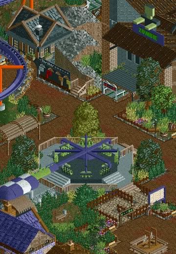
The scariest section of the park certainly holds the most blood curdling attractions. Here you can see one of the parks finest thrill rides cleverly named by what the ride does to it's guests. Guest's have be known to scream at the top of their lungs to try and survive the onslaught of twists, turns and loops. Near-by is a roto-drop named Zombie with a desolate feeling to the ride, guests queue in silence anticipating the huge thrill. After that we can see a few more attractions around the area like graves that were never cleared when the park was built, a chance to get your picture taken dancing to thriller with the man himself, Michael Jackson at the front.
Grand Central - 100%
The Enchanted Valley - 100%
Agrabah - 100%
Deep Sea Legends - 80%
Old Town Mexico - 100%
Twisted Acres - 85%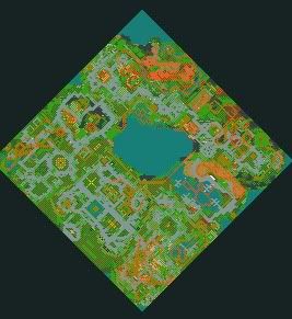
Park progress - 94%
Please comment as always and show some love, hopefully this should be done and released for the parks birthday in February.
Just bringing this over. First post updated with every single screen released for this, I think you can agree they don't look too bad together
-

 pierrot
Offline
photo walls and zombie is just awesome idea. great man
+
http://www.flatrides.com
This site inspires me a lot!
-

 Kumba
Offline
Love that flat right and the little zombie guy. Only changes im going to suggest are that you pick another fence besides that brown bars kinda one, also some kinda centerpiece cap on the intersection of the support arms on the flat.
This park is so high on my list of park I have been eagerly awaiting it's not even funny
-

 Turtle
Offline
Actually can't bloody wait man. This looks incredible, brilliant colours and atmosphere throughout.
 -
 Levis
Offline
you asked for a reply so here it is
 .
.
First thing I notice is Thrill XXX. What does the XXX stand for ?
?
The zombie building looks a bit plain. compaired to the rest of the screen the entrance of zombie looks almost blocky. The zombie it self is kinda nice, but maybe you could add brows or a mouth to it to give it some more style .
.
at the top left corner of the screen it looks a little bit unfinnished, right?
the foilage is quite nice expect the part almost in the middle at the bottom side of the screen. next to the gallows. This doesn't look good to me. I think one or two different shurbs between those others could work. for now it almost ruins the feeling for me. why does only the exit of the twist ride has fences around the stairs and the platform. now peeps will have some troubles gettings of the ride probally. personlly I would remove the fences there (at least next to the stairs) and maybe add a bar or something like that so people wont be entering the ride from the exit. Also where is the cabin for the operator. I would check the edged of the path one more time. now at some places there is rock under it which connects to the poles which you use as border for the foilage. but because the foilage is so dense you dont see whats under it, so it almost seems like the foilage is on rocks. and thats not right I think .
.
well you asked for a reply .
.
-
 highroll3r
Offline
nice jk cant wait to see this in game. you do have a broad immagination i must say. love the photo wall and the zombie. i think that the brown fence should stay it goes with the path.
 Tags
Tags
- No Tags

