(Archive) Advertising District / Dreamport!
-
 31-January 08
-

 posix
Offline
Is that a lemon? I think it looks awesome. Have to agree on the mouse track. Not really working.
 -
 Chocotopian
Offline
I actually like the mouse track, particularly the one on the left. I can imagine it in a real park, hanging over the guests as they enter the shop, twitching slightly, about to snatch them up etc. Perhaps the other vine could rest over a corner or something too? Either way, I love that screen.
 -

 Phatage
Offline
FEED ME! Lil' shop is a great idea, and executed fairly well (perfect size!). I see that you're going for both a foliage feel with the wild mouse track at the same time as making them seem like movable limbs for the plant, but as others said it isn't too convincing atm. I would keep the track and add foliage; hopefully you're intending for it to be robotically movable!
 -

 Turtle
Offline
Very nice. I think Phatage nailed it, the track could work, but needs to blend in to the foliage a bit more to be more convincing. I love the detail and ideas you get into every single damn shop. Ridiculous.
 -

 BelgianGuy
Offline
I love everything except the lower part of the pretzel loop^, you could've hacked a twister or a floorless coaster in there to make it look bigger on the lower part than it'll look on the top part, otherwise really nice...
 -

 J K
Offline
For anyone that doesn't know it's not a lemon lol. It's a man eating plant that grows by feeding on humans, a musical was made out of the story. I thought it might look pretty cool and yes it was envisaged to be animatronic to interact with all of the guests in the area. I do need to work on those tentacles however based on the feedback, as I agree they need more detail.
A picture to show you guys what it's based off.
Thanks for the comments so far, I'll look to reply very soon. -

 wheres_walto
Offline
Maybe the yellow isn't the best color. I think green would work better with a different color trim for the lips. Then again, the green might blend in too much with the surroundings. The idea is fantastic however and the shop itself looks good.
 -

 J K
Offline
Yeah when I first saw the picture I went with that too but it looks too similar to the area. Good idea about sorting the lips out with a different accent.
 -
 Splitvision
Offline
I got what that was immediately, even though i haven't heard of that story. But based on the majority of the guesses of what it's meant to be, you might need to refine it further. I like the colouring of it but maybe w_w is right, a distinction between the head and the lips might help, and as many have mentioned you could make the tentacles more tentacle-y.
 -

 J K
Offline
Reply time!
Robbie - I know, I've built quite a lot since last time you saw it
Louis! - There used to be a wall on each side to make it look thicker but I've had to delete one side to preserve the object limit. I agree it isn't working at the moment so I will be looking to change it.
Turbin3 - I'm gonna hack so foliage into it like Phatage said, I'm hoping that will connect the scenery and track together more.
Liampie - Thanks, they love you too.
Splitvision - Great shout about the vines, I'll be sure to add them soon.
Posix - It's a man-eating plant as shown in the picture below your post. I also agree the vines need some work.
Chocotopian - Thanks man! That was the vision for this idea so I'm glad you can appreciate it to it's full extent.
Phatage - Thanks buddy, I'm glad you've posted to be honest as I want my park to appeal to realistic players as well as the people who appreciate fantasy. It was always a worry of mine that this park would be snubbed by the modern RCT movement thats going on at the moment.
Pierrot - It's not, but thanks.
Turtle - Thanks a lot, theres certainly a lot to see in this park.
BelgianGuy - After our talk I'm still really happy with the track and how it looks. I'm not going to change it to be honest as I like the look of it.
Splitvision - It's gonna be hard to do the lips so I'm not sure how I'm gonna go about that but the tentacles should be a good challenge
Thanks for the replies so far guys, any more would be awesome. -

 Casimir
Offline
I had no idea what it is before I saw the drawing. But it was awesome before and is pretty awesome now that I know it. It's strange but it kind of reminds me of a Super Mario game. Which is awesome.
Did you already find a way to do the plant's lips?
Would be pretty awesome.
Awesome! xD
I'm really looking forward to seeing more if the park. Soon, I hope? -

 Magnus
Offline
Really looking forward to see this in game.
I just listend to the Little Shop of Horrors today and the Cover of my Disc features a green Audrey. I personally think changing the colours and adding the flower pot would make the theme a lot more obvious.
Personally can't wait to see the finished area, as I always planned on doing a Little Shop of Horrors area myself. Do not know why, but I always envisioned it being an indoor area.
Good luck on finished next year.
-

 J K
Offline
04/01/11
It's pretty scary saying this but
Final Update
Banshee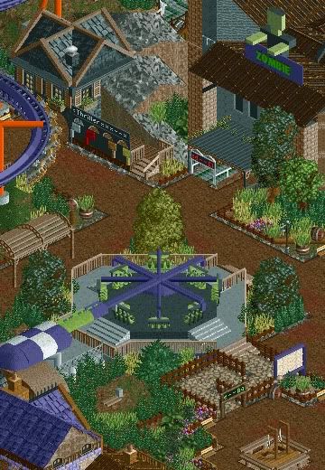
The scariest section of the park certainly holds the most blood curdling attractions. Here you can see one of the parks finest thrill rides cleverly named by what the ride does to it's guests. Guest's have be known to scream at the top of their lungs to try and survive the onslaught of twists, turns and loops. Near-by is a roto-drop named Zombie with a desolate feeling to the ride, guests queue in silence anticipating the huge thrill. After that we can see a few more attractions around the area like graves that were never cleared when the park was built, a chance to get your picture taken dancing to thriller with the man himself, Michael Jackson at the front.
Grand Central - 100%
The Enchanted Valley - 100%
Agrabah - 100%
Deep Sea Legends - 80%
Old Town Mexico - 100%
Twisted Acres - 85%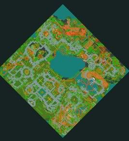
Park progress - 94%
Please comment as always and show some love, hopefully this should be done and released for the parks birthday in February. -

 Austin55
Offline
Wow.... So Playfull and fun, this is really going to be awesome I think.
Ive really been underestimating this park so far but I think now that Ive looked through some of this thread It is probably my most anticipated release now. -

 BelgianGuy
Offline
I agree and the ideas shown are extremely cool and nice details
But the building with the zombie on top drags the screen down in my opinion I think the suppoting for the overhanging roof can be better and look more aesthetically pleasing than it is right now, I know you're struggling with the object limit but some more depth and details on that building would improve this greatly
Also try to add more colours rather than shades of brown, all other screens shown even in this area have a lot of vibrant colours even for twisted acres so try to bring in something more eyecatching on a bigger scale cuz now even with the flat the brown is pretty dominant, maybe some well placed coloured flowers could really chance the colouring balance in this.
Btw the sunken trees are genious. -
 Timothy Cross
Offline
Wow, great stuff. The zombie made of deco blocks; cool theming. The MJ Thriller idea is brilliant. Looking forward to you finishing.
EDIT:
Also, this. The building itself could use some work, I agreeBut the building with the zombie on top drags the screen down in my opinion
 Tags
Tags
- No Tags


